@beamimpact/web-sdk
v1.55.0TypeScript
The Beam SDK enables brands to connect with their customers over shared values, not transactional discounts, to build stronger loyalty. Our integration achieves this by allowing customers to (a) choose a nonprofit where the brand will donate part of their
0/weekUpdated 1 months agoUnpacked: 3.2 MB
Published by avsalvatore
npm install @beamimpact/web-sdk@beamimpact/web-sdk
The Beam SDK enables brands to connect with their customers over shared values, not transactional discounts, to build stronger loyalty. Our integration achieves this by allowing customers to (a) choose a nonprofit where the brand will donate part of their purchase from a set of curated options and (b) track their cumulative impact with every order towards quantifiable goals.
Beam takes care of all the nonprofit management and compliance, impact tracking, UI styling and dynamic campaignization.
Learn more: beamimpact.com
---
- Installation
- CDN
- NPM
- Using Beam
- Web Components
- React
- Serverside-Rendering
- Debug Mode
- Widget Options
- beam-community impact
- beam-cumulative-impact
- beam-select-nonprofit
- Events
- beam-post-purchase
- Events
- Customizing inner widgets
- Integrations
- Cart Integration
- Shopify
- Utils
- Integrations
- Statsig A/B Testing
- Visibility
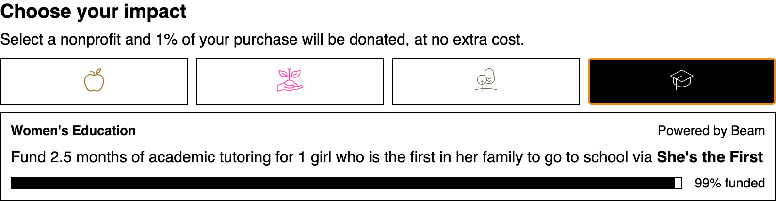 alt="Screenshot of Beam widget" />
The Beam Web SDK provides a set of web components and framework-specific wrappers for
integrating Beam widgets into an e-commerce website.
Installation
@beamimpact/web-sdk is available on NPM or via CDN.
$3
Most e-commerce applications will load Beam over the CDN.
Include the script for the widget you want to use at the top of the page:
``html`
crossorigin
src="https://sdk.beamimpact.com/web-sdk/v1.36.1/dist/components/community-impact.js"
>
> Versions
>
> Replace v1.36.1 with the latest version available on NPM
- type="module" is required to parse the bundle correctly
- This script will register the Beam custom element so it can be used anywhere in the page
- You may need to adjust your page's content security policy to allow scripts and images from beamimpact.com.
$3
`shell`
npm install @beamimpact/web-sdk
Import the component in your app's JavaScript:
`js`
import { BeamCommunityImpact } from "@beamimpact/web-sdk/dist/components"; // Native web component
import { BeamCommunityImpact } from "@beamimpact/web-sdk/dist/react"; // React component
Using Beam
$3
Beam web components are custom elements, so they can be used in HTML:
`html`
Because they are standard HTML elements, Beam widgets can have attributes like class, style, and data-attributes.
Components can also be created using Javascript:
`js`
const widget = document.createElement("beam-select-nonprofit");
widget.chainId = 1000;
widget.apiKey = "abc123";
const parent = document.querySelector("#sidebar-cart .footer");
parent.appendChild(widget);
The elements can also have children which show up before the script loads or if it fails to parse:
`html`
$3
Beam provides a React wrapper for the web components.
Key differences: event handler callbacks are exposed for the Beam events, and the components are named using the
JSX-friendly uppercase format.
`tsx
import { BeamSelectNonprofit } from "@beamimpact/web-sdk/dist/react";
import { events } from "@beamimpact/web-sdk/dist/integrations/utils";
chainId={1000}
onNonprofitSelect={(event: events.BeamNonprofitSelectEvent) => {
const { selectedNonprofitId, nonprofitName } = event.detail;
// do something
}}
/>;
`
$3
(ie, NextJS)
The Beam Widgets run clientside and save data (such as the user's nonprofit selection) in localStorage and cookies.
Use next/dynamic to lazy-load
components async on the client instead of the server.
`tsx
"use client";
import dynamic from "next/dynamic";
const BeamSelectNonprofit = dynamic(() => import("@beamimpact/web-sdk/dist/react/select-nonprofit"), {
loading: () => null,
ssr: false,
});
`
$3
Add the debug attribute to a component to show an error state in the DOM when errors occur. Otherwise, check for
console logs.
`html`
Widget Options
Required props for all widgets:
- apiKey - Beam API Key
Optional props:
- baseUrl - (provided by Beam) - URL for a dev or staging APIlang
- - en, fr, etc. Language code for a Beam-supported translation target
$3
Shows impact progress cards for each nonprofit supported by a brand, for brand impact pages, etc.
`html`
- chainId = Beam customer IDcardStyle
- = image or icon - visual style to use for impact cards
$3
Shows total impact in terms of nonprofit funding goals - e.g., "9,000 lbs of ocean trash removed"
`html`
- chainId = Beam customer ID
$3
Widget that integrates into a cart to allow customers to support a nonprofit as they check out.
`html`
- storeId = Beam ID for site, i.e., EU or US online store (optional) - used to show relevant nonprofits to customerscountryCode
- & postalCode = If storeId is not provided, location information can be provided instead (optional)cart
- = Usually set automatically by the cart integration (see below), the cart property allows customizing the
nonprofits shown based on the items in the cart
#### Events
`js`
document.addEventListener("beamnonprofitselect", (evt) => {
const { selectedNonprofitId, selectionId, nonprofitName } = evt.detail;
// ...
});
#### Event Types
Select Nonprofit Widget & Post Purchase Widget
- Event: beamnonprofitselect
- Description: Emitted when the end user selects a nonprofit in the Beam widget, and when the previous selection was restored automatically
Select Nonprofit Widget
- Event: beamcartchange
- Description: Emitted when Beam detects that cart contents have changed, and when items are added to the cart for the first time
- Event: beamnonprofitselectionremoved
- Description: Emitted when the nonprofit selection is removed from deselection or due to nonprofit cohort change
Post Purchase Widget
- Event: beamordercreated
- Description: Emitted when an order is registered with Beam for the first time, but NOT on repeat visits, page refreshes, etc.
$3
A wrapper component that registers transactions and renders either the beam-impact-overview orbeam-redeem-transaction widget, depending on if the user made a selection before purchase or not.
`html
`
`js
const widget = document.createElement("beam-post-purchase");
// Config values:
widget.apiKey = "abc123"; // Required
widget.storeId = 100; // Beam Store ID
widget.countryCode = "GB"; // 2-letter country code for order
widget.postalCode = "11111"; // String - postalCode in country-specific format
widget.orderId = String(10101); // partner provides ID
widget.email = "test@beamimpact.com"; // customer email
widget.cartTotal = 100.01; // Cart total before tax
widget.currencyCode = "USD"; // "CAD" etc.
widget.cart = {
schema: {
source: "shopify",
},
content: {
items: [{ sku: "PRODUCT-100" }],
},
}; // see OpenAPI spec for cart formats
widget.discountCodes = ["PROMO10", "CLEARANCE_50"]; // discount / promo codes
widget.lang = "en"; // en | fr Language
widget.domain = "example.com"; // [Optional] Base domain of the store, if subdomains for store and checkout differ
widget.debug = false; // boolean
`
#### Events
`js`
document.addEventListener("beamnonprofitselect", (evt) => {
const { selectedNonprofitId, nonprofitName } = evt.detail;
// ...
});
#### Customizing inner widgets
Use beam-post-purchase::part(impact-overview) or beam-post-purchase::part(redeem-transaction) to apply CSS.
Integrations
$3
Integrating Beam with your cart allows for customizing the available nonprofits based on the items in the cart.
`ts
import { updateCart } from "https://sdk.beamimpact.com/web-sdk/v1.36.1/dist/integrations/cart.js";
// on cart change
const cart = {
cartId: "cart_100", // external cart ID (from partner site, optional)
subtotal: 90,
itemCount: 1,
currencyCode: "USD",
content: {
items: [
{ remoteProductIdentifier: "sku-123", localAmount: 50 },
{ remoteProductIdentifier: "sku-456", localAmount: 40 },
],
},
};
const beamConfig = {
apiKey: "abc-123",
storeId: 123,
domain: "my-tld.com", // optional, domain or subdomain to set cookies on
baseUrl: "", // optional, Beam API url (staging or production)
};
await updateCart(beamConfig, cart);
`
$3
The registerCartIntegration() function integrates the Beam Nonprofit Select widget with the Shopify cart, which
allows Beam metadata for the nonprofitId and selectionId to be added to the order as the customer goes through the
checkout flow, and to track the cart token and cart value for the Beam ROI calculation.
Add event tracking script to main layout:
`html`
Post-purchase script:
`ts
import { showOrderPageWidgets } from "https://sdk.beamimpact.com/web-sdk/v1.36.0/dist/integrations/shopify.esm.js";
await showBeamOrderPageWidgets({
apiKey: beam.apiKey,
chainId: beam.chainId,
storeId: beam.storeId,
orderId, // From Liquid
email, // From Liquid
cartTotal, // From Liquid
cart, // Cart line items
currencyCode, // From Liquid
countryCode, // From Liquid
postalCode, // From Liquid
parentSelector: ".step__sections", // CSS selector
lang: "en", // From Liquid
baseUrl: beam.baseUrl,
debug: false,
});
`
$3
Several utilities are exposed which making integrating with existing applications easier.
1. waitForElement returns a Promise which resolves when the selector appears.errors
2. contains Beam custom error classes.events
3. contains Beam custom events classes / event names.
`js
import { waitForElement, errors, events } from "https://sdk.beamimpact.com/web-sdk/v1.36.1/dist/integrations/utils.js";
try {
const parentElement = await waitForElement("#my-selector", { timeout: 1000 });
parentElement.appendChild(widget);
} catch (err) {
if (err instanceof errors.BeamError) {
/ do something /
}
}
window.addEventListener(BeamNonprofitSelectEvent.eventName, async (event) => {});
`
$3
#### Statsig A/B Testing
Beam has a prebuilt integration for A/B testing with Statsig.
`ts
import { StatsigPlugin } from "@beamimpact/web-sdk/dist/integrations/statsig";
import { init, getConfig } from "@beamimpact/web-sdk/dist/integrations/beam";
const beam = await init({
apiKey: "",
chainId: 1,
storeId: 1,
domain: "my-store.com", // in case site uses subdomains for different pages
plugins: [new StatsigPlugin({ statsigApiKey: "" })],
});
`
Initializing the Statsig plugin will automatically log statsig_init, cart_created, and order_created events.
To manually log additional events:
`ts`
beam.plugins.statsig.logEvent(eventName, eventValue, metadataObject);
Setup for A/B tests is async. Waiting for Beam A/B test setup to be ready in other scripts:
`ts`
const beam = getConfig();
// Wait for promise to resolve
await beam.readyPromise; // resolves when plugins are all ready
// OR use event listeners
if (beam.status !== "ready") {
beam.addEventListener("beamstatuschange", (event) => {
const status = event.detail.status;
if (status === "ready") doSomething(beam);
else if (status === "error") handleError(event.detail.error);
});
}
##### Visibility
Once initialized, all Beam widgets have display: none unless user is assigned to A/B test group that shows Beam.
To hide additional elements, add the CSS className beam-sync-visibility to them. Elements with this class willdisplay: none
automatically have if the user can't see Beam.
To access the experiment state in JavaScript:
`ts
import { getConfig } from "@beamimpact/web-sdk/dist/integrations/beam";
getConfig().plugins.statsig.experiments.shouldShowBeam; // boolean
``