@skilld/drupal-theme-generator
v1.0.7
Drupal theme generator
SkilldskilldDrupaldrupaldrupal.orgcomponentcomponentstheme-generatortheme generatorcomponent connector
0/weekUpdated 1 years agoMITUnpacked: 1.3 MB
Published by Skilld
npm install @skilld/drupal-theme-generator
This theme generator was inspired by Component connector module.
It will help you to generate your custom theme for Drupal
#### Navigation
- Installation
- Features
- About component connector module
- - Ways of components delivering in drupal today
- - Integration with component connector module
- - What's the benefits
- Explanation of generated theme
- - Purposes of generated theme
- - Structure of generated theme
- How to create new component
- How to compile styles and scripts
- How to run and compile storybook
- Linting
- Drupal's breakpoints in CSS and JS
- SVG sprite
- - Why SVG sprite technology
- - How to generate SVG sprite
- - How to use SVG sprite
- - How to optimize source SVG files
- How to generate favicon
- About components
- - Atomic design
- - Component structure
- - Principle of building components
- - Namespaces
- - Pre-defined components
- - - Buttons and inputs
- - - Atom "Image"
- - - Molecule "Responsive Image"
- - - Helper "Root variables"
- - - Helper "Wrapper as link"
- - Pre-defined Drupal javascript
- - Third party libraries
- Methodology of doing Storybook
- - How to split design system on components
- - Accessibility in Storybook
- - Which component I'm currently seeing in Storybook?
- Debug in Drupal
- License
Installation
Our plans are to create contrib starterkit theme and put it on drupal.org, so you will be able
to generate sub-theme using
this php script
or drush. However these functionalities aren't done yet.
But already today you can generate your new drupal theme with this generator using:
1. npx @skilld/drupal-theme-generator
2. or via docker - docker run -it --rm -u $(id -u):$(id -g) -v "$PWD":/app -w /app node:lts-alpine npx @skilld/drupal-theme-generator
After execution of one of those commands - just follow instructions in console.
Then you have to:
1. cd themename/
2. yarn install or via docker make install
3. yarn build or via docker make build
If you are under Mac OS and want to use Make commands - be sure in Makefile you have:
``
CUID := 1000#$(shell id -u)
CGID := 1000#$(shell id -g)
Features
- Vite 5 (ESM build)
- PostCSS 8
- Javascript ES6+
- Storybook 8 (ESM build)
- Drupal's breakpoints in CSS and JS. Read more
- Rems everywhere. Write your source css styles in pixels, but on the build task it will be converted to rems automatically.
- Drupal component generator - learn more
- Linting and auto-fixer of CSS, JS, YML files using Stylelint, Eslint and Prettier
- SVG sprite generator and optimizer of SVG assets. Why SVG sprite technology
- (Experimental feature) Favicon generator. Check below how to use favicon generator.
- Integration with Color module to be able to customize palette of colours on your web-site through admin back office.
- Multiple base components pre-installed in theme with minimal styles and scripts.
About component connector module
The process of delivering components in Drupal is not so easy thing. Drupal
is having own Render API which is a bit out of component approach. However, component approach
turn out to be very popular and we want to promote delivering of front-end components in Drupal.
$3
To date, how you actually can deliver your front-end component in Drupal?
Initially you have many different ways to do that. For example:
1. Via twig overrides you can {{ include }} twig of front-end component to apply it in Drupal.
2. Via Drupal hooks: preprocess hooks, alter hooks and so on.
3. If your component should be layout in drupal - then Layout API
4. Writing your own theme hooks which will take your component into account
5. And so on - many ways !
Another problem is delivering of assets in Drupal.
Initially your my-component/styles.css and my-component/scripts.js is nothing in Drupal. So you have to:
1. Declare a new drupal library
2. Attach it where need.
Of course, today we already have several great initiatives, like SDC or
UI Patterns, which already greatly simplifying life of developers.
But are these initiatives enough?
Well, SDC initiative can't resolve next problems:
1. It still requires an extra layer to connect your component via twig for example - where you have to override drupal's
twig file just to include twig of your component and map the fields to
SDC props and slots.
2. Second problem is an actually dangerous mapping of drupal's fields.
We are not recommending to map entity machine names to component's props and slots, for example:
`
{{ include('my-title', {
  content: content.field_title,
}) }}
It's very dangerous to do it like this, because one day field machine name can be changed, or a whole field will be removed,
or field will be removed from view mode display. In that case you can get an error, because in twig you are expecting
machine name of the field.
So we vote for an abstract mapping, which for example Layout API can give to us. Instead of referring to the real machine names
of entities, we can declare abstract layout's regions and we don't have to worry about which entities will be placed in regions
of our layout. Regions are static, while machine names of entities are not.
Another old-school way of building front-end in twig is to do something like this:
`
{{ include('my-button', {
  text: 'Some text',
  icon: 'some-icon'
}) }}
From our point of view it could be much simplier and more correct to customize settings of components from admin back-office. So it's a question
to cost of development. Guess how many entities with different view modes you can have, and what if you need
to connect your my-button component in lots of different places. What will be easier and faster - to overridetext
twig files or to make several clicks in admin back-office to enter specific and choose the icon for
the button?
Regarding UI Patterns - unfortunately as a standalone module it can't wrap all the possible cases in Drupal.my-selectbox
For example:
- How to connect component to the core theme hook select with its template select.html.twig?pager
Right now only by using old-school ways: via twig overrides, or playing around drupal hooks. So it becomes a question
to all core theme hooks drupal have: , breadcrumb, status_messages, input, textarea, details and
so on.
Yes, UI patterns already can provide you many different ways of connection your component into drupal: as a field formatter,UI Patterns
as a layout, as a view style, and so on. So potentially you can build ~60% of the web-site only by using
and configuration of them via admin back-office.
$3
We wanted to get rid of all the extra layers to connect components in Drupal and stay native and flexible
at the same time. You have to check this module before reading on.
$3
#### For a company in long term strategy.
1. Much less time development of drupal websites will take.
We are estimating a 30% reduction in the total time to develop your custom Drupal project with custom design system of any complexity
comparing to what you had before - that means... money !
2. Build Storybook today, integrate in Drupal later.
I hope you all already had experience with Storybook. It's a great tool for keeping
front-end state up-to-date on the project. It makes your customers happy since they can see a lot of progress already in the
beginning of project. Since front-end developer can build all pages with all html structure, styles and scripts
from your unique design system, spending only ~10-20% of the project's budget and customer can see already a lot of results
in the beginning of its project. But that's not all, because with component connector almost all components from storybook will be
fully re-used by Drupal, so Storybook becomes not a standalone tool. Methodology of doing storybook is well described
below.
3. Fast growing drupal experience of drupal developers.
#### For a regular drupal developer
1. Again. Experience with Drupal.
2. Familiar structure of theme, similar to drupal core themes.
3. Powerful and modern tools: vite, storybook - everything to make your life easier and development process faster.
4. Faster creation of new components, thanks to Component generator.
How to use Component generator is described below.
Explanation of generated theme
You have to install and enable the following Drupal modules before enabling generated theme:
- UI patterns
- UI Patterns Field Formatters
- Components
- Component connector
However if you don't want/need to get full experience of the usage of component connector module and want
just to try theme as it is - you can remove all dependencies from your_theme.info.yml file except ofcomponents:components.
$3
Goal of generated theme is to implement a whole design system in components and integrate
them in Drupal natively.
As a front-end developer you can not be an architect of Drupal web-site, no matter which experience you have.
The architect
of project can be defined only with communication between all involved persons - project managers,
back-end and front-end developers, all together. That means when front-end developer want to create one or another component - he
should think first how this component will be integrated in Drupal - as a theme, layout, suggestion or ui_patterns
way. If front-end developer sure its component should be applied to core theme hook select - there issuggestions
no problem with it, so front-end developer can just move its component into folder (Read again about component connector integrationsuggestions
if you don't clearly understand why folder). But if front-end developer can't guess what this componentuncategorized
will be in Drupal - a component should be placed in folder and wait for its usage. When back-end developer willuncategorized
start to work on this subject - he can decide how component can be integrated in Drupal and move it from folder
to the one of other folders.
However, it was recommended usage. But you also may not use described integration at all. There is always available folders:
- templates/overrides for your twig overridescss/
- for storing stylesjs/
- for javascripttheme_name.theme
- for hooks
$3
- Source CSS and JS files have suffixes .src in filenames.src
- Generated styles and scripts doesn't have suffix. Normally you should never touch generated assets since it's build affectedcss/
- Styles and scripts required only by Drupal can be added in the root or js/ folders. For example styles.storybook/
for administrative toolbar - we don't want to take care about such components in storybook. So toolbar overrides
can be done only for Drupal
- folder for storing storybook stuff. If you don't use storybook on your project - feel free just ignore or remove this folderfavicon/
- folder contains generated favicons for different browsers. You can generate your custom favicon this wayfonts/
- folder for storing project fontsimages/svg/
- folder for storing source SVG assets. Pay attention to images/sprite.svg - this file is auto-generated,templates/
so you shouldn't modify it normally. Read more about SVG sprite
- folder contains two sub-folders. One of them is overrides/ - this folder is for drupal's twig overrides.components/
And folder for storing components required by integration.
How to create new component
Run yarn cc or via docker make cc
and follow instructions in console.
New component will be added in templates/components/** folder. Read more about component generator.
How to compile styles and scripts
Simply run yarn build or via docker make build
It will compile all assets from css/, js/ and templates/components/** folders. Compiled assetsdist
are living near to sources. So we don't have or app folder in the root of theme.
build task contains subtask lint:fix which executes right after build - so linting with auto-fixer included.
There is Stylelint, ESlint and Prettier for the linting of code. Warnings are not allowed -> that's why any warning
in console will be targeted as error type. Stylelint and ESlint are running in a parallel and once it's finished - Prettier
executes. If you got an error on Stylelint or ESlint steps - Prettier will not be executed. Note that you
have to resolve all errors in console before making commit.
There is also watcher available, just run yarn build:watch or make build:watch to enable it.
How to run and compile storybook
To run storybook on local port run yarn storybook or via dockermake storybook
To create static storybook run yarn build:storybook or make build:storybook
Linting
Linting and auto-fixers are already included in build command. So normally if you are usingyarn build or make build
commands - it's already enough. But if you want to just lint assets without taskyarn lint
simply run command (or via docker make lint).yarn lint:fix
And if you want to auto-fix linting errors, run (or via dockermake lint:fix)
All warnings are interpreting by all kind of linters as errors.
So if you are using CI or some custom scripts before git commit for validation or something, youwarnings
will get failed results even in case of .
Drupal's breakpoints in CSS and JS
We have made a very nice functional, which allows you to align media queries everywhere: in your CSS, JS and
Drupal's responsive images.
Based on Breakpoints in Drupal
you have already pre-defined theme_name.breakpoints.yml file in theme with some pre-defined breakpoints after installation
of your new theme. Of course your custom design system can have own breakpoints system, but if it's not - you can simply use
default breakpoints provided by our theme generator. And you can use those breakpoints from CSS or JS.
Usage in CSS:
`
.selector {
  @media (--xxs) { ... }
  @media (--xs) { ... }
  @media (--s) { ... }
  @media (--m) { ... }
  @media (--l) { ... }
  @media (--xl) { ... }
  @media (--xxl) { ... }
}
In JS all available breakpoints lives in drupalSettings
and its usage is:
`
drupalSettings.yourThemeBreakpoints.xxs
drupalSettings.yourThemeBreakpoints.xs
drupalSettings.yourThemeBreakpoints.s
drupalSettings.yourThemeBreakpoints.m
drupalSettings.yourThemeBreakpoints.l
drupalSettings.yourThemeBreakpoints.xl
drupalSettings.yourThemeBreakpoints.xxl
So you can simply check if window is matching specific media, like this for example:
`
if (window.matchMedia(drupalSettings.yourThemeBreakpoints.xl).matches) { ... }
All the default breakpoints you will get after theme installation are market and mobile first based. Market based means we did an
analysis of market of world-spread electronic devices and default breakpoints are the more fitting.
Answering your questions why for example breakpoint min-width: 1441px and not 1440px - it's logically justified.1440
Well a big amount of laptops around the world have screens with the resolution pixels. Now guess any1440
responsive image which is taking a whole width of viewport (for example some banner image) - it makes sense to load pixelsmin-width: 1440px
image on such laptops, isn't? If there was a breakpoint - then on such screens the next breakpoint could be
triggered.
SVG sprite
An SVG sprite is a single SVG file that contains multiple icons as
$3
There is a lot of benefits of using svg sprite instead of other technologies of delivering icons:
1. SVG sprite is cached by browser once user visited any page
2. Possibility to customize colors for single color icons based on design system palette
3. Technology supported by all major browsers
4. No blinking effects on hover of icon which happens to iconic CSS background images for example
5. Weight of SVG sprite is tiny if to compare with CSS background images, or iconic fonts technologies
6. No shred of quality degradation on resize, but also better anti aliasing than iconic fonts for example
$3
Source SVG icons should be stored in images/svg folder. Compiled SVG sprite lives in images/sprite.svg.
To generate SVG sprite from source icons just run yarn sprite or via dockermake sprite
SVG sprite generation is a rare task, so it's not included in build task, because it takes time,
and probably you will need to generate or re-generate svg sprite just only several times for entire project.
$3
Normally there is already a component called a-icon, which is living in templates/components/theme/ folder.
You can use this component any time you should have SVG icon in your render.
Usage in twig is next:
`
Usage in PHP:
`
''
Path to SVG sprite lives in drupalSettings and
its usage in JS is:
`
$3
Sometimes source icons can have weird structure inside and many useless attributes and techniques
for web usage (for example it's stroke based instead of fill). If you need to clean-up specific svgFILE=icon-name.svg yarn svg-fix
icon - simply run or via docker FILE=icon-name.svg make svg-fix.images/svg
You don't need to write full path to icon in those commands. It's supposed your icon already placed in folder
If you need to optimize all of the icons at once - run yarn svg-fix:all or via dockermake svg-fix:all
How to generate favicon
You have to have your favicon in vector graphic format named favicon.svg. Put this file inyarn favicon
the root of theme and just run or via dockermake favicon
Wait a bit and new favicons will be added into favicon folder.page_attachments_alter
Then clear cache in Drupal and new favicons will be automatically applied in drupal
because of Drupal hook in your_theme.theme file.
About components
$3
In components we are using Atomic design approach.
Component folder and files inside has atomic prefixes:
- a - Atom. Usually it's tiny undividable cells, like a-icon, a-checkbox, a-radio, a-throbber, etc.h
- - Helper. Kinda softener, helps other components to get some universal functionality. Read more about helpers.m
- - Molecule. Can be some m-card, m-banner, or m-checkboxes. So it's a good-size components, with several "atoms" inside, but not big enougho
to be organisms.
- - Organism. Can be some o-some-view or o-some-block. Analogue in Drupal are blocks for example, or views, which contains several molecules.t
- - Template. It can be layouts of the whole page. If you are using Panels for example or someTemplate
other module which allows you to configure different layouts for different pages - this is where category will help.p
- - Page. Global layout of the entire web-site, including header, footer, system, main content regions and so on. Analogues in Drupal are page maintenance_page
theme hook or for example.
These prefixes allows us:
- To be sure our custom component will never override drupal's default twig suggestions. For example if drupal's
twig suggestion is select.html.twig - twig in our component will never have same naming, instead it will have something likea-select.html.twig. So there is no collisionsa-component-name
- To better group components. It's a natural awareness when you know that molecule contains atoms for example, but not vice versa. In storybook we have sidebar with the list of all components and it's grouped per their atomic type
- To understand which order should be in DOM tree for css and js assets. For example if is loaded in DOM tree after some molecule or organism - probably it shouldn't be like this, because high risk styles of atom will override styles of more high-level component. And by the way loading of assets in storybook is built by this principle.
$3
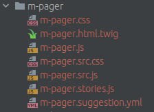
Every component folder contains several files inside:
- .src.css and it's compiled version .css
- and it's compiled version .js. By the way in these js files we initially have code wrapped in Drupal's behavior. Drupal's settings and context are also available and it works in storybook..stories.js
- - for storybook needs. Initially such files contains everything you will need for preview any component in storybook. If you don't want.html.twig
to support storybook on your project - you can just ignore this file.
- - twig of component. By the way attributes variable is always available in any component by default in Storybook. Other fields and settings you can declare in .yml file or describe them in .stories.js
- - configuration of component. Read more about how to write yml files and also explanation of every file inside component.
Also here is the link to our component generator
where you can find more information about every file in component.
$3
If you are not too much familiar with Drupal or just don't know what your current component will be in
Drupal - just put your component in templates/components/uncategorized folder. And later when back-end developer will start.yml
to work on such component in Drupal - he can change storybook
file and move your component from
folder to some other specific folder (depending on the type of integration will be taken).
Goal is to build maximum amount of components which will be natively integrated in Drupal. Which means - in the end of
project storybook folder should have as minimum as possible components, which are not integrated. Also Helpers canstorybook
live in this folder, because they are not explicitly used in Drupal. And of course you will always have some other unclear and/or complicated
components, like dialogs or autocompletes or ajax throbbers which will be partially integrated in drupal (for example only css
file of such components will be integrated in drupal and that's all). Such components should also live in folder, because
they are not natively integrated.
$3
We also using Components drupal module for namespaces.
Global namespace is @component no matter in which folder component is living. Same namespace is working
in Storybook. So if you need to call your component somewhere in twig, you can just write:
`
{{ include('@component/a-button/a-button.html.twig', { props }) }}
You can find several examples of such usage in pre-defined components.
If component was moved from one folder to another - normally
all you have to do is to change yml file only. Read more about how yml file should be organized.
$3
In generated theme you will get a big list of pre-defined components. It is base components which are exist on
every single project. Every pre-defined component has minimal twig with minimal styles and scripts by default. Also components are
already attached to their required type of integration (so it's already splitted by required folders). You can take these
components as a reference for creation of your custom components. You can also customize pre-defined components based on your
design system.
Now several words about some "specific" pre-defined components.
#### Buttons and inputs
Keep in mind that with component connector native integration we are not recommending to create abstract components which can not be
applicable to Drupal, like button component for example (which meansButton
UI component ). In terms of Drupal - there is no simple integration of UI component button. But Drupal have input
for example theme hook. So we can be sure that input [type="submit"] should look like a button. For thata-input-submit
we have added in our theme generator in the list of pre-defined components - component, which is living intemplates/components/theme/a-input-submit. So this component is applied always to input__submit hook in Drupal.
Ok, where else we should have buttons? Well - it can be some links, which are visually looking like a button. But in Drupal
there is no theme hooks like link-button or at least just link. So we have added a new component a-link-button where we a_link_button
have declared a new theme hook . Now from PHP back-end developers can use this hook.
What about Drupal admin back-office? Well - there is another component which is ui_pattern called m-cta-field which can be link
applied to the field type, and its visual display will be just like a button.
So as you can see by default you have 3 different pre-installed components for buttons in theme generator, which are integrated in Drupal
differently. But where to store styles for buttons in that case?
For styles - there is fourth component, called h-button and it lives in templates/components/uncategorized/h-button. This componenttwig
doesn't have any or stories.js file. It's just a CSS styles for buttons. This component is already attached globally in Drupal,a-input-submit
so it's available on any page. If you will open components , a-link-button, m-cta-field - you will notice its h-button
templates contains classnames as a reference to the base styles.
Regarding other input types, like checkbox, radio, text, email, password and other - for some of them there is alreadytemplates/components/theme/a-input-*
pre-defined components and it's living in folders. Each such component already integrated
in Drupal for its specific input type. If you need other types in your design system - just create one more component and integrate
it in Drupal same way.
For the textable inputs - there is helper component called h-text-input which contains base styles for textable inputs, like text, email, etc. Even templates/components/suggestions/a-textarea component is related to h-text-input.
For the boolean inputs (checkbox and radio) - same situation. Since visual difference between those two components usually is a
CSS border-radius only - we have added one more helper h-boolean which contains base styles for radio and checkbox input type.
It's integrated same way as other input types described above.
So such integration of buttons and inputs is logically substantiated and we are recommending to follow same principal.
#### Atom "Image"
This component is living in templates/components/suggestions/a-image folder. It is applied to the core theme hook image. config.styles.yml
But you can find also file in this component. This file is supposed to be for documenting all the image
styles from entire design system. There is several "test" image styles under the hood - you can remove them, because they are
just added for testing purposes and to be as a reference for you to create other image styles.
As a front-end developer - you are an architect of site layout, so you can understand which image styles you have to create
on which media breakpoints and with which image style effects.
In config.styles.yml you will find an explanation how you should declare your image styles.
Example of creation image style with effect Scale and crop:
`
500_x_500_scale_and_crop:
  label: 500 x 500 (Scale and crop)
  effect: image_scale_and_crop
  width: 500
  height: 500
Example of creation image style with effect Scale and auto width:
`
auto_x_500_scale:
  label: Auto x 500 (Scale)
  effect: image_scale
  width: auto
  height: 500
Example of creation image style with effect Scale and auto height:
`
500_x_auto_scale:
  label: 500 x Auto (Scale)
  effect: image_scale
  width: 500
  height: Auto
Example of creation image style with effect Scale and maximum possible width and height:
`
500_x_500_scale:
  label: 500 x 500 (Scale)
  effect: image_scale
  width: 500
  height: 500
Storybook is sensitive to scale_and_crop and scale image effects. In case if effect is scale,500_x_auto
dimensions affected. For example if image style is (so auto height), in that case storybook will take into500x461
account width of image style and by using little coefficient will make height. For example final dimensions of such image can be or 500x523 - so height is close to width, but various.
Idea of this file is to document all possible image styles, so after back-end developer can write a simple script which will take
this file and generate all possible image styles and its configs in Drupal automatically. This process is supposed to be done
only once on project. Normally back-end developer can generate all image styles in Drupal only when 100% of image styles are described
in this file. Moreover, this file is already using
by our storybook. So Storybook and Drupal will be aligned in terms of images.
For the displaying images in Storybook we are using faker library. And by default
type of images is abstract, but you can customize this type in a-image.stories.js if you need.
Usage of this component in storybook is next:
`
r('a-image', {
  style: 'machine_name_of_image_style',
  fakerProvider: 'some_other_type_of_image', // If need to customize image type - https://fakerjs.dev/api/image.html
})
Pay your attention to the default image style called 1_x_1_fallback. This image style is helpful when for example you should havedisplay: none;
hidden image on some media breakpoint. Not everyone knows, but image is still downloading by browser even if it's hidden in CSS with. For browser it doesn't matter if it's hidden or not. So for such cases to improve performance on the page - you
can use this image style in your responsive image group for specific breakpoint (on which your image is supposed to be hidden).
#### Molecule "Responsive Image"
This component is living in templates/components/suggestions/m-responsive-image folder. It is applied to the core theme hookresponsive_image. You can also find config.groups.yml file in the folder of this component. This file is supposed to be fora-image
documenting all the responsive image groups from entire design system. Same as - there is several "test" responsive image
groups pre-defined in this file. You can remove them and create your own.
In config.groups.yml you will find an explanation how you should declare your responsive image groups.
Example of some responsive image group:
`
machine_name_of_responsive_image_group:
  label: Label
  breakpoints:
    xxl:
      1x: 500_x_200_scale_and_crop
    l:
      1x: 500_x_200_scale_and_crop
      2x: 1000_x_400_scale_and_crop
    xxs:
      1x: 500_x_200_scale_and_crop
  fallback: 500_x_200_scale_and_crop
So as you can see a-image and m-responsive-image are totally referring to Drupal architecture.
Idea is to collect and document all the responsive image groups, so once it's done - back-end developer can write a simple script which
will take this file and generate all responsive image groups with configs in Drupal automatically. This process is supposed to be done
only once on project. Normally back-end developer can generate all responsive image groups in Drupal only when 100% of responsive image groups are described
in this file. Storybook is also using this file,
so you can build your storybook components with the specific responsive image groups.
For displaying image in Storybook we are using faker library. And by default
type of images is abstract, but you can customize this type in m-responsive-image.stories.js if you need.
Usage of this component in storybook is next:
`
r('m-responsive-image', {
  group: 'machine_name_of_responsive_image_group',
  fakerProvider: 'some_other_type_of_image', // If need to customize image type - https://fakerjs.dev/api/image.html
});
#### Helper "Root variables"
This component is living in templates/components/uncategorized/h-root-variables folder.
Sometimes 100vw or 100vh CSS values may return incorrect dimensions of visible area in viewport (especially on iOS devices).
This is where this helper can help you.
It helps you to measure your real viewport's width and height and put these dimensions into css variables
in html tag via style attribute, so they are always accessible on any page.
These CSS variables are:
`
  --viewport-width
  --viewport-height
By default in css/_variables.src.css these variables are set to 100vw and 100vh as a fallback.
Example of usage:
1. Mobile dropdown navigation which should take full height of the screen.
2. Dialogs which should be sensetive to max-height of the viewport.
3. etc.
#### Helper "Wrapper as link"
This component is living in templates/components/uncategorized/h-wrapper-as-link folder.
This component helps you to simulate link on the entire wrapper using little javascript. For example if in your entity only title is a link in Drupal,
but you want to have a whole entity clickable - you can use this helper.
Usage of this component:
1. This component has own library definition in theme_name.libraries.yml, so you have to link this library to your relatedwrapper-as-link-container
component as a dependency if you want to use it.
2. Simply add html attribute to the expected wrapper and JS script will automatically find first matched
link inside of your wrapper and simulate click on the entire wrapper.
It works even with ajax use-ajax links.
When script has finished execution and if link was found - you will get another html attribute added in your wrapper called
wrapper-as-link-target-built. You can use this attribute as a reference in your CSS files.
As an example - guess the m-card, which contains image, clickable title, and some body text. Default behavior is whenwrapper-as-link-target-built
only title is clickable. But once script has been added & executed on the page - a whole card becomes clickable, so you can
use attribute to improve visual styling.
Be careful, if in your entity you have several links with different href, probably you shouldn't use this script in that case.
$3
After theme generation you will find two javascript files in /js folder:
1. ajax-throbber.src.js and its compiled version. This file is supposed to override ajax throbbers in Drupal.Ajax
It's fully aligned with the pre-defined components so normally you will see all the same ajax throbbers in Drupal,
just like in Storybook when you activating control in component. For now there is only 3 types of componentselement
where ajax throbber is reflecting: for buttons (there is different logic of throbber in case if button doesn't have icons,
or have icon only before text or after), for radios and checkboxes. If which is triggered ajax request isstates.src.js
not in this list - fullscreen throbber will be added.
2. and its compiled version. Since we are using SVG sprite technology, we have switchedinput html tag on button in a-input-submit component. However, drupal's core states.js can't handle button
html tags. So this file contains a fix for state for button html tag for form submits.
$3
We want to follow drupal core principle in terms of third party libraries. So libraries should live in /libraries/your-library-folder/
in the root of project and been manageable via root . This is recommended process of managing and delivering
third party libraries in Drupal.
However front-end world loves package.json and want to have control on used third party libraries in there. This topic is still
WIP and there is no "good" solution at this moment.
What you can do today is next:
1. You can manage third party libraries in package.json of the theme and then import it normally right in your my-component.src.js,@import "your-lib.css"
same to CSS - . Imported libraries are not affecting linters and it will be compiled in every target filesimport
in every component where you did imports. We don't have chunks! - that means if you will import same library 10 times in 10
different components - library will be compiled 10 times in 10 different files. So it's a question of your architecture. If you need to call
same library several times -> create new component and put your library in there and then re-use it as a dependency in Drupal. The more times
you are using libraries via , the more weight of those libs - the more build becomes slower.theme_name/.storybook/preview-head.html
2. Alternative way is to declare assets of third party libraries in Storybook separately in file. jQuery
After theme installation you already have library declared out there.
So when you will run Storybook there will be already accessible libraries in DOM, and then in your javascript of components you
have to write same code as it's done in Drupal core.
For example if we are talking about Splide library, then JS code in your component should be like this:
`
(({ behaviors }, Splide) => {
  behaviors.someDrupalBehaviorName = {
    attach: (context) => {
      if (!Splide) {
        return;
      }

      // otherwise process the code.
    }
  }
})(Drupal, window.Splide);
Then, in the root composer you have to add Splide package again exclusively for Drupal. So once composer require
will be executed - third party library will be downloaded into root folder.
Then, declare a new Drupal library in theme_name.libraries.yml with the paths to CSS and JS of your third party library, like:
`
splide:
  css:
    component:
      /libraries/splide/dist/css/splide-core.min.css: { minified: true }
  js:
    /libraries/splide/dist/js/splide.min.js: { minified: true }
And then link this drupal library as a dependency in your component-name.[type_of_integration].yml
Other solutions are currently unstable.
We are working on this subject and will try to find a good and simple solution which will make everyone happy.
Methodology of doing Storybook
Storybook is a great specification of the current front-end state on project. Even after several years of development
if newcomer will join the project - he can just open Storybook to see the latest state of all components.
We are highly recommending to keep Storybook updated so it should be always aligned with the actual state
of Drupal web-site. Once you lose at least several minor updates - potentially you can lose a whole Storybook.
If architecture of some blocks was changed in Drupal, if new features are planning to appear - always provide them in Storybook
and then integrate in Drupal.
$3
Sometimes designers already can do this job on design, so it will simplify a bit work for developer. However, keep in mind
that designer is not Drupal developer. If designer have provided a list of components on figma or somewhere else -
it doesn't really mean same components should be added in web. There is only one important thing for you before creation
of components - is how this component will be integrated in Drupal !
Of course there is always common components on any design system, like checkbox, radio, logo, and so on.button
But keep in mind that even component is not so easy to integrate.
Please see above to understand why even button.
Here is several good practices regarding splitting design system on components:
- Try to use as much as possible same namings from your design system (if your design system have it). It's about everything:
naming of components, naming of modifiers of components, naming of colors and so on.
- Don't use unclear namings. For example if color name on design is color-yellow - ask designer to change such naming onto something morecolor-primary
neutral and abstract, like for example, or at least color-1. Same for modifiers - no modifier namings likebutton-green, instead -> button-primary or button-second, etc.atoms
- Following naming principal your components will be aligned with design, which will save you a lot of time during development.
- If your design is not splitted on components, then you have to do it by yourself. For that - start to integrate first, thenuncategorized
more high-level components. Even if you are not familiar with Drupal too much - you anyway can integrate simple components like: buttons,
icons, texts, form elements, cards, teasers, etc.
- Don't create monster components with a lot of modifiers. Practice shows it will be impossible to support them in future. For example
if you have two or three similar cards with the only one or two little difference - it can be same component with modifiers. But if
components requires different markup -> split them on different components.
- Communicate with the lead back-end developer on the project. If you don't clearly understand how exactly you have to split some elements
on components from your design - just postpone this subject if no solution at this moment, or just put your component in
folder. So later, when back-end developer will start to work on this subject, you all together can re-do such component if need and
integrate this in Drupal by the one of available types of integration.
Normally Storybook is supposed to be finished only when a whole design is embodied in components.
Here is an example of the tree of components:
Atoms
- a-link-button
-
-
Molecules
- m-cta-field
- -
-
- -
-
- -
-
- -
- -
- -
Organisms
- o-view-items
- -
- -
- -
Templates
- t-homepage
- -
- -
Pages
- Header
- - o-some-organisms
- Main content
- -
- Footer
- -
$3
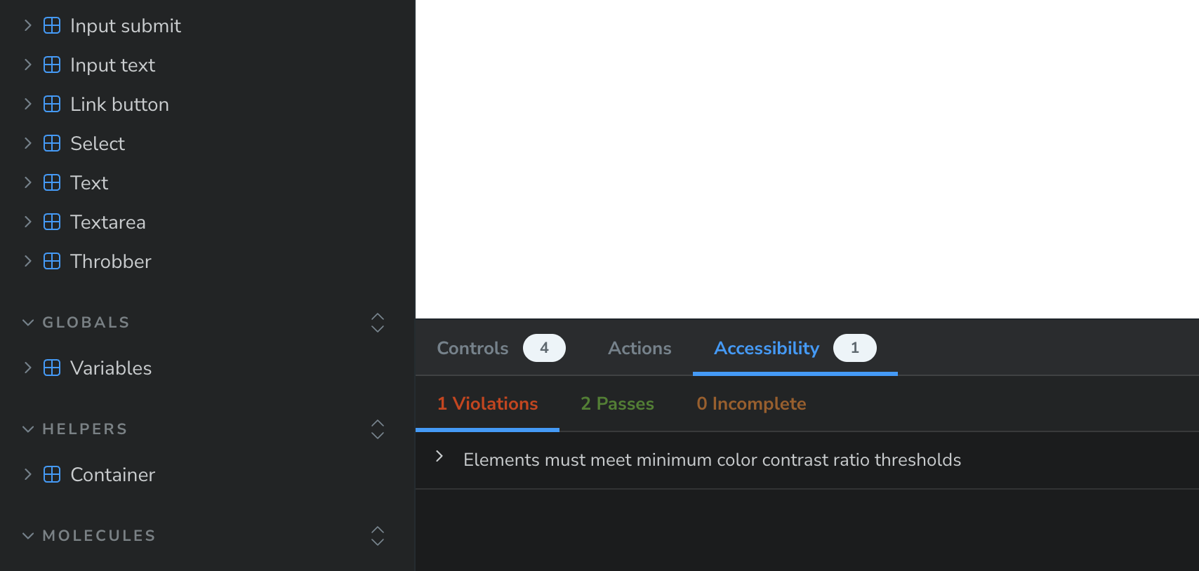
@storybook/addon-a11y plugin has been added in package.json. It will help you to immediately recognize a11y issues and fix them, right in Storybook!
$3
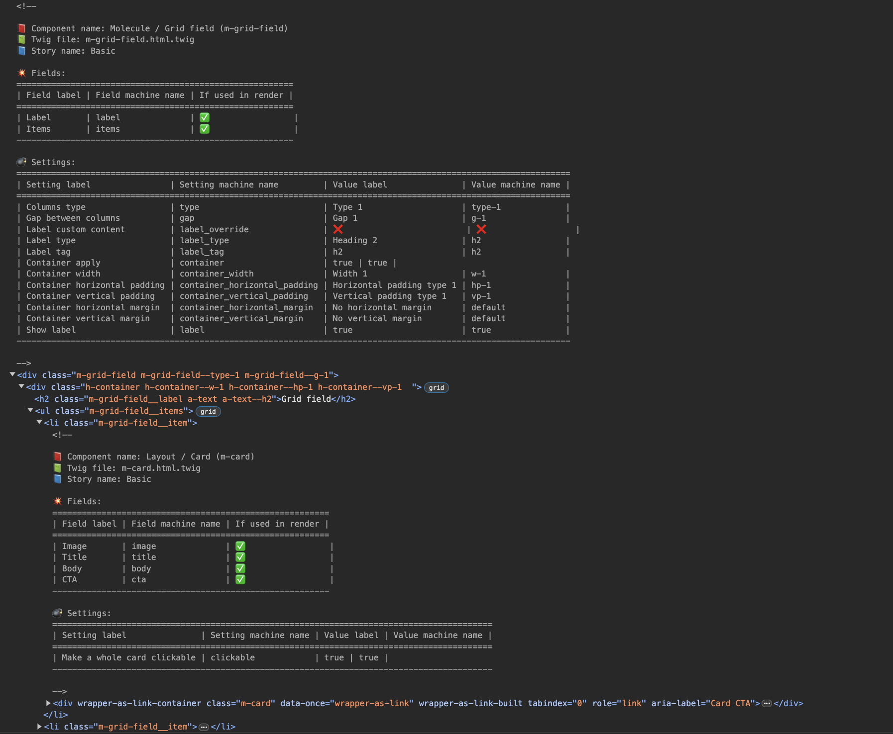
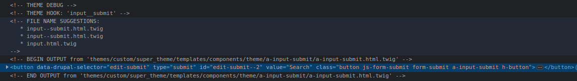
Every component now have a very detailed explanation in HTML comments. Just open devtools and
start to navigate through the DOM tree.
Every HTML comment includes:
1. Component name (human label and machine name)
2. Which twig file is used to render component
3. Story name
4. List of fields in component illustrating which fields are used and not used in the current render.
5. List of all possible settings (settings declared in yml files or through the argTypes).
Debug in Drupal
For debugging in Drupal you need to:
1. Disable aggregation first on performance page /admin/config/development/performance
2. Thanks to Drupal 10.1 we now have Development settings page /admin/config/development/settings`. You have
to enable everything on this page
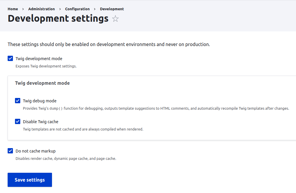
3. Then open DevTools in browser on the user page and there you will see a lot of useful information for every
layer of render
License
This project is licensed under the MIT open source license.