@synapsecns/widget
v0.9.49TypeScript
Widget library for interacting with the Synapse Protocol
0/weekUpdated 2 months agoMITUnpacked: 1.5 MB
Published by trajan0x
npm install @synapsecns/widgetThis explains how to integrate the bridge widget into your dApp in just a few minutes. This widget enables users to bridge tokens directly on your site, utilizing the Synapse Protocol.
Live version of the widget:
/_ link to landing page to come _/
Example use cases include:
- Building a custom frontend for the Synapse Protocol
- Bridging assets in a DeFi application
- Acquiring a token to participate in a web3 game
This guide shows how to customize the widget to seamlessly blend with your app's theme by altering colors, fonts, and the token list. Learn to make the widget appear as an integral part of your application.
Installation
The widget is available on npm or yarn.
npm:
``bash`
npm install @synapsecns/widget
yarn:
`bash`
yarn add @synapsecns/widget
Note: The widget's peerDependencies require the consumer app to use react and react-dom (>=17.0.1)
Get started
To get started, import the Widget React component into your App. You will need a web3Provider parameter to pass to the widget. The demo landing page app, for example, defines this provider from the ethers library. However, the component supports any similar provider:
`tsx
import { Bridge } from '@synapsecns/widget'
const MyApp = () => {
const web3Provider = new ethers.BrowserProvider(window.ethereum)
return
}
`
Your site should now display a fully operational bridge widget integrating the routes and tokens supported by the Synapse protocol. By utilizing Synapse's multiple routers, you will be able to find the best quotes to support your bridging use case.
Bridge Widget Props
The widget accepts a number of props to customize its functionality and appearance. Below is a quick summary with more detailed explanations later on.
web3Provider
Web3Provider. Required.
customRpcs
Custom JSON-RPC endpoints for your consumer application. Optional but recommended.
customTheme
Custom theme for the widget. Optional. If not provided, defaults to light theme.
container
HTML element to render the widget in. Optional. If not provided, false.
targetChainIds
List of chain IDs for the destination side of your consumer app. Optional. If not provided, defaults to all Synapse Protocol supported networks.
targetTokens
List of tokens to display in the widget. These tokens are imported from the widget package. Optional. If not provided, defaults to all Synapse Protocol supported tokens.
protocolName
A short name for users of the widget to identify the protocol. Optional. If not provided, defaults to 'Target'.
hideConsoleErrors
Boolean to enable suppressing Synapse (SDK, Widget) console.error messages in your consumer app's browser. If not provided, defaults to logging error messages.
- A list of targetTokens can be found here
- A list of Synapse Protocol supported chains can be found here
web3Provider prop (required)
ethers v6
`ts`
const web3Provider = new ethers.BrowserProvider(window.ethereum)
ethers v5
`ts`
const web3Provider = new ethers.providers.Web3Provider(window.ethereum, 'any')
Enhanced and Reliable Performance
The bridge widget is a React component designed for straightforward integration into any React-based project. Engineered for immediate functionality, and apart from a web3Provider, it requires no initial parameters or web3 setup to begin operation. The widget facilitates bridging across all networks where the Synapse Protocol is active.
While the widget is primed for immediate use without configuration as it provides some basic primary and fallback JSON-RPC endpoints, we encourage developers to specify their own for enhanced performance. This can be done by including a customRpcs parameter in the format of an object with chain ids as keys and their associated RPC endpoints as values.
`tsx
import { Bridge, CustomRpcs } from '@synapsecns/widget'
const customRpcs: CustomRpcs = {
1: 'https://ethereum.my-custom-rpc.com',
10: 'https://optimism.my-custom-rpc.com',
42161: 'https://arbitrum.my-custom-rpc.com',
}
const MyApp = () => {
const web3Provider = new ethers.BrowserProvider(window.ethereum)
return
}
`
Token and Chain Customization
To further tailor the bridge widget to meet the specific demands of your project, additional optional targetTokens and targetChainIds parameters are provided. These allow for customizing which chain and tokens your consuming application will support bridging to. This is effectively a way to filter for specific tokens on destination chain your application's users bridge.
`tsx
import { Bridge, CustomRpcs, ETH, USDC, USDT } from '@synapsecns/widget'
const MyApp = () => {
const web3Provider = new ethers.BrowserProvider(window.ethereum)
return (
targetTokens={[ETH, USDC, USDT]}
targetChainIds={[42161, 43114]}
/>
)
}
`
Note: Token naming convention is based on the tokens provided by @synapsecns/widget. For example, USDC on Metis is METISUSDC instead of simply USDC. The package's src/constants/bridgeable.ts file contains a detailed list of supported tokens and the chains they live on. Additionally, to see a detailed list of Synapse Protocol supported chains, please see src/constants/chains.ts.
useBridgeSelections Hook
The widget also provides a useBridgeSelections hook that can be used to access the selected tokens and chains. This hook returns an object of type BridgeSelections which has fields of originChain, originToken, destinationChain, and destinationToken.
originChain and destinationChain structure:
`
{
  id,
  name,
}
originToken and destinationToken structure:
`
{
  symbol,
  address
}
In the consumer app:
`ts`
const { originChain, originToken, destinationChain, destinationToken } =
useBridgeSelections()
Theme Customization
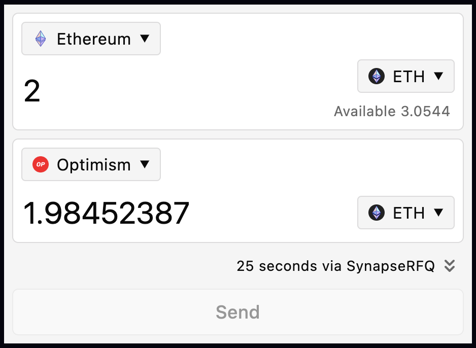
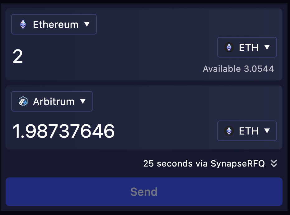
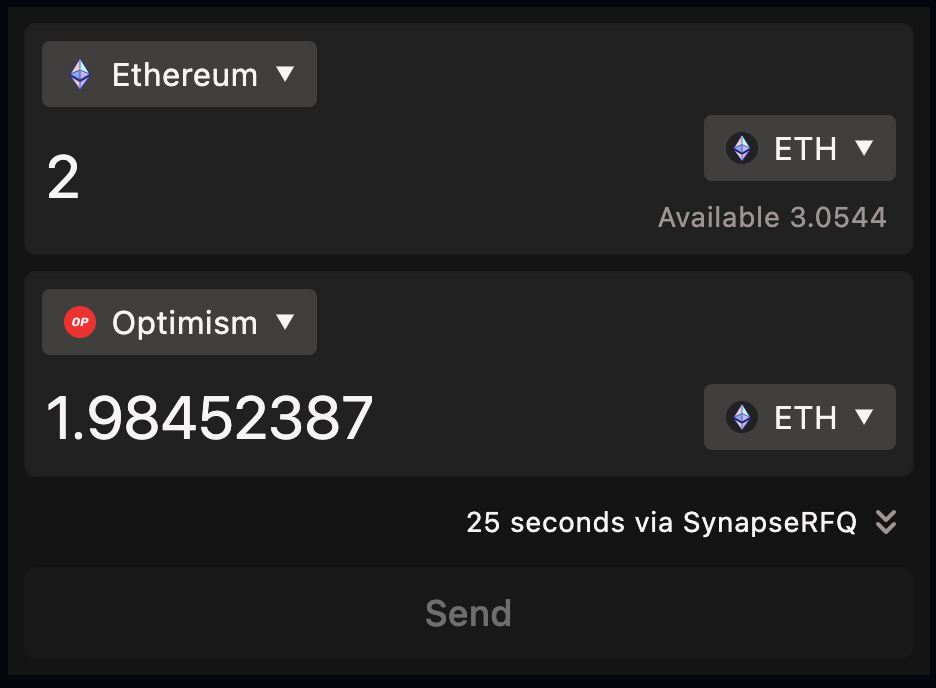
The widget is designed to be easily customized to match your app's theme. The widget accepts an optional customTheme configurable bgColor parameter for 'dark', 'light', and custom color modes:
`tsx`
Additionally, the widget supports more complex custom themes with the customTheme property. This allows for more fine-grained control over the widget's colors and fonts.
`tsx
const customTheme = {
// Generate from base color, 'dark', or 'light'
bgColor: '#08153a',
// Basic customization
'--synapse-text': 'white',
'--synapse-secondary': '#ffffffb3',
'--synapse-root': '#16182e',
'--synapse-surface': 'linear-gradient(90deg, #1e223de6, #262b47e6)',
'--synapse-border': 'transparent',
// Full customization (Uses based colors by default)
'--synapse-focus': 'var(--synapse-secondary)',
'--synapse-select-bg': 'var(--synapse-root)',
'--synapse-select-text': 'var(--synapse-text)',
'--synapse-select-border': 'var(--synapse-border)',
'--synapse-button-bg': 'var(--synapse-surface)',
'--synapse-button-text': 'var(--synapse-text)',
'--synapse-button-border': 'var(--synapse-border)',
// Transaction progress colors (set bgColor to auto-generate)
'--synapse-progress': 'hsl(265deg 100% 65%)',
'--synapse-progress-flash': 'hsl(215deg 100% 65%)',
'--synapse-progress-success': 'hsl(120deg 100% 30%)',
'--synapse-progress-error': 'hsl(15deg 100% 65%)',
}
customTheme={customTheme}
/>
`
Please see the examples/landing-page folder for more examples.
Container Customization
The widget additionally supports a container property of true or false to adjust its width to the container it's in.
`tsx`
Example Apps
Within the repository's /examples folder, there are three example apps. The landing-page folder contains a fully functional demo with customizations of the widget. The with-react and with-next` folders contain a simple implementation of the widget using React and Next.js, respectively.