@vincent-hyu-uit/react-native-stack-carousel
v0.1.16TypeScript
React native stack carousel
0/weekUpdated 1 months agoMITUnpacked: 37.3 KB
Published by vincent
npm install @vincent-hyu-uit/react-native-stack-carousel@vincent-hyu-uit/react-native-stack-carousel
A beautiful, performant stack carousel component for React Native with smooth animations and gesture support. Perfect for displaying images or custom content in a stacked card layout.
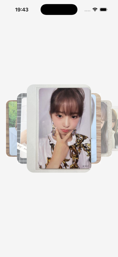
Demo


Features
- 🎨 Stacked card layout - Cards stack behind each other with progressive scaling
- 🎯 Smooth gestures - Swipe left/right to navigate between items
- ⚡ High performance - Built with react-native-reanimated for 60fps animations
- 🎨 Customizable - Customize card size, spacing, scale, and overlay opacity
- 📱 TypeScript support - Full TypeScript definitions included
- 🔄 Render props - Flexible rendering with custom components
Installation
``sh`
npm install @vincent-hyu-uit/react-native-stack-carousel
$3
This library requires the following peer dependencies:
`sh`
npm install react-native-gesture-handler react-native-reanimated
$3
Add the Reanimated plugin to your babel.config.js:
`js`
module.exports = {
presets: ['module:@react-native/babel-preset'],
plugins: ['react-native-reanimated/plugin'],
};
$3
No additional setup required for Android.
Usage
$3
`tsx
import React from 'react';
import { Image, StyleSheet, View } from 'react-native';
import { StackCarousel } from '@vincent-hyu-uit/react-native-stack-carousel';
const IMAGES = [
'https://picsum.photos/id/1/400/600',
'https://picsum.photos/id/2/400/600',
'https://picsum.photos/id/3/400/600',
];
export default function App() {
return (
renderItem={({ item }) => (
)}
/>
);
}
const styles = StyleSheet.create({
container: {
flex: 1,
alignItems: 'center',
justifyContent: 'center',
},
card: {
width: 220,
height: 300,
borderRadius: 24,
},
});
`
$3
`tsx`
renderItem={({ item, index }) => (
)}
cardWidth={250}
cardHeight={350}
cardOffsetRatio={0.25}
/>
API Reference
$3
Main component for rendering the stack carousel.
#### Props
| Prop | Type | Default | Description |
|------|------|---------|-------------|
| data | T[] | required | Array of data items to render |renderItem
| | (info: RenderItemInfo | required | Function to render each item |cardWidth
| | number | 220 | Width of each card in pixels |cardHeight
| | number | 300 | Height of each card in pixels |cardOffsetRatio
| | number | 0.25 | Offset between stacked cards as a ratio of cardWidth (0-1) |scaleSide
| | number | 0.8 | Scale multiplier for side cards. Each card behind is scaleSide times smaller |opacitySide
| | number | 0.4 | Overlay opacity for inactive cards (0-1) |containerStyle
| | ViewStyle | - | Custom style for the container |cardStyle
| | ViewStyle | - | Custom style for each card wrapper |
$3
Information passed to the renderItem function.
`tsx`
type RenderItemInfo
item: T; // The current item from the data array
index: number; // The index of the current item
};
Examples
$3
`tsx`
renderItem={({ item }) =>
cardWidth={280}
cardHeight={400}
/>
$3
`tsx`
renderItem={({ item }) =>
cardOffsetRatio={0.2} // Closer together
// or
cardOffsetRatio={0.4} // Further apart
/>
$3
`tsx`
renderItem={({ item }) =>
scaleSide={0.85} // Less dramatic scaling
// or
scaleSide={0.7} // More dramatic scaling
/>
$3
`tsx`
renderItem={({ item }) =>
opacitySide={0.2} // Lighter overlay
// or
opacitySide={0.6} // Darker overlay
/>
How It Works
The carousel uses a progressive scaling system where:
- The active card (front) has scale 1.0
- Each card behind is scaled by (default 0.8)scaleSide = 0.8`: Card 1 = 1.0, Card 2 = 0.8, Card 3 = 0.64, Card 4 = 0.512, etc.
- So if
Cards also have an overlay that fades in as they move away from the active position, creating a depth effect.
Future Updates
This library is actively being developed. Planned features include:
- More customization options
- Additional animation effects
- Performance optimizations
- Enhanced gesture controls
Contributing
Contributions are welcome! Please feel free to submit a Pull Request.
License
MIT
---
Made with ❤️ by vincent-hyu-uit