A directive used for picking number by using up/down button, instead of typing
npm install angular-number-picker![][bower-url]
[![NPM version][npm-image]][npm-url]
![][david-url]
![][dt-url]
![][license-url]
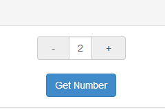
A directive used for picking number by using -/+ button, instead of typing the number directly.
This is an angular directive designed in mobile-first concept. Which means you would have better user experience while in mobile development.
> While running on mobile device, you would increase/decrease the number continuously by long tap the -/+ button.
Try it: plunker
- angularjs (1.4.3+)
- bootstrap (3.3.5+)
``JavaScript`
bower install angular-number-picker --save
`JavaScript`
npm install angular-number-picker --save
`html`
`javascript`
import {ngNumberPicker} from 'angular-number-picker';
`javascript`
var ngNumberPicker = require('angular-number-picker').ngNumberPicker;
`html`
Add ngNumberPicker module as your angular app's dependency
`javascript`
var demo = angular.module('demo', [ngNumberPicker]);
>ngNumberPicker is the variable you get from above "Import" stage
Use h-number tag in your html
`HTML`
You can use transclusion, too
`HTML`
Writing DemoController
`javascript
demo.controller('DemoController', ['$scope', function($scope) {
$scope.input = {
num: 0
};
$scope.getNumber = function() {
alert('The number is: [' + $scope.input.num + ']');
};
$scope.onChange = function(){
console.log('The number is Changed ', $scope.input.num);
};
}]);
`
configuration ##| Attribute | Type | Required | Description |
| :------------- |:-------------| :-----:| :-----|
| value | [expression] | Yes | Expression to evaluate as the input number |
| min | Number | No | The minimal point to limit the operation. 0 by default |
| max | Number | No | The maximum point to limit the operation. 100 by default |
| step | Number | No | The step value for the operation. 1 by default|
| singular | String | No | Label to be included after value when value is 1|
| plural | String | No | Label to be included after value when value is not 1|
| unit-position | String | No | where to place the singular/plural. Available options: left, right. right by default. |
| change | Function | No | Function to be called while number is changed|
The wrapper class for the h-number element
The wrapper class for +- operator
The wrapper class for the number area at the center
The active class will be added to the input-group-addon button, while touching them. So it's possible to implement your own behavior.
The picker-unit-left class will be added to the left unit span
The picker-unit-right class will be added to the right unit span
> It's easy to implement those classes to achieve your own UI
`bash`
npm install
`bash`
bower install
Shell
npm start
``>I will launch a debug server at http://localhost:8000/
[expression]: https://docs.angularjs.org/guide/expression
[bower-url]: https://img.shields.io/bower/v/angular-number-picker.svg
[npm-url]: https://npmjs.org/package/angular-number-picker
[npm-image]: https://badge.fury.io/js/angular-number-picker.png
[david-url]: https://david-dm.org/leftstick/angular-number-picker.png
[dt-url]:https://img.shields.io/npm/dt/angular-number-picker.svg
[license-url]:https://img.shields.io/npm/l/angular-number-picker.svg