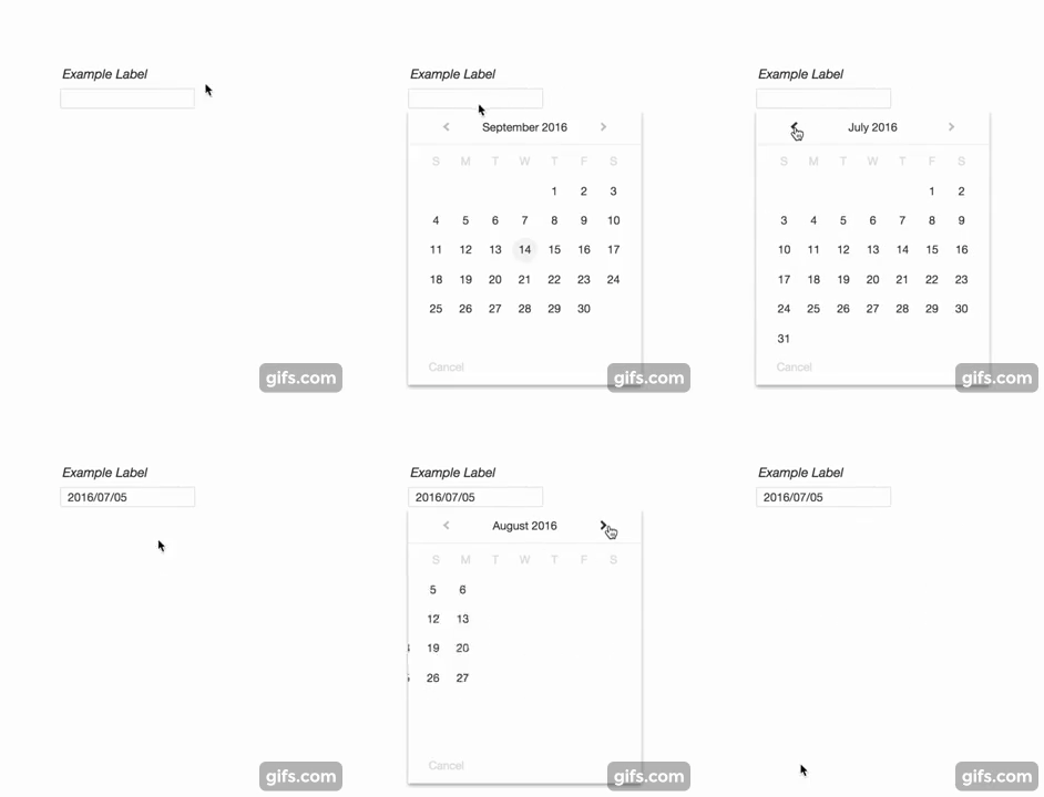
[](https://www.npmjs.org/package/angular8-material-datepicker) [](https://travis-ci.org/koleary94
npm install angular8-mat-datepicker

Fork of a minimalist datepicker library for Angular by koleary94. As it seems development has stopped progressing and it is a solid base
for a simple calendar module.
Will attempt to resolve a few of the bigger open issues currently in the main repo

npm install --save angular8-mat-datepicker
$3
Please note I will be deprecating....
In favor of
It works better for the framework and encourages less bad patterns.$3
Import the Datepicker Module and add it to the of your module
`
import { DatepickerModule } from 'angular8-mat-datepicker'@NgModule({
  imports: [ DatepickerModule ],
  declarations: [ ... ],
  bootstrap: [ ... ]
})
export class YourModule { }
If you already have a module of the same name, you can create an alias
import { DatepickerModule as YourAlias } from 'angular8-mat-datepicker'
Call the component from within a template
and you're set!$3
The datepicker component can be called with no arguments. See the Angular 2 Documentation for how to communicate with child components. If you use an event emitter, the datepicker component has an emitter called (when the date is picked), and dateChange (for two-way binding).Optional parameters are listed below.
| Parameter | Type | Description |
|---|---|---|
|
accentColor | string | Replaces the default blue accent color |
|altInputStyle | boolean | If true, changes the input styling to primarily use the accent color |
| date | Date | The source of truth for the selected date. If passed, the date will automatically be displayed in the input field and clicking on the input field will bring up the respective month. |
| dateFormat | string or function | By default, the date will be shown in YYYY-MM-DD (ISO 8601 standard). Other formats include MM-DD-YYYY and DD-MM-YYYY. If you pass in a string, it is not case sensitive. You can also pass in a function to create the string yourself, which must be of the type (date: Date): string. |
|disabled | boolean | If true, adds "disabled" attribute to input |
| fontFamily | string | By default, the element will use 'Helvetica Neue', 'Helvetica', 'Arial', 'Calibri', 'Roboto' in that order. Passing in this value will override these defaults.|
|placeholder | string | This text will be shown if the date is empty |
| rangeStart | Date | The beginning boundary for selecting a date. For example, passing in new Date(2015,2) will prevent the user from being able to get to February 2015. |
| rangeEnd | Date | Same as rangeStart, but for the end boundary. e.g. passing in new Date() will prevent the user from being able to get to the next month. |
| cancelText | string | default is Cancel can be changed to the text you desire. |
| weekStart | number | default is 0 witch is Sunday, Monday is 1` and so on |