bonree-cascader
v1.3.0TypeScript
cascade select ui component for react
0/weekUpdated 2 weeks agoMITUnpacked: 128.3 KB
Published by afc163@gmail.com
rc-cascader
React Cascader Component
[![NPM version][npm-image]][npm-url]  [![build status][github-actions-image]][github-actions-url] [![Test coverage][codecov-image]][codecov-url]   [![npm download][download-image]][download-url]
[npm-image]: http://img.shields.io/npm/v/rc-cascader.svg?style=flat-square
[npm-url]: http://npmjs.org/package/rc-cascader
[github-actions-image]: https://github.com/react-component/cascader/workflows/CI/badge.svg
[github-actions-url]: https://github.com/react-component/cascader/actions
[codecov-image]: https://img.shields.io/codecov/c/github/react-component/cascader/master.svg?style=flat-square
[codecov-url]: https://codecov.io/gh/react-component/cascader/branch/master
[download-image]: https://img.shields.io/npm/dm/rc-cascader.svg?style=flat-square
[download-url]: https://npmjs.org/package/rc-cascader
Browser Support
|!IE | !Chrome | !Firefox | !Opera | !Safari|
| --- | --- | --- | --- | --- |
| IE 8+ ✔ | Chrome 31.0+ ✔ | Firefox 31.0+ ✔ | Opera 30.0+ ✔ | Safari 7.0+ ✔ |
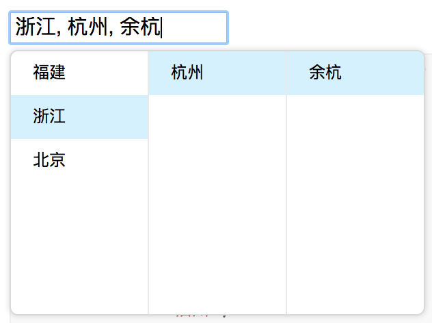
Screenshots
Example
http://react-component.github.io/cascader/
Install

``
bash

$ npm install rc-cascader --save
`
Usage
`js
import React from 'react';
import Cascader from 'rc-cascader';
const options = [{
'label': '福建',
'value': 'fj',
'children': [{
'label': '福州',
'value': 'fuzhou',
'children': [{
'label': '马尾',
'value': 'mawei',
}],
}, {
'label': '泉州',
'value': 'quanzhou',
}],
}, {
'label': '浙江',
'value': 'zj',
'children': [{
'label': '杭州',
'value': 'hangzhou',
'children': [{
'label': '余杭',
'value': 'yuhang',
}],
}],
}, {
'label': '北京',
'value': 'bj',
'children': [{
'label': '朝阳区',
'value': 'chaoyang',
}, {
'label': '海淀区',
'value': 'haidian',
}],
}];
React.render(
...
, container);
`
API


$3


    name

    type

    default

    description


      options

      Object


      The data options of cascade


      value

      Array


      selected value


      defaultValue

      Array


      initial selected value


      onChange

      Function(value, selectedOptions)


      callback when finishing cascader select


      changeOnSelect

      Boolean

      false

      change value on each selection


      loadData

      Function(selectedOptions)


      callback when click any option, use for loading more options


      expandTrigger

      String

      'click'

      expand current item when click or hover


      open

      Boolean


      visibility of popup overlay


      onDropdownVisibleChange

      Function(visible)


      callback when popup overlay's visibility changed


      transitionName

      String


      transition className like "slide-up"


      prefixCls

      String

      rc-cascader

      prefix className of popup overlay


      dropdownClassName

      String


      additional className of popup overlay


      popupPlacement

      String

      bottomLeft

      use preset popup align config from builtinPlacements:bottomRight topRight bottomLeft topLeft


      getPopupContainer

      function(trigger:Node):Node

      () => document.body

      container which popup select menu rendered into


      dropdownMenuColumnStyle

      Object


      style object for each cascader pop menu


      fieldNames

      Object

      { label: 'label', value: 'value', children: 'children' }

      custom field name for label and value and children


      expandIcon

      ReactNode

      >

      specific the default expand icon


      loadingIcon

      ReactNode

      >

      specific the default loading icon


      hidePopupOnSelect

      Boolean

      >true

      hide popup on select


      virtual

      Boolean | { height?: number, itemHeight?: number }

      false

      Enable virtual scrolling for better performance with large datasets. Can be a boolean or config object with height (default: 180) and itemHeight (default: 32)


$3


    name

    type

    default

    description


      label

      String


      option text to display


      value

      String


      option value as react key


      disabled

      Boolean


      disabled option


      children

      Array


      children options


Development
`bash
$ npm install
$ npm start
`
Test Case
`bash
$ npm test
`
Coverage
`bash
$ npm run coverage
``
License
rc-cascader is released under the MIT license.