npm install circle-progress.vueHi!
Highly customizable & lightweight & responsive circular progressbar component for Vue 3, built with SVG and extensively customizable.
``
npm install --save circle-progress.vueAdding into app
`
import { CircleProgressBar } from 'circle-progress.vue';
`
Please write me, if you need more props :)
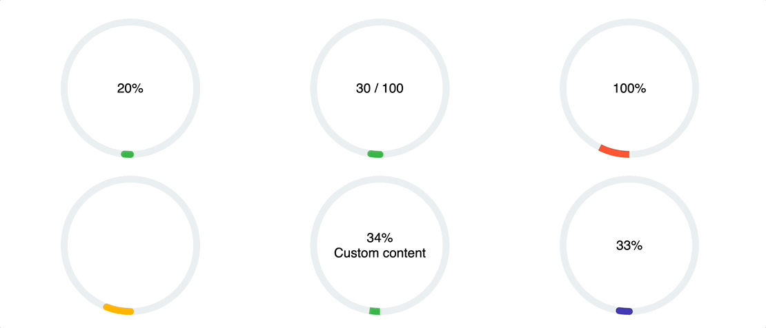
You can customize your progress bars as you want. For example:
| Props | Type | Description | Default |
|-------------------|------------------|--------------------------------------------------------------------------|----------------|
| max* | Number | Max value | - (required) |Number
| value* | | Current value | - (required) |Number, String
| size | | Size of the circle | '124' |String
| colorFilled | | Circle color if limit exceed | '#FF5533' |String
| colorUnfilled | | Circle color if limit not exceed | '#3BB44A' |String
| colorBack | | Back circle color | '#ECEEF1' |BooleaN
| percentage | | Show percentage | false |BooleaN
| rounded | | Rounding the circle line | false |String
| animationDuration | | Animation Duration | '0.5s' |String
| strokeWidth | | Circle Stroke width | '5px' |String
| strokeWidthUnfilled | | Unfilled circle stroke width (if not provided, uses strokeWidth) | '20px' |Boolean
| reversedFilling | | Enable reversed filling | false |Number
| startAngle | | Allowing to specify an angle in degrees where the fill should begin | 180 |
Also you can use slots to throw your custom content. For example:
`
:max="80"
percentage
rounded>
{{ value }} / {{ max }}
If you find this component helpful, consider supporting its development! ☕

Your support helps keep this project alive and continuously improved! 🚀