custom-cursor-react
v1.0.5
Interactive and customizable cursor component for React
reactcursorreact custom cursorreact cursorreact interactive cursorcustom cursorinteractive cursoranimated cursor
0/weekUpdated 3 years agoMITUnpacked: 58.8 KB
Published by ajmnz
npm install custom-cursor-reactReact Custom Cursor 🎉
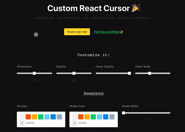
Animated, customizable and interactive cursor for React


Installation
``
$ npm install custom-cursor-react
Try it!
Live DemoUsage
Import the component and stylesjavascript
import CustomCursor from 'custom-cursor-react';
import 'custom-cursor-react/dist/index.css';
`Include it in your App
jsx
const App = () => (
customClass='custom-cursor'
dimensions={30}
fill='#FFF'
smoothness={{
movement: 0.2,
scale: 0.1,
opacity: 0.2,
}}
targetOpacity={0.5}
/>
);
`Available properties
All of them are optional.
> Don't forget the dot (
) when setting the targets.
| Property            | Type             | Description                                                                       | Default       |
|---------------------|------------------|-----------------------------------------------------------------------------------|---------------|
|
targets | string or array | CSS selectors of the elements you want your cursor to interact with when hovered. | undefined |
| customClass | string | Custom class of the circle element. | cursor-circle |
| dimensions | number | Width and height of the circle | 50 |
| fill | string | Hex code of the cursor's color | #000 |
| strokeColor | string | Hex code of the cursor's stroke color | #000 |
| strokeWidth | number | Stroke width of the cursor | 0 |
| smoothness | number or object | Global smoothness or specific value for scale, opacity or movement. | 0.2 (Global) |
| opacity | number | Opacity of the cursor | 0.5 |
| targetOpacity | number | Opacity of the cursor when hovering the targets | 1 |
| targetScale | number | Scale of the cursor when hovering the targets` | 4 |> This component is a refactor of a project by Mary Low available here.