expo-m3-progress
v0.1.0TypeScript
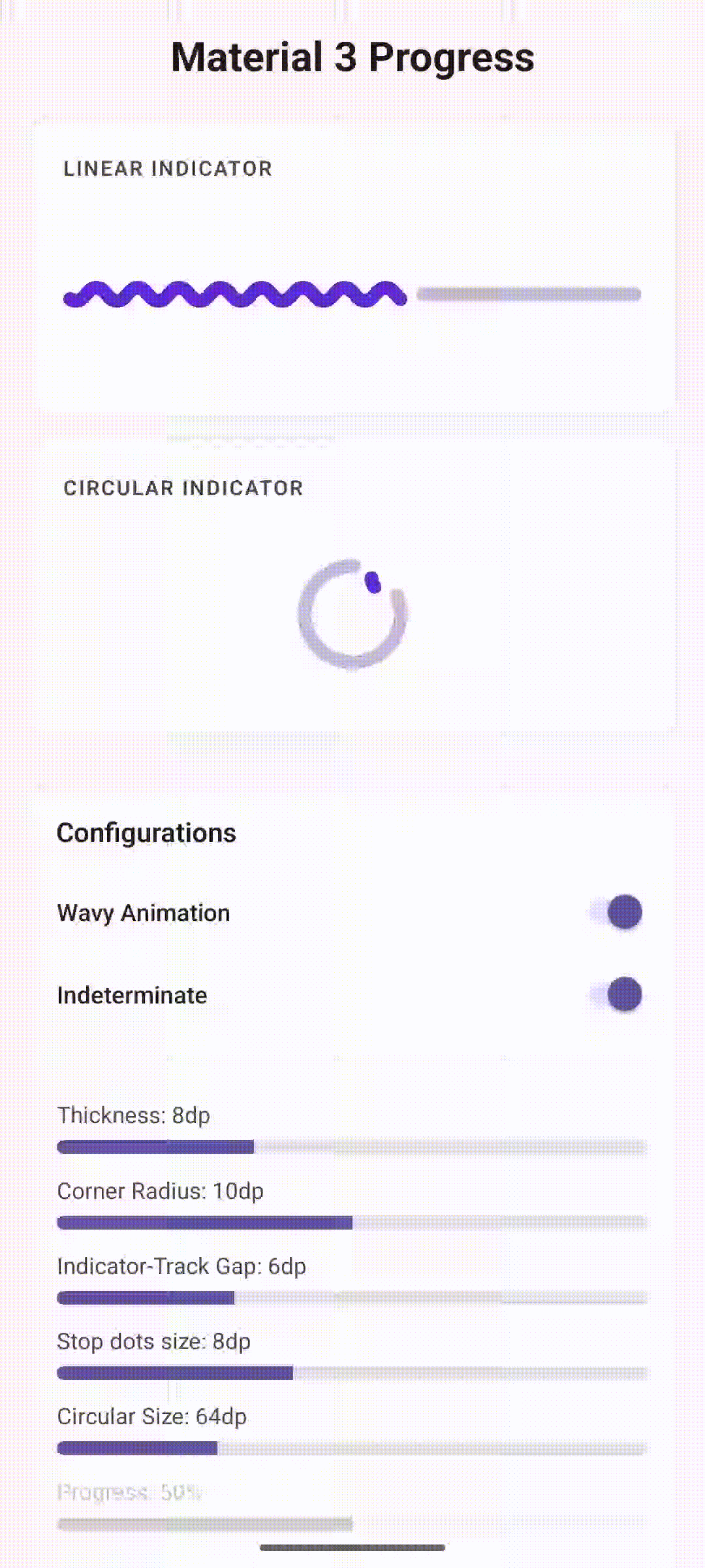
Material You Expressive Progress Indicators
0/weekUpdated 1 months agoMITUnpacked: 39.6 KB
Published by Franko Prifti
npm install expo-m3-progressexpo-m3-progress
Material 3 Expressive Progress Indicators for Expo and React Native.
This library provides highly customizable progress indicators following the Material 3 Expressive design system, including wavy animations on Android.
Features
- ✨ Material 3 Expressive: Implements the latest Material Design progress indicator specs.
- 🌊 Wavy Animation: Smooth, configurable wavy motion (Android native).
- 🎨 Highly Customizable: Control colors, thickness, corner radius, gaps, and stop indicators.
- 📱 Native Performance: Built with Expo Modules for optimal performance.
- 🔄 Indeterminate & Determinate: Supports both modes.
Installation
``bash`
npx expo install expo-m3-progress
Usage
$3
`tsx
import { ExpoM3ProgressView } from 'expo-m3-progress';
// Linear Progress
indeterminate={true}
indicatorColor="#6750A4"
trackColor="#E7E0EB"
style={{ width: '100%', height: 16 }}
/>
// Circular Progress
progress={0.5}
indeterminate={false}
indicatorSize={48}
style={{ width: 48, height: 48 }}
/>
`
$3
The wavy animation is a unique feature of the Material 3 expressive indicators on Android.
`tsx`
wavy={true}
waveAmplitude={4}
wavelength={24}
waveSpeed={2}
indicatorTrackGap={4}
trackStopIndicatorSize={4}
style={{ width: '100%', height: 20 }}
/>
Props
| Prop | Type | Default | Description |
| :--- | :--- | :--- | :--- |
| variant | 'linear' \| 'circular' | 'circular' | The style of the progress indicator. |indeterminate
| | boolean | true | Whether the progress is indeterminate. |progress
| | number | 0 | The progress value (0 to 1). Only used when indeterminate is false. |indicatorColor
| | string | - | Color of the active indicator. |trackColor
| | string | - | Color of the progress track. |trackThickness
| | number | 4 | Thickness of the track and indicator. |trackCornerRadius
| | number | thickness / 2 | Corner radius of the track ends. |indicatorTrackGap
| | number | 4 | Gap between the indicator and the track. |
$3
| Prop | Type | Default | Description |
| :--- | :--- | :--- | :--- |
| indicatorSize | number | 48 | The diameter of the circular indicator. |
$3
| Prop | Type | Default | Description |
| :--- | :--- | :--- | :--- |
| trackStopIndicatorSize | number | thickness | Size of the dot at the end of the track. |
$3
| Prop | Type | Default | Description |
| :--- | :--- | :--- | :--- |
| wavy | boolean | false | Enable wavy animation. |waveAmplitude
| | number | 0 | Height of the waves. |wavelength
| | number | 0 | Distance between wave peaks. |waveSpeed
| | number | 0 | Speed of the wave animation. |
Platform Support
- ✅ Android: Full support including Material 3 Expressive and Wavy animations.
- ⚠️ iOS: Currently maps to standard ActivityIndicator (wavy and expressive M3 props are ignored).null`).
- ⚠️ Web: Not currently supported (returns
License
MIT