hamburger-menu
v0.7.1
☰ A responsive CSS solution for a hamburger menu ☰
0/weekUpdated 2 weeks agoMITUnpacked: 20.4 KB
Published by Center Key
npm install hamburger-menu☰ HamburgerMenu ☰
_A responsive CSS solution_


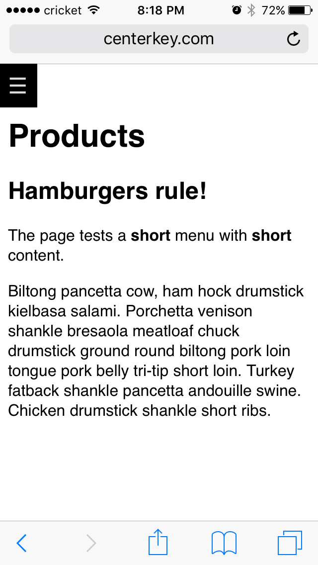
Hamburger button menus should be used with caution as they can impair user interaction.
As they say, "Out of sight, out of mind".
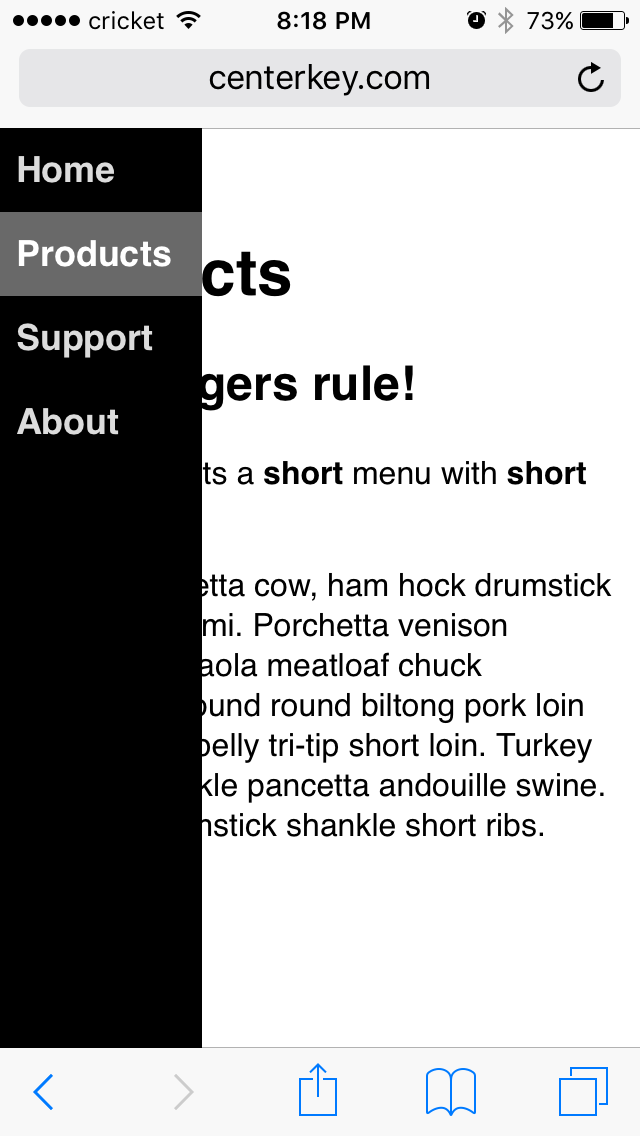
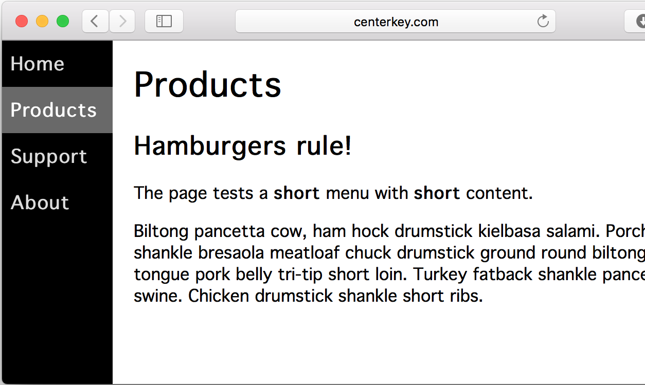
When you do need a hamburger button menu, this solution uses CSS to replace the navigation menu
with a tappable hamburger icon on mobile devices or any browser with a sufficiently narrow screen.
Tapping the hamburger reveals the navigation menu with smooth CSS animation.
A) Try It Out
Interactive example:
https://hamburger-menu.js.org
B) Setup
Include the HamburgerMenu CSS and JavaScript:
``
html
...

...

...
`
...or from the jsDelivr CDN:
html
...

...

...
`...the HamburgerMenu files can be installed using npm:
terminal
$ npm install hamburger-menu
`C) Usage
See the
x3000.html
test page for an example or follow the instructions below.Insert the following HTML into your web page and modify the menu items (
) as appropriate
for your website:
`html
`D) Customize
Change the width and colors by adding the CSS below into your website and modifying it:
css
/ HamburgerMenu ☰ Custom width and colors /
body {
   padding-right: 50px;         / gutter on left and right sides of page /
   padding-left: 200px;         / set to "padding-right" + "width"(aside) /
   }
nav.hamburger-menu aside {
   width: 150px;                / menu width /
   }
nav.hamburger-menu {
   color: gainsboro;            / menu font color /
   background-color: teal;      / menu background color /
   }
nav.hamburger-menu aside menu li.current {
   border-color: white;         / border color for selected menu item /
   }
nav.hamburger-menu aside menu li.current >span,
nav.hamburger-menu aside menu li.current >a,
nav.hamburger-menu aside menu li >span:hover,
nav.hamburger-menu aside menu li >a:hover {
   color: white;                / menu font highlight color /
   background-color: darkcyan;  / menu background highlight color /
   }
`E) Highlight Menu Item for Current Page
HamburgerMenu automatically highlights the selected menu item.Turn off automatic highlighting by either:
1. Not loading the
 file
1. Adding the class
disable-auto-highlight to the