json-diff-viewer-component
v0.6.1
Vanilla JS web component for side-by-side JSON diff visualization
0/weekUpdated 4 days agoMITUnpacked: 24.1 KB
Published by metaory
npm install json-diff-viewer-component
json-diff-viewer
Compare JSON side-by-side, visually
A zero-dependency web component for visualizing JSON differences
with synchronized scrolling, collapsible nodes, and syntax highlighting
metaory.github.io/json-diff-viewer-component
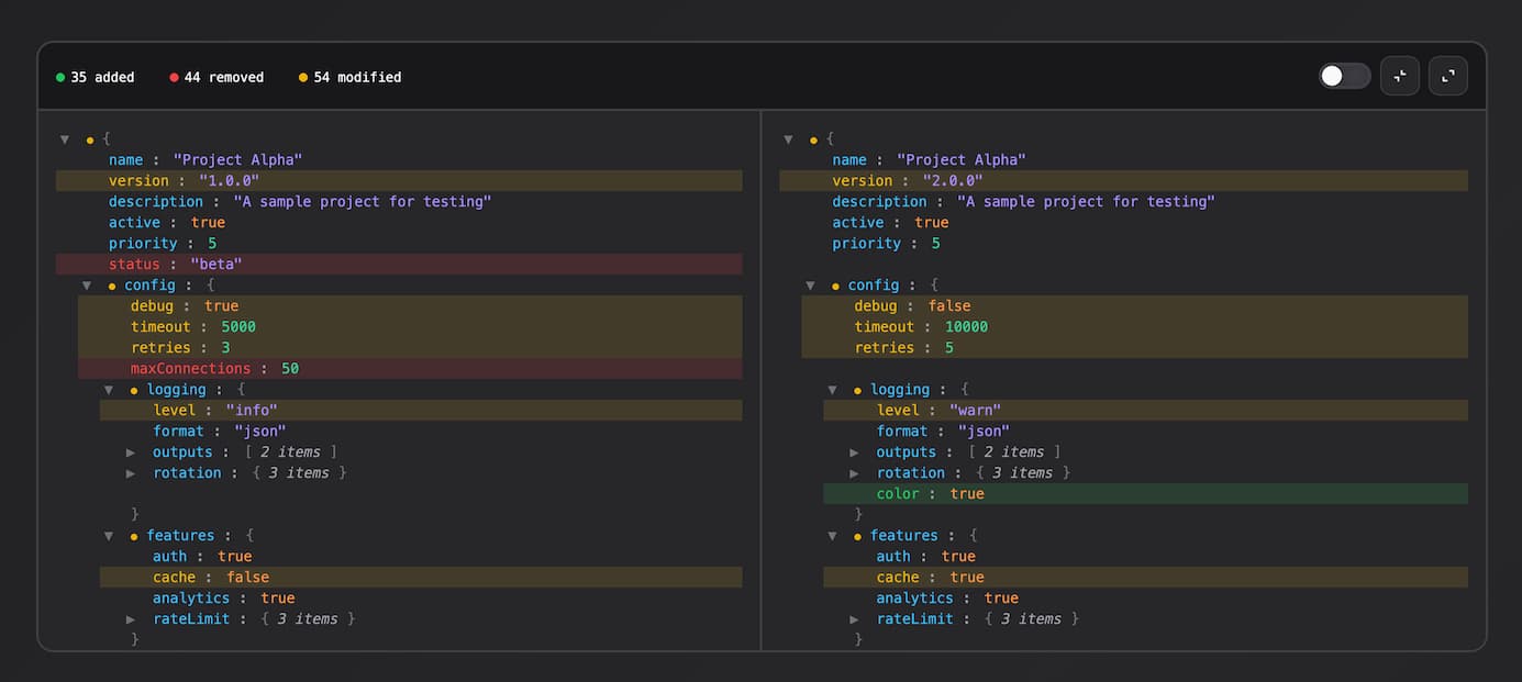
Features
- Deep nested JSON comparison
- Side-by-side synchronized scrolling
- Collapsible nodes (synced between panels)
- Diff indicators bubble up to parent nodes
- Stats summary (added/removed/modified)
- Show only changed filter toggle
- Syntax highlighting
- Zero dependencies
- Shadow DOM encapsulation
Install
``bash`
npm i json-diff-viewer-component
Usage
$3
`js
import "json-diff-viewer-component";
const viewer = document.querySelector("json-diff-viewer");
viewer.setData(leftObj, rightObj);
`
$3
`html`
right='{"name":"bar"}'
>
$3
`js`
viewer.left = { name: "foo" };
viewer.right = { name: "bar" };
$3
`js`
viewer.setData(leftObj, rightObj);
Framework Examples
$3
`jsx
import { useEffect, useRef } from "react";
import "json-diff-viewer-component";
function DiffViewer({ left, right }) {
const viewerRef = useRef(null);
useEffect(() => {
if (viewerRef.current) {
viewerRef.current.setData(left, right);
}
}, [left, right]);
return
}
`
$3
`vue
`
Diff Types
| Type | Color | Description |
| -------- | ------ | ------------------------ |
| Added | Green | Key exists only in right |
| Removed | Red | Key exists only in left |
| Modified | Yellow | Value changed |
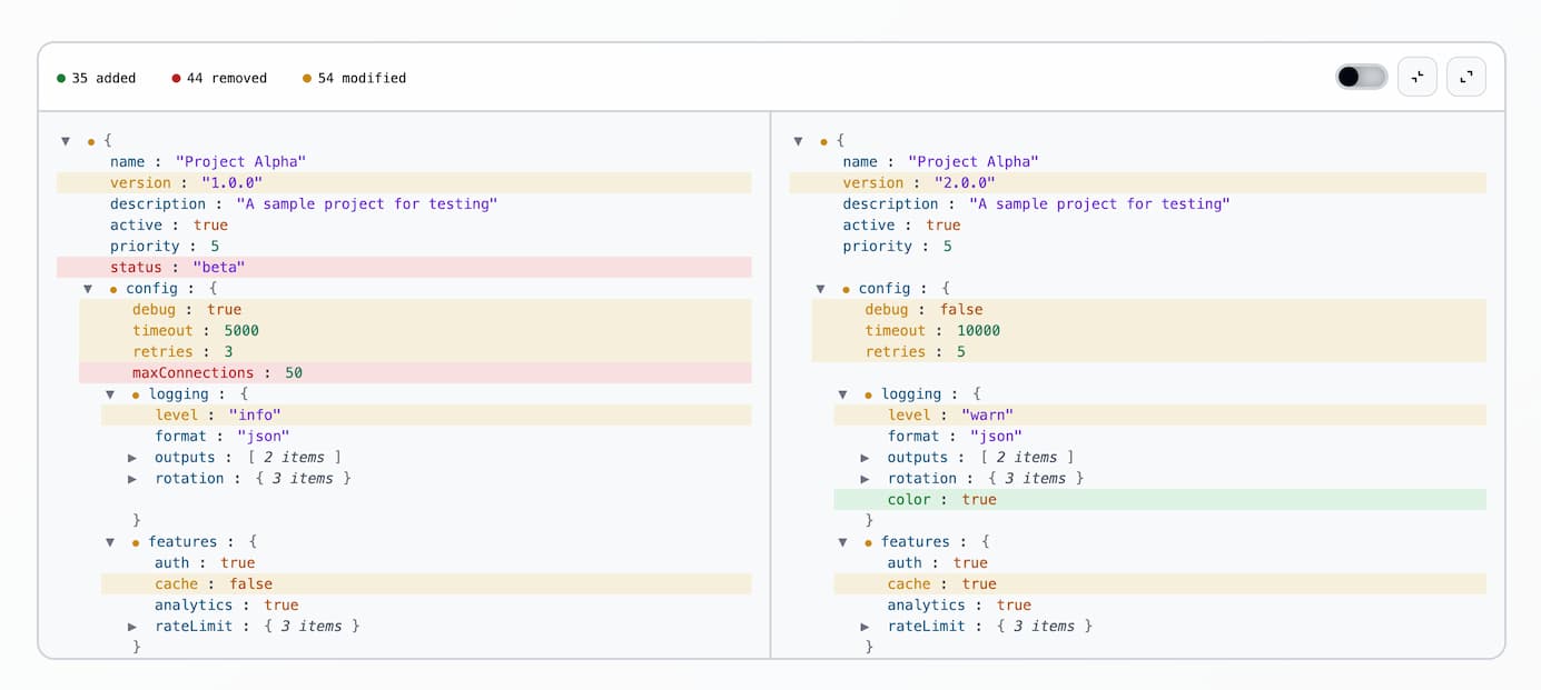
Styling
Customize the component by overriding CSS custom properties (design tokens) on the json-diff-viewer element. All tokens are defined on :host and can be overridden from outside the shadow DOM.
$3
`css
json-diff-viewer {
/ Diff colors /
--add: #22c55e; / Added items /
--rem: #ef4444; / Removed items /
--mod: #eab308; / Modified items /
/ Backgrounds /
--bg: #18181b; / Main background /
--bg2: #27272a; / Panel background /
/ Borders /
--bdr: #3f3f46; / Border color /
/ Text /
--txt: #fafafa; / Primary text /
--dim: #a1a1aa; / Dimmed/secondary text /
/ Controls /
--slider: var(--bdr); / Slider toggle active color /
/ Syntax highlighting /
--key: #38bdf8; / Object keys /
--str: #a78bfa; / String values /
--num: #34d399; / Number values /
--bool: #fb923c; / Boolean values /
--nul: #f472b6; / Null values /
--br: #71717a; / Brackets and braces /
}
`
Create your own theme by overriding these tokens. For example, a light theme:
`css`
json-diff-viewer {
--bg: #fafafa;
--bg2: #ffffff;
--bdr: #e4e4e7;
--txt: #18181b;
--dim: #71717a;
--key: #0284c7;
--str: #7c3aed;
--num: #059669;
/ ... override other tokens as needed /
}
$3
The component requires a defined height to enable scrolling. Without a height, the component will expand to fit all content.
`css`
json-diff-viewer {
height: 600px;
border-radius: 16px;
}
For full-height layouts, use flexbox:
`css
.container {
display: flex;
flex-direction: column;
height: 100vh;
}
json-diff-viewer {
flex: 1;
min-height: 0;
}
`
Dev
`bash``
npm run dev # start dev server
npm run build # build for production