ng-clock-picker-lib-voova
v1.3.0TypeScript
This is a customize version from the original https://jedrzejiwanicki.github.io/ng-clockpicker, Original function will not work the same
0/weekUpdated 3 years agoMITUnpacked: 1.3 MB
Published by parinya.k
npm install ng-clock-picker-lib-voova

Notice !!
This is a custom version to use it on my own.
Install
npm i ng-clock-picker-lib-voova --save
Usage
- Please use it as "By injecting service straight into component" you can see in the bottom of this README file
- Normal behavior from original will not work
#### By injecting service straight into component:
``typescript
import { Component, ViewContainerRef } from '@angular/core';
import { ClockPickerDialogService, ClockPickerConfig } from 'ng-clock-picker-lib';
@Component({
selector: 'app-root',
templateUrl: './app.component.html',
styleUrls: ['./app.component.scss'],
})
export class AppComponent {
config: ClockPickerConfig = {
wrapperClassName: 'className',
closeOnOverlayClick: true
};
constructor(private vcr: ViewContainerRef, private clockPickerDialogService: ClockPickerDialogService) {}
ngOnInit(): void {
this.clockPickerDialogService.registerViewContainerRef(this.vcr);
}
showModal(): void {
this.clockPickerDialogService.showClockPickerDialog(this.config).subscribe((time: string) => console.log(time))
}
}
`
$3
- The option "is24" will not work on this repo
- The option "format" is "hour24" or "hour12" it will return data like "18.30" or "06.30" PM
`typescript`
export interface ClockPickerConfig {
wrapperClassName?: string;
buttonCancel?: string;
buttonConfirm?: string;
closeOnOverlayClick?: boolean;
initialValue?: string;
is24?: boolean;
format?: string
}
Original Docs
$3

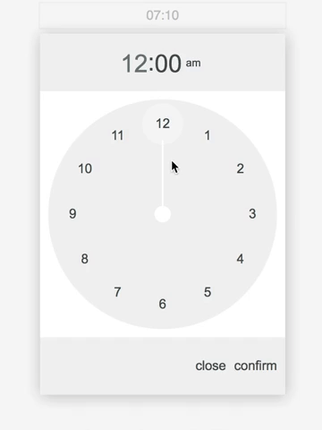
Demo
Install
npm i ng-clock-picker-lib --save
Usage
Add NgClockPickerLibModule to your module imports:
`typescript
import { BrowserModule } from '@angular/platform-browser';
import { NgModule } from '@angular/core';
import { NgClockPickerLibModule } from 'ng-clock-picker-lib';
import { AppComponent } from './app.component';
@NgModule({
declarations: [
AppComponent,
],
imports: [
BrowserModule,
NgClockPickerLibModule,
ReactiveFormsModule,
FormsModule,
],
providers: [],
bootstrap: [AppComponent]
})
export class AppModule { }
`
#### With reactive forms:
`angular2html`
#### With template driven forms:
`angular2html`
#### With event binding:
`angular2html`
#### By injecting service straight into component:
`typescript
import { Component, ViewContainerRef } from '@angular/core';
import { ClockPickerDialogService, ClockPickerConfig } from 'ng-clock-picker-lib';
@Component({
selector: 'app-root',
templateUrl: './app.component.html',
styleUrls: ['./app.component.scss'],
})
export class AppComponent {
config: ClockPickerConfig = {
wrapperClassName: 'className',
closeOnOverlayClick: true
};
constructor(private vcr: ViewContainerRef, private clockPickerDialogService: ClockPickerDialogService) {}
ngOnInit(): void {
this.clockPickerDialogService.registerViewContainerRef(this.vcr);
}
showModal(): void {
this.clockPickerDialogService.showClockPickerDialog(this.config).subscribe((time: string) => console.log(time))
}
}
`
$3
The option "is24" will not work on this repo
`typescript`
export interface ClockPickerConfig {
wrapperClassName?: string;
buttonCancel?: string;
buttonConfirm?: string;
closeOnOverlayClick?: boolean;
initialValue?: string;
is24?: boolean;
}
$3
Customize your clock picker styles by passing wrapperClassName to config object.
#### Examples:
`scss
.my-class-name .clock-picker__item-button--selected {
background-color: $color-primary;
color: $color-text-light;
}
.my-class-name .clock-picker__item-button--selected:hover {
background-color: $color-primary;
color: $color-text-light;
}
.my-class-name .clock-picker__clock-face .clock-picker__clock-face__tick {
stroke: $color-primary;
}
.my-class-name .clock-picker__clock-face .clock-picker__clock-face__center {
fill: $color-primary;
}
``