ngx-mat-input-tel
v21.0.0TypeScript
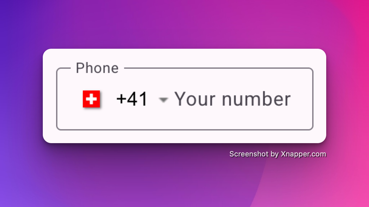
An Angular Material package for entering and validating international telephone numbers. It adds a flag dropdown to any input, detects the user's country, displays a relevant placeholder and provides formatting/validation methods.
angularmaterialng15ng16ngx-mat-intl-tel-inputintl-tel-inputng-intl-tel-inputphone numberphonevalidation
3.4K/weekUpdated 2 months agoMITUnpacked: 288.1 KB
Published by Raphaël Balet
npm install ngx-mat-input-telInternational Telephone Input for Angular Material (ngxMatInputTel)
An Angular Material package for entering and validating international telephone numbers. It adds a flag dropdown to any input, detects the user's country, displays a relevant placeholder and provides formatting/validation methods.

!NPM
!npm bundle size
!npm
Demo
- https://stackblitz.com/~/github.com/rbalet/ngx-mat-input-tel
Caution
This is a fork from the ngx-mat-intl-tel-input library whish is not maintained anymore.
Supports:
| Angular | ngx-mat-input-tel |
| ------- | ----------------- |
| >= 18 | >= 19.2.0 |
| >= 15 | < 19.2.0 |
- Validation with libphonenumber-js
Installation
$3
$ npm i ngx-mat-input-tel@latest
$3
$ npm i libphonenumber-js@latest
Usage
$3
Add NgxMatInputTelComponent to your component file:
``ts`
imports: [NgxMatInputTelComponent]
Example
Refer to main app in this repository for working example.
`html`
`html
`
If you want to show the sample number for the country selected or errors , use mat-hint anf mat-error as
`html`
Inputs
| Options | Type | Default | Description |
| ------------------ | ------------------------- | ---------------- | -------------------------------------------------------------------------------------------------------------- |
| ariaLabel | string | Select country | Aria label for the country selector button |off
| autocomplete | \| tel | off | For input autocompletion |string
| cssClass | | undefined | If input custom class are needed |Record
| countriesName | | COUNTRIES_NAME | For using different country names in the dropdown (Eg. Multilingual website) |CountryCode
| defaultCountry | | undefined | Default country code |boolean
| enablePlaceholder | | false | Input placeholder text, which adapts to the country selected. |boolean
| enableSearch | | false | Whether to display a search bar to help filter down the list of countries |string
| format | \\\\ | default | Format of "as you type" input. Possible values: national, international, default |boolean
| hideAreaCodes | | false | Hide the Area codes in the country dropdown selection |number
| maxLength | | 15 | max length of the input. |string[]
| onlyCountries | | [] | List of manually selected country abbreviations, which will appear in the dropdown. |string
| placeholder | | undefined | Placeholder for the input component. |string[]
| preferredCountries | | [] | List of country abbreviations, which will appear at the top. |boolean
| resetOnChange | | false | Reset input on country change |string
| searchPlaceholder | | Search ... | Placeholder for the search input |isPossible
| validation | \| isValid | isValid | Change the validation type |boolean
| separateDialCode | | false | Whether to separate the dial code from the input _Note: you'll have to manually add margin-left to your input_ |
Outputs
| Options | Type | Default | Description |
| -------------- | ----------------------- | ----------- | ----------------- |
| countryChanged | EventEmitter | undefined | On country change |
Css variable
| Name | Default | Explanation |
| -------------------------------------- | -------------- | ------------------------------------------------------------------------------------------------------- |
| --ngxMatInputTel-opacity | 0 | If you wish both, the country flag and the placeholder to be shown by default |--ngxMatInputTel-selector-opacity
| | 0 | If you wish the country flag to be shown by default |--ngxMatInputTel-placeholder-opacity
| | 0 | If you wish the placeholder flag to be shown by default |--ngxMatInputTel-flag-display
| | inline-block | If you wish to hide the country flag |--ngxMatInputTel-menu-flag-display
| | inline-block | If you wish to hide the country flag inside the menu only |--ngxMatInputTel-gap
| | 32px | If you wish to change the gap between the flag and the input field (Only works with separateDialCode) |
Validator
In case you had to manually remove the validator, the library exported it so you could add it back again.
| Name | Description | Example |
| ------------------------- | ----------------------------------------------- | ------------------------------------------------------ |
| ngxMatInputTelValidator | The actual phone validator used for the control | phoneControl.addValidators([ngxMatInputTlValidator]) |
Library Contributions
- Fork repo.
- Go to ./projects/ngx-mat-input-tel
- Update with new functionality.
- Update README.md
- Pull request.
$3
- Build lib: $ npm run build_lib
- Copy license and readme files:
- Create package:
- Build lib and create package:
$3
After building and creating package, you can use it locally too.
In your project run:
$ npm install --save {{path to your local '*.tgz' package file}}`
Authors and acknowledgment
- maintainer Raphaël Balet
- Forked from ngx-mat-intl-tel-input
$3
Contributions are welcome! See our contribution notes.


