pineapple-sass
v1.11.18
A must-have Sass mixin library for all your Sassy needs
0/weekUpdated 3 years agoMITUnpacked: 2.7 MB
Published by Arun Michael Dsouza
npm install pineapple-sass
pineapple-sass    
A must-have Sass mixin library for all your Sassy needs
http://arunmichaeldsouza.github.io/pineapple-sass/
* Easy to use
* Comprehensive list of mixins
* Forget about all those vendor prefixes
* Support for CSS3 animations, transforms and transitions
* Support for CSS3 filters
* Bundled with media query mixins
Installation
#### via bower
You can install the package using bower. Make sure you have bower installed, then run :
``html`
bower install pineapple-sass
#### via npm
`html`
npm install pineapple-sass
Or download the latest release.
Usage
The _pineapple-sass.scss build script is a Sass partial that can be included in your sass project. All pineapple sass mixins will be then readily avaialble for your use.
You can also use the individual mixin components present in the src folder -
* Animations component
* Backgrounds component
* Borders component
* Display component
* Filters component
* Fonts component
* Media Queries component
* Shadows component
* Text component
* Transforms component
* Utilities component
Mixins
$3
#### transition
> Add CSS transition to any element
Syntax
`html`
@include transition($transition...);
Example
`html
.element {
@include transition(opacity .2s ease-in);
}
Output CSS -
.element {
-webkit-transition: opacity 0.2s ease-in;
-moz-transition: opacity 0.2s ease-in;
-o-transition: opacity 0.2s ease-in;
-ms-transition: opacity 0.2s ease-in;
transition: opacity 0.2s ease-in;
}
`
#### animation
> Animate an element
Syntax
`html`
@include animation($animation...);
Example
`html
.element {
@include animation(test 3s infinte 2s);
}
Output CSS -
.element {
-webkit-animation: test 3s 2s infinte;
-moz-animation: test 3s 2s infinte;
-o-animation: test 3s 2s infinte;
animation: test 3s 2s infinte;
}
`
$3
#### backgroundOpacity
> Add opacity to a background color. Converts a HEX value into its rgba() equivalent

Syntax
`html`
@include backgroundOpacity($color, $opacity);
Example
`html
.element {
@include backgroundOpacity(#50a4e2, .5);
}
Output CSS -
.element {
background-color: rgba(80, 164, 226, 0.5);
}
`
#### backgroundSize
> Set background size for a background image

Syntax
`html`
@include backgroundSize($size);
Example
`html
.element1 {
@include backgroundSize(100%);
}
.element2 {
@include backgroundSize(cover);
}
Output CSS -
.element1 {
-webkit-background-size: 100% auto;
-moz-background-size: 100% auto;
-o-background-size: 100% auto;
background-size: 100% auto;
}
.element2 {
-webkit-background-size: cover;
-moz-background-size: cover;
-o-background-size: cover;
background-size: cover;
}
`
#### linearGradient
> Add a linear gradient to any element's background

Syntax
`html`
@include linearGradient($direction, $colors...);
Example
`html
.element {
@include linearGradient(left, #00a0e3 5%, #50a4e2, #0a6da7);
}
Output CSS -
.element {
background: -webkit-linear-gradient(left, #00a0e3 5%, #50a4e2, #0a6da7);
background: -moz-linear-gradient(left, #00a0e3 5%, #50a4e2, #0a6da7);
background: -o-linear-gradient(left, #00a0e3 5%, #50a4e2, #0a6da7);
background: linear-gradient(to right, #00a0e3 5%, #50a4e2, #0a6da7);
}
`
#### repeatingLinearGradient
> Add a repeating linear gradient to any element's background
Syntax
`html`
@include repeatingLinearGradient($direction, $colors...)
Example
`html
.element {
@include repeatingLinearGradient(left, #00a0e3, #50a4e2, #0a6da7);
}
Output CSS -
.element {
background: -webkit-repeating-linear-gradient(left, #00a0e3, #50a4e2, #0a6da7);
background: -moz-repeating-linear-gradient(left, #00a0e3, #50a4e2, #0a6da7);
background: -o-repeating-linear-gradient(left, #00a0e3, #50a4e2, #0a6da7);
background: repeating-linear-gradient(to right, #00a0e3, #50a4e2, #0a6da7);
}
`
#### radialGradient
> Add a radial gradient to any element's background

Syntax
`html`
@include radialGradient($gradientValues...);
Example
`html
.element {
@include radialGradient(#50a4e2, #0a6da7, #00a0e3);
}
Output CSS -
.element {
background: -webkit-radial-gradient(#50a4e2, #0a6da7, #00a0e3);
background: -o-radial-gradient(#50a4e2, #0a6da7, #00a0e3);
background: -moz-radial-gradient(#50a4e2, #0a6da7, #00a0e3);
background: radial-gradient(#50a4e2, #0a6da7, #00a0e3);
}
`
#### repeatingRadialGradient
> Add a repeating radial gradient to any element's background
Syntax
`html`
@include repeatingRadialGradient($gradientValues...);
Example
`html
.element {
@include repeatingRadialGradient(#50a4e2, #00a0e3, #0a6da7);
}
Output CSS -
.element {
background: -webkit-repeating-radial-gradient(#50a4e2, #00a0e3, #0a6da7);
background: -o-repeating-radial-gradient(#50a4e2, #00a0e3, #0a6da7);
background: -moz-repeating-radial-gradient(#50a4e2, #00a0e3, #0a6da7);
background: repeating-radial-gradient(#50a4e2, #00a0e3, #0a6da7);
}
`
$3
#### border
> Add a border to any element
Syntax
`html`
@include border($width, $style, $color);
Example
`html
.element {
@include border(1px, dotted, #000);
}
Output CSS -
.element {
border: 1px dotted #000;
}
`
#### borderRadius
> Add border radius to an element

Syntax
`html`
@include borderRadius($radius);
Example
`html
.element {
@include borderRadius(5px);
}
Output CSS -
.element {
-webkit-border-radius: 5px;
-moz-border-radius: 5px;
border-radius: 5px;
}
`
#### borderRadiusEdge
> Add border radius to a specifix edge(left/right) of an element

Syntax
`html`
@include borderRadiusEdge($edge, $radius);
Example
`html
.element {
@include borderRadiusEdge(left, 20px);
}
Output CSS -
.element {
border-top-left-radius: 20px;
border-bottom-left-radius: 20px;
}
`
#### sideBorderAndRadius
> Add border and a radius to any side(top/bottom/left/right) of an element

Syntax
`html`
@include sideBorderAndRadius($side, $width, $type, $color, $radius);
By default the $radius is set to 0.
Example
`html
.element {
@include sideBorderAndRadius(bottom, 2px, solid, #3FCA5C, 10px);
}
Output CSS -
.element {
border-bottom: 2px solid #3FCA5C;
border-left: none;
border-top: none;
border-right: none;
-webkit-border-radius: 10px;
-moz-border-radius: 10px;
border-radius: 10px;
}
`
#### borderImage
> Add a border image to any element
Syntax
`html`
@include borderImage($borderWidth, $url, $mode, $sliceTop, $sliceRight, $sliceBottom, $sliceLeft)
By default $sliceRight, $sliceBottom and $sliceLeft are set to 0.
Example
`html
.element {
@include borderImage(10px, "https://mdn.mozillademos.org/files/4127/border.png", round, 30);
}
Output CSS -
.element {
border-width: 10px;
-webkit-border-image: url("https://mdn.mozillademos.org/files/4127/border.png") 30 round;
-moz-border-image: url("https://mdn.mozillademos.org/files/4127/border.png") 30 round;
-o-border-image: url("https://mdn.mozillademos.org/files/4127/border.png") 30 round;
border-image: url("https://mdn.mozillademos.org/files/4127/border.png") 30 round;
}
`
$3
#### clearfix
> Add clearfix hack - to contain floats within containers
Syntax
`html`
@include clearfix;
Example
`html
.element {
@include clearfix;
}
Output CSS -
.element:before, .element:after {
content: "";
clear: both;
display: table;
}
`
#### displayFlex
> Add flex display property to any element
Syntax
`html`
@include displayFlex;
Example
`html
.element {
@include displayFlex;
}
Output CSS -
.element {
display: -webkit-box;
display: -ms-flexbox;
display: -webkit-flex;
display: flex;
}
`
#### boxSizing
> Set box sizing for an element
Syntax
`html`
@include boxSizing($sizing);
Example
`html
.element {
@include boxSizing(border-box);
}
Output CSS -
.element {
-webkit-box-sizing: border-box;
-moz-box-sizing: border-box;
box-sizing: border-box;
}
`
#### truncate
> Truncate single line text

Syntax
`html`
@include truncate;
Example
`html
.element {
@include truncate;
}
Output CSS -
.element {
white-space: nowrap;
overflow: hidden;
text-overflow: ellipsis;
}
`
$3
#### blur
> Blur an element

Syntax
`html`
@include blur($value);
Where value is in px.
Example
`html
.element {
@include blur(5px);
}
Output CSS -
.element {
-webkit-filter: blur(5px);
filter: blur(5px);
}
`
#### grayscale
> Add grayscale filter to an element
Syntax
`html`
@include grayscale($value);
Where value is in %.
Example
`html
.element {
@include grayscale(80%);
}
Output CSS -
.element {
-webkit-filter: grayscale(80%);
filter: grayscale(80%);
}
`
#### sepia
> Add sepia filter to an element
Syntax
`html`
@include sepia($value);
Where value is in %.
Example
`html
.element {
@include sepia(80%);
}
Output CSS -
.element {
-webkit-filter: sepia(80%);
filter: sepia(80%);
}
`
#### saturate
> Add saturation filter to an element
Syntax
`html`
@include saturate($value);
Where value is in % or is a number.
Example
`html
.element {
@include saturate(80);
}
Output CSS -
.element {
-webkit-filter: saturate(80);
filter: saturate(80);
}
`
#### hueRotate
> Rotate hue of an element
Syntax
`html`
@include hueRotate($value);
Where value is in degrees.
Example
`html
.element {
@include hueRotate(80deg);
}
Output CSS -
.element {
-webkit-filter: hue-rotate(80deg);
filter: hue-rotate(80deg);
}
`
#### invert
> Invert colors of an element

Syntax
`html`
@include invert($value);
Where value is in %.
Example
`html
.element {
@include invert(80%);
}
Output CSS -
.element {
-webkit-filter: invert(80%);
filter: invert(80%);
}
`
#### opacity
> Set opacity of an element
Syntax
`html`
@include opacity($value);
Where value is in %.
Example
`html
.element {
@include opacity(30%);
}
Output CSS -
.element {
-webkit-filter: opacity(30%);
filter: opacity(30%);
}
`
#### brightness
> Set brightness of an element
Syntax
`html`
@include brightness($value);
Where value is in %.
Example
`html
.element {
@include brightness(80%);
}
Output CSS -
.element {
-webkit-filter: brightness(80%);
filter: brightness(80%);
}
`
#### contrast
> Set contrast of an element

Syntax
`html`
@include contrast($value);
Where value is in %.
Example
`html
.element {
@include contrast(150%);
}
Output CSS -
.element {
-webkit-filter: contrast(150%);
filter: contrast(150%);
}
`
#### dropShadow
> Add drop shadow filter to an element
Syntax
`html`
@include dropShadow($value);
Example
`html
.element {
@include dropShadow(1px 2px 3px rgba(0,0,0,.45));
}
Output CSS -
.element {
-webkit-filter: drop-shadow(1px 2px 3px rgba(0, 0, 0, 0.45));
filter: drop-shadow(1px 2px 3px rgba(0, 0, 0, 0.45));
}
`
#### url
> Add an SVG filter via URL
Syntax
`html`
@include url($value);
Example
`html
.element {
@include url(#svg-blur);
}
Output CSS -
.element {
-webkit-filter: url(#svg-blur);
filter: url(#svg-blur);
}
`
$3
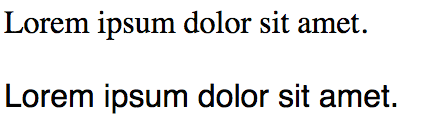
#### fontFace
> Load a web-safe font with fallbacks
Syntax
`html`
@include fontFace($font);
Example
`html
.element1 {
@include fontFace(Times);
}
.element2 {
@include fontFace(Helvetica);
}
Output CSS -
.element1 {
font-family: times, serif;
}
.element2 {
font-family: helvetica, sans-serif;
}
`
$3
Pineapple Sass has 5 inbuilt breakpoint variables -
`html`
$largeScreen: 1200px;
$mediumScreen: 992px;
$smallScreen: 768px;
$extraSmallScreen: 480px;
$smallMobile: 320px;
These breakpoint variables are used with the media query mixins.

#### media-l-screen
> Detect large screens and apply css
Syntax
`html`
@include media-l-screen {
...
}
Example
`html
.element {
@include media-l-screen {
background-color: #eee;
}
}
Output CSS -
@media screen and (max-width: 1200px) {
.element {
background-color: #eee;
}
}
`
#### media-m-screen
> Detect medium screens and apply css
Syntax
`html`
@include media-m-screen {
...
}
Example
`html
.element {
@include media-m-screen {
background-color: #ddd;
}
}
Output CSS -
@media screen and (max-width: 992px) {
.element {
background-color: #ddd;
}
}
`
#### media-s-screen
> Detect small screens and apply css
Syntax
`html`
@include media-s-screen {
...
}
Example
`html
.element {
@include media-s-screen {
background-color: #ccc;
}
}
Output CSS -
@media screen and (max-width: 768px) {
.element {
background-color: #ccc;
}
}
`
#### media-xs-screen
> Detect x-small screens and apply css
Syntax
`html`
@include media-xs-screen {
...
}
Example
`html
.element {
@include media-xs-screen {
background-color: #bbb;
}
}
Output CSS -
@media screen and (max-width: 480px) {
.element {
background-color: #bbb;
}
}
`
#### media-s-mobile
> Detect small mobile screens and apply css
Syntax
`html`
@include media-s-mobile {
...
}
Example
`html
.element {
@include media-s-mobile {
background-color: #aaa;
}
}
Output CSS -
@media screen and (max-width: 320px) {
.element {
background-color: #aaa;
}
}
`
#### media-retina
> Detect retina screen and apply css
Syntax
`html`
@include media-retina {
...
}
Example
`html
.element {
@include media-retina {
background-color: #50a4e2;
}
}
Output CSS -
@media (-webkit-min-device-pixel-ratio: 1.5), (min--moz-device-pixel-ratio: 1.5), (-o-min-device-pixel-ratio: 3 / 2), (min-device-pixel-ratio: 1.5), (min-resolution: 1.5dppx) {
.element {
background-color: #50a4e2;
}
}
`
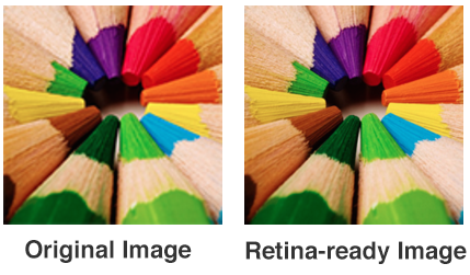
#### retinizeBackground
> Retinize a background image
Syntax
`html`
retinizeBackground($file, $postfix, $type, $width, $height, $location);
Where,
$file is the file name
$postfix is the high-res image postfix. Eg - If you have image.png as your primary image, and image-2x.png as your postfixed high-res image (which will be used on retina screens), then -2x is the postfix.
$type is the file type of image
$width is the width of image
$height is the height of image
$location is the location of the files. By default it is set to empty string.
Example
`html
.element {
@include retinizeBackground("image", "-2x", "png", 200px, 200px, "../img/");
}
Output CSS -
.element {
background-image: url("../img/image.png");
-webkit-background-size: 200px 200px;
-moz-background-size: 200px 200px;
-o-background-size: 200px 200px;
background-size: 200px 200px;
}
@media (-webkit-min-device-pixel-ratio: 1.5), (min--moz-device-pixel-ratio: 1.5), (-o-min-device-pixel-ratio: 3 / 2), (min-device-pixel-ratio: 1.5), (min-resolution: 1.5dppx) {
.element {
background-image: url("../img/image-2x.png");
-webkit-background-size: 200px 200px;
-moz-background-size: 200px 200px;
-o-background-size: 200px 200px;
background-size: 200px 200px;
}
}
`
$3
#### boxShadow
> Add box shadow to any element

Syntax
`html`
@include boxShadow($shadows...);
Example
`html
.element {
@include boxShadow(0px 4px 5px #666, 2px 6px 10px #999);
}
Output CSS -
.element {
-webkit-box-shadow: 0px 4px 5px #666, 2px 6px 10px #999;
-moz-box-shadow: 0px 4px 5px #666, 2px 6px 10px #999;
box-shadow: 0px 4px 5px #666, 2px 6px 10px #999;
}
`
#### insetBoxShadow
> Add inset box shadow to any element
Syntax
`html`
@include insetBoxShadow($x, $y, $blur, $color);
Example
`html
.element {
@include insetBoxShadow(0, 2px, 10px, #444);
}
Output CSS -
.element {
-webkit-box-shadow: inset 0 2px 10px #444;
-moz-box-shadow: inset 0 2px 10px #444;
box-shadow: inset 0 2px 10px #444;
}
`
$3
#### userSelect
> Set user select property for an element
Syntax
`html`
@include userSelect($value);
Example
`html
.element {
@include userSelect(none);
}
Output CSS -
.element {
-webkit-user-select: none;
-moz-user-select: none;
-ms-user-select: none;
}
`
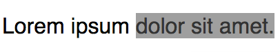
#### textSelection
> Modify css for text selection
Syntax
`html`
@include textSelection {
...
}
Example
`html
.element {
@include textSelection {
color: #343434;
background-color: #a0a0a0;
}
}
Output CSS -
.element::selection,
.element::-moz-selection {
color: #343434;
background-color: #a0a0a0;
}
`
#### placeholder
> Style placeholders within input fields

Syntax
`html`
@include placeholder {
...
}
Example
`html
.element {
@include placeholder {
color: #E4204D;
}
}
Output CSS -
.element::-webkit-input-placeholder {
color: #E4204D;
}
.element:-moz-placeholder {
color: #E4204D;
}
.element::-moz-placeholder {
color: #E4204D;
}
.element:-ms-input-placeholder {
color: #E4204D;
}
`
$3
#### scale
> Scale an element
Syntax
`html`
@include scale($x, $y);
By default $y is set to 0.
Example
`html
.element {
@include scale(2, 3);
}
Output CSS -
.element {
-webkit-transform: scale(2, 3);
-moz-transform: scale(2, 3);
-o-transform: scale(2, 3);
-ms-transform: scale(2, 3);
transform: scale(2, 3);
}
`
#### translate
> Translate an element
Syntax
`html`
@include translate($x, $y);
By default $y is set to 0.
Example
`html
.element {
@include translate(10px, 30px);
}
Output CSS -
.element {
-webkit-transform: translate(10px, 30px);
-moz-transform: translate(10px, 30px);
-o-transform: translate(10px, 30px);
-ms-transform: translate(10px, 30px);
transform: translate(10px, 30px);
}
`
#### rotate
> Rotate an element

Syntax
`html`
@include rotate($deg);
Where $deg is a number.
Example
`html
.element {
@include rotate(45);
}
Output CSS -
.element {
-webkit-transform: rotate(45deg);
-moz-transform: rotate(45deg);
-o-transform: rotate(45deg);
-ms-transform: rotate(45deg);
transform: rotate(45deg);
-webkit-backface-visibility: hidden;
}
`
#### skew
> Skew an element

Syntax
`html`
@include skew($x, $y);
Where $x and $y are numbers. By default $y is set to 0.
Example
`html
.element {
@include skew(20);
}
Output CSS -
.element {
-webkit-transform: skew(20deg, 0deg);
-moz-transform: skew(20deg, 0deg);
-o-transform: skew(20deg, 0deg);
-ms-transform: skew(20deg, 0deg);
transform: skew(20deg, 0deg);
-webkit-backface-visibility: hidden;
}
`
#### flip
> Flip / mirror an element

Syntax
`html`
@include flip;
Example
`html
.element {
@include flip;
}
Output CSS -
.element {
-webkit-transform: scaleX(-1);
-moz-transform: scaleX(-1);
-o-transform: scaleX(-1);
transform: scaleX(-1);
filter: FlipH;
-ms-filter: "FlipH";
}
`
$3
#### cursorPointer
> Add a pointer cursor to the hover state of an element
Syntax
`html`
@include cursorPointer;
Example
`html
.element {
@include cursorPointer;
}
Output CSS -
.element:hover {
cursor: pointer;
}
`
#### noFocus
> Remove focus from a button or input field while in focused state
Syntax
`html`
@include noFocus;
Example
`html
.element {
@include noFocus;
}
Output CSS -
.element:focus {
outline: none;
box-shadow: none;
}
``
Support
If you'd like to help support the development of the project, please consider backing me on Patreon -

License
MIT Licensed
Copyright (c) 2015 Arun Michael Dsouza (amdsouza92@gmail.com)
Permission is hereby granted, free of charge, to any person obtaining a copy of this software and associated documentation files (the "Software"), to deal in the Software without restriction, including without limitation the rights to use, copy, modify, merge, publish, distribute, sublicense, and/or sell copies of the Software, and to permit persons to whom the Software is furnished to do so, subject to the following conditions:
The above copyright notice and this permission notice shall be included in all copies or substantial portions of the Software.
THE SOFTWARE IS PROVIDED "AS IS", WITHOUT WARRANTY OF ANY KIND, EXPRESS OR IMPLIED, INCLUDING BUT NOT LIMITED TO THE WARRANTIES OF MERCHANTABILITY, FITNESS FOR A PARTICULAR PURPOSE AND NONINFRINGEMENT. IN NO EVENT SHALL THE AUTHORS OR COPYRIGHT HOLDERS BE LIABLE FOR ANY CLAIM, DAMAGES OR OTHER LIABILITY, WHETHER IN AN ACTION OF CONTRACT, TORT OR OTHERWISE, ARISING FROM, OUT OF OR IN CONNECTION WITH THE SOFTWARE OR THE USE OR OTHER DEALINGS IN THE SOFTWARE.