react-avatar-edit
v1.2.0TypeScript
ReactJS component to upload, crop, and preview avatars
9.1K/weekUpdated 3 years agoMITUnpacked: 224.9 KB
Published by Kirill Novikov
npm install react-avatar-editreact-avatar
👤 Load, crop and preview avatar with ReactJS component

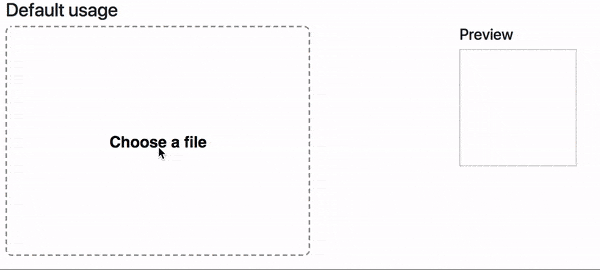
Demo
Demo website
Install
``npm i react-avatar-edit`
Usage
`javascript
import React from 'react'
import ReactDOM from 'react-dom'
import Avatar from 'react-avatar-edit'
class App extends React.Component {
constructor(props) {
super(props)
const src = './example/einshtein.jpg'
this.state = {
preview: null,
src
}
this.onCrop = this.onCrop.bind(this)
this.onClose = this.onClose.bind(this)
this.onBeforeFileLoad = this.onBeforeFileLoad.bind(this)
}
onClose() {
this.setState({preview: null})
}
onCrop(preview) {
this.setState({preview})
}
onBeforeFileLoad(elem) {
if(elem.target.files[0].size > 71680){
alert("File is too big!");
elem.target.value = "";
};
}
render () {
return (
height={295}
onCrop={this.onCrop}
onClose={this.onClose}
onBeforeFileLoad={this.onBeforeFileLoad}
src={this.state.src}
/>
)
}
}
ReactDOM.render(
`
Component properties
| Prop | Type | Description
| ---------------------- | ---------------- | ---------------
| img | Image | The Image object to display
| src | String/Base64 | The url to base64 string to load (use urls from your domain to prevent security errors)
| width | Number | The width of the editor
| height | Number | The height of the editor (image will fit to this height if neither imageHeight, nor imageWidth is set)
| imageWidth | Number | The desired width of the image, can not be used together with imageHeight
| imageHeight | Number | The desired height of the image, can not be used together with imageWidth
| cropRadius | Number | The crop area radius in px (default: calculated as min image with/height / 3)
| cropColor | String | The crop border color (default: white)
| lineWidth | Number | The crop border width (default: 4)
| minCropRadius | Number | The min crop area radius in px (default: 30)
| backgroundColor | String | The color of the image background (default: white)
| closeIconColor | String | The close button color (default: white)
| shadingColor | String | The shading color (default: grey)
| shadingOpacity | Number | The shading area opacity (default: 0.6)
| mimeTypes | String | The mime types used to filter loaded files (default: image/jpeg,image/png)
| label | String | Label text (default: Choose a file)
| labelStyle | Object | The style object for preview label (use camel case for css properties fore example: fontSize)
| borderStyle | Object | The style for object border preview (use camel case for css properties fore example: fontSize)
| onImageLoad(image) | Function | Invoked when image based on src prop finish loading
| onCrop(image) | Function | Invoked when user drag&drop event stop and return cropped image in base64 string
| onBeforeFileLoad(file) | Function | Invoked when user before upload file with internal file loader (etc. check file size)
| onFileLoad(file) | Function | Invoked when user upload file with internal file loader
| onClose() | Function | Invoked when user clicks on close editor button
| exportAsSquare | Boolean | The exported image is a square and the circle is not cut-off from the image
| exportSize | Number | The size the exported image should have (width and height equal). The cropping will be made on the original image to ensure a high quality.
| exportMimeType | String | The mime type that should be used to export the image, supported are: image/jpeg, image/png (Default: image/png)
| exportQuality | Number | The quality that should be used when exporting in image/jpeg. A value between 0.0 and 1.0.
Contributing
* To start developer server please use `npm run start`
* To build production bundle use npm run build``