react-infinite-calendar
v2.3.1
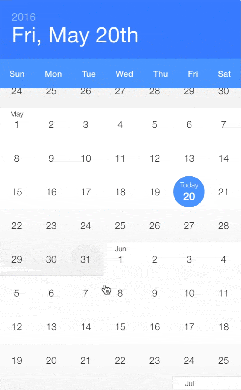
Infinite scrolling date-picker built with React, with localization, themes, keyboard support, and more.
9.0K/weekUpdated 3 years agoMIT
Published by Clauderic Demers
npm install react-infinite-calendar
React Infinite Calendar


$3
Features
---------------
* Infinite scroll – Just keep scrollin', just keep scrollin'
* Flexible – Min/max date, disabled dates, disabled days, etc.
* Extensible – Add date range-selection, multiple date selection, or create your own HOC!
* Localization and translation – En français, s'il vous plaît!
* Customizeable – Customize and theme to your heart's content.
* Year selection – For rapidly jumping from year to year
* Keyboard support – ⬆️ ⬇️ ⬆️ ⬇️ ⬅️ ➡️ ⬅️ ➡️ ↩️
* Events and callbacks – beforeSelect, onSelect, onScroll, etc.
* Mobile-friendly – Silky smooth scrolling on mobile
Getting Started
---------------
Using npm:
``
npm install react-infinite-calendar react-addons-css-transition-group --save
ES6, CommonJS, and UMD builds are available with each distribution. For example:
`js`
import InfiniteCalendar from 'react-infinite-calendar';
import 'react-infinite-calendar/styles.css'; // Make sure to import the default stylesheet
You can also use a global-friendly UMD build:
`html`
Usage
------------
$3
`js
import React from 'react';
import { render } from 'react-dom';
import InfiniteCalendar from 'react-infinite-calendar';
import 'react-infinite-calendar/styles.css'; // only needs to be imported once
// Render the Calendar
var today = new Date();
var lastWeek = new Date(today.getFullYear(), today.getMonth(), today.getDate() - 7);
render(
height={600}
selected={today}
disabledDays={[0,6]}
minDate={lastWeek}
/>,
document.getElementById('root')
);
`
For more usage examples, see http://clauderic.github.io/react-infinite-calendar/ or check out some code examples.
$3
| Property | Type | Default | Description |
|:---------------|:----------------|:-------------------------------------------------------------------------------------------------------------------------------------|:---------------------------------------------------------------------------------------------------------------------------------------------------------------------------------------------------------------------------------|
| selected | Date or Boolean | new Date()
| Value of the date that appears to be selected. Set to false if you don't wish to have a date initially selected. |
| width | Number | 400 | Width of the calendar, in pixels |
| height | Number | 600 | Height of the calendar, in pixels |
| min | Date | new Date(1980, 0, 1) | The minimum month that can be scrolled to. |
| max | Date | new Date(2050, 11, 31) | The maximum month that can be scrolled to. |
| minDate | Date | new Date(1980, 0, 1) | The minimum date that is selectable. |
| maxDate | Date | new Date(2050, 11, 31) | The maximum date that is selectable. |
| disabledDays | Array | | Array of days of the week that should be disabled. For example, to disable Monday and Sunday: [0, 6] |
| disabledDates | Array | | Array of dates that should be disabled. For example: [new Date(2017, 1, 8), new Date(), new Date(2017, 5, 17)] |
| display | String | 'days' | Whether to display the years or days view. |
| displayOptions | Object | See default displayOptions | See display options section for more details. |
| locale | Object | See default locale | By default, React Infinite Calendar comes with the English locale. You can use this to change the language, or change the first day of the week. See date-fns documentation for more details |
| theme | Object | See default theme | Basic customization of the colors |
| className | String | | Optional CSS class name to append to the root InfiniteCalendar element. |
| onSelect | Function | | Callback invoked after beforeSelect() returns true, but before the state of the calendar updates |
| onScroll | Function | | Callback invoked when the scroll offset changes. function (scrollTop: number) {} |
| onScrollEnd | Function | | Callback invoked 150ms after the last onScroll event is triggered. function (scrollTop: number) {} |
| rowHeight | Number | 56 | Height of each row in the calendar (each week is considered a row) |
| autoFocus | Boolean | true | Whether the Calendar root should be auto-focused when it mounts. This is useful when keyboardSupport is enabled (the calendar must be focused to listen for keyboard events) |
| tabIndex | Number | 1 | Tab-index of the calendar |$3
| Property | Type | Default | Description |
|:---------------------|:--------|:-------------|:-------------------------------------------------------------------------------------------------------------------------------------------------|
| layout | String | 'portrait' | Layout of the calendar. Should be one of 'portrait' or 'landscape' |
| showHeader | Boolean | true | Show/hide the header |
| shouldHeaderAnimate | Boolean | true | Enable/Disable the header animation |
| showOverlay | Boolean | true | Show/hide the month overlay when scrolling |
| showTodayHelper | Boolean | true | Show/hide the floating back to Today helper |
| showWeekdays | Boolean | true | Show/hide the weekdays in the header |
| hideYearsOnSelect | Boolean | true | Whether to automatically hide the years view on select. |
| overscanMonthCount | Number | 4 | Number of months to render above/below the visible months. Tweaking this can help reduce flickering during scrolling on certain browers/devices. |
| todayHelperRowOffset | Number | 4 | This controls the number of rows to scroll past before the Today helper appears |Example usage of display options:
`jsx
layout: 'landscape',
showOverlay: false,
shouldHeaderAnimate: false
}}
/>
`Dependencies
------------
React Infinite Calendar has very few dependencies. It relies on
for virtualization and date-fns for handling date manipulation. It also uses recompose for extending the default functionality. It also has the following peerDependencies: react, and react-addons-css-transition-group`.Reporting Issues
----------------
If you find an issue, please report it along with any relevant details to reproduce it. The easiest way to do so is to fork this jsfiddle.
Contributions
------------
Yes please! Feature requests / pull requests are welcome. Learn how to contribute
Have a suggestion or just want to say hello? Come chat on Gitter!
License
---------
react-infinite-calendar is available under the MIT License.