react-msa-viewer
v1.0.1
A React component to create Multiple Sequence Alignments
0/weekUpdated 6 months agoMITUnpacked: 3.3 MB
Published by Plotly, Inc
npm install react-msa-viewer
=============


react-msa-viewer is a performant, extendable, highly-customizable, production-ready
React Component that renders a Multiple Sequence Alignment (MSA).
__WARNING: Work in progress - use with caution__
Live demo
---------
Checkout the storybook at https://msa.bio.sh
Getting started
---------------
``jsx
import MSAViewer from '@plotly/react-msa-viewer';
function MSA() {
const options = {
sequences: [
{
name: "seq.1",
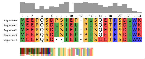
sequence: "MEEPQSDPSIEP-PLSQETFSDLWKLLPENNVLSPLPS-QA-VDDLMLSPDDLAQWLTED"
},
{
name: "seq.2",
sequence: "MEEPQSDLSIEL-PLSQETFSDLWKLLPPNNVLSTLPS-SDSIEE-LFLSENVAGWLEDP"
},
{
name: "seq.3",
sequence: "MEEPQSDLSIEL-PLSQETFSDLWKLLPPNNVLSTLPS-SDSIEE-LFLSENVAGWLEDP"
},
],
colorScheme: "zappo",
};
return (
);
}
`
$3
For npm users, run:
`
npm i --save @plotly/react-msa-viewer
For yarn users, run:
`
yarn add @plotly/react-msa-viewer
$3
 acts a Context Provider for all MSA subcomponents.
Hence, it will automatically take care of synchronization between all MSA components in its tree:
`jsx
import {
Labels,
MSAViewer,
OverviewBar,
PositionBar,
SequenceOverview,
SequenceViewer,
} from '@plotly/react-msa-viewer';
function MSA() {
const options = {
sequences: [
{
name: "seq.1",
sequence: "MEEPQSDPSIEP-PLSQETFSDLWKLLPENNVLSPLPS-QA-VDDLMLSPDDLAQWLTED"
},
{
name: "seq.2",
sequence: "MEEPQSDLSIEL-PLSQETFSDLWKLLPPNNVLSTLPS-SDSIEE-LFLSENVAGWLEDP"
},
{
name: "seq.3",
sequence: "MEEPQSDLSIEL-PLSQETFSDLWKLLPPNNVLSTLPS-SDSIEE-LFLSENVAGWLEDP"
},
],
};
return (
);
}
`
$3
Using the react-msa-viewer with React is highly recommended.
However, it can be used in Vanilla JS:
`html`
See an example on CodePen.
Props
-----
__Warning__: these properties are still susceptible to a _change at any moment_.
$3
A general-purpose layout for the MSA components
When children are passed it acts as a Context Provider for the msaStore,
otherwise it provides a default layout and forwards it props the respective
components.
#### Props
##### barAttributes
Attributes to apply to each bar.
type: object
##### barFillColor
Fill color of the OverviewBar, e.g. #999999
type: string
##### barMethod
Method to use for the OverviewBar:
- information-content: Information entropy after Shannon of a column (scaled)conservation
- : Conservation of a column (scaled)
type: enum('information-content'|'conservation')
##### barStyle
Inline styles to apply to each bar.
type: object
##### colorScheme
Colorscheme to use. Currently the follow colorschemes are supported:
buried_index, clustal, clustal2, cinema, helix_propensity, hydro,lesk, mae, nucleotide, purine_pyrimidine, strand_propensity, taylor,turn_propensity, and zappo.
See msa-colorschemes for details.
type: custom
##### height
Height of the sequence viewer (in pixels), e.g. 500.
type: number
##### labelAttributes
Attributes to apply to each label.
type: object
##### labelComponent
Component to create labels from.
type: union(object|func)
##### labelStyle
Inline styles to apply to each label.
type: object
##### layout
Predefined layout scheme to use (only used when no child elements are provided).
Available layouts: basic, inverse, full, compact, funky
type: enum('basic'|'default'|'inverse'|'full'|'compact'|'funky')
##### markerAttributes
Attributes to apply to each marker.
type: object
##### markerComponent
Component to create markers from.
type: union(object|func)
##### markerStartIndex
At which number the PositionBar marker should start counting.
Typical values are: 1 (1-based indexing) and 0 (0-based indexing).
type: number
##### markerSteps
At which steps the position labels should appear, e.g. 2 for (1, 3, 5)
type: number
##### markerStyle
Inline styles to apply to each marker.
type: object
##### msaStore
A custom msaStore (created with createMSAStore).
Useful for custom interaction with other components
type: object
##### onResidueClick
Callback fired when the mouse pointer clicked a residue.
type: func
##### onResidueDoubleClick
Callback fired when the mouse pointer clicked a residue.
type: func
##### onResidueMouseEnter
Callback fired when the mouse pointer is entering a residue.
type: func
##### onResidueMouseLeave
Callback fired when the mouse pointer is leaving a residue.
type: func
##### position
Current x and y position of the viewpoint
in the main sequence viewer (in pixels).
This specifies the position of the top-left corner
of the viewpoint within the entire alignment,
e.g. {xPos: 20, yPos: 5}.
type: custom
##### sequenceBorder
Whether to draw a border.
type: bool
##### sequenceBorderColor
Color of the border. Name, hex or RGB value.
type: string
##### sequenceBorderWidth
Width of the border.
type: number
##### sequenceOverflow
What should happen if content overflows.
type: enum("hidden"|"auto"|"scroll")
##### sequenceOverflowX
What should happen if x-axis content overflows (overwrites "overflow")
type: enum("hidden"|"auto"|"scroll"|"initial")
##### sequenceOverflowY
What should happen if y-axis content overflows (overwrites "overflow")
type: enum("hidden"|"auto"|"scroll"|"initial")
##### sequenceScrollBarPositionX
X Position of the scroll bar ("top or "bottom")
type: enum("top"|"bottom")
##### sequenceScrollBarPositionY
Y Position of the scroll bar ("left" or "right")
type: enum("left"|"right")
##### sequenceTextColor
Color of the text residue letters (name, hex or RGB value)
type: string
##### sequenceTextFont
Font to use when drawing the individual residues.
type: string
##### sequences (required)
Sequence data.
sequences expects an array of individual sequences.
sequence: Raw sequence, e.g. MEEPQSDPSIEP (required)name: name of the sequence, e.g. Sequence X
Example:
`js`
const sequences = [
{
name: "seq.1",
sequence: "MEEPQSDPSIEP-PLSQETFSDLWKLLPENNVLSPLPS-QA-VDDLMLSPDDLAQWLTED",
},
{
name: "seq.2",
sequence: "MEEPQSDLSIEL-PLSQETFSDLWKLLPPNNVLSTLPS-SDSIEE-LFLSENVAGWLEDP",
},
];
type: arrayOf[SequencePropType]
##### tileHeight
Height of the main tiles (in pixels), e.g. 20
type: number
##### tileWidth
Width of the main tiles (in pixels), e.g. 20
type: number
##### width
Width of the sequence viewer (in pixels), e.g. 500.
type: number
$3
Displays the sequence names.
#### Props
##### cacheElements
defaultValue: 10
##### font
Font of the sequence labels, e.g. 20px Arial
type: string
##### labelAttributes
Attributes to apply to each label.
type: object
##### labelComponent
Component to create labels from.
type: union(object|func)
##### labelStyle
Inline styles to apply to each label.
type: object
defaultValue:
##### style
Inline styles to apply to the Label component
type: object
$3
Creates a small overview box of the sequences for a general overview.
#### Props
##### engine
Rendering engine: canvas or webgl (experimental).
type: enum('canvas'|'webgl')
defaultValue:
##### fillColor
Fill color of the OverviewBar, e.g. #999999
type: string
defaultValue:
##### height (required)
Width of the component (in pixels), e.g. 100
type: number
defaultValue:
##### method
Method to use for the OverviewBar:
- information-content: Information entropy after Shannon of a column (scaled)conservation
- : Conservation of a column (scaled)
type: enum('information-content'|'conservation')
defaultValue:
##### style
Custom style configuration.
type: object
##### width (required)
Width of the component (in pixels), e.g. 100
type: number
$3
Displays the sequence names with an arbitrary Marker component
#### Props
##### cacheElements
defaultValue: 10
##### font
Font of the sequence labels, e.g. 20px Arial
type: string
##### height
Height of the PositionBar (in pixels), e.g. 100
type: number
defaultValue:
##### markerAttributes
Attributes to apply to each marker.
type: object
##### markerComponent
Component to create markers from.
type: union(object|func)
##### markerSteps
At which steps the position labels should appear, e.g. 2 for (1, 3, 5)
type: number
defaultValue:
##### markerStyle
Inline styles to apply to each marker.
type: object
defaultValue:
##### startIndex
At which number the PositionBar marker should start counting.
Typical values are: 1 (1-based indexing) and 0 (0-based indexing).
type: number
defaultValue:
##### style
Inline styles to apply to the PositionBar component
type: object
defaultValue:
font: "12px Arial",
}
$3
#### Props
##### engine
Rendering engine: canvas or webgl (experimental).
type: enum('canvas'|'webgl')
defaultValue:
##### height (required)
Width of the component (in pixels), e.g. 100
type: number
defaultValue:
##### style
Custom style configuration.
type: object
##### tileHeight
Height of a tile in the OverviewBar, e.g. 5
type: number
defaultValue:
##### tileWidth
Width of a tile in the OverviewBar, e.g. 5
type: number
defaultValue:
##### width (required)
Width of the component (in pixels), e.g. 100
type: number
$3
Component to draw the main sequence alignment.
#### Props
##### border
Whether to draw a border.
type: bool
defaultValue:
##### borderColor
Color of the border. Name, hex or RGB value.
type: string
defaultValue:
##### borderWidth
Width of the border.
type: number
defaultValue:
##### cacheElements
Number of residues to prerender outside of the visible viewbox.
type: number
defaultValue:
##### onResidueClick
Callback fired when the mouse pointer clicked a residue.
type: func
##### onResidueDoubleClick
Callback fired when the mouse pointer clicked a residue.
type: func
##### onResidueMouseEnter
Callback fired when the mouse pointer is entering a residue.
type: func
##### onResidueMouseLeave
Callback fired when the mouse pointer is leaving a residue.
type: func
##### overflow
What should happen if content overflows.
type: enum("hidden"|"auto"|"scroll")
defaultValue:
##### overflowX
What should happen if x-axis content overflows (overwrites "overflow")
type: enum("hidden"|"auto"|"scroll"|"initial")
defaultValue:
##### overflowY
What should happen if y-axis content overflows (overwrites "overflow")
type: enum("hidden"|"auto"|"scroll"|"initial")
defaultValue:
##### scrollBarPositionX
X Position of the scroll bar ("top or "bottom")
type: enum("top"|"bottom")
defaultValue:
##### scrollBarPositionY
Y Position of the scroll bar ("left" or "right")
type: enum("left"|"right")
defaultValue:
##### showModBar
Show the custom ModBar
type: bool
defaultValue:
##### textColor
Color of the text residue letters (name, hex or RGB value)
type: string
defaultValue:
##### textFont
Font to use when drawing the individual residues.
type: string
defaultValue:
##### xGridSize
Number of residues to cluster in one tile (x-axis) (default: 10)
type: number
defaultValue:
##### yGridSize
Number of residues to cluster in one tile (y-axis) (default: 10)
type: number
defaultValue:
$3
The React MSA Viewer uses an Redux store internally.
You can connect your components with it too.
`jsx
import React, {Component} from 'react';
import {
msaConnect,
MSAViewer,
SequenceViewer,
} from '@plotly/react-msa-viewer';
class MyFirstMSAPluginComponent extends React.Component {
render() {
const residue = "E";
const style = {
width: this.props.tileWidth,
height: this.props.tileHeight,
backgroundColor: this.props.colorScheme.getColor(residue),
}
return (
{residue}
);
}
}
const mapStateToProps = state => {
return {
tileHeight: state.props.tileHeight,
tileWidth: state.props.tileWidth,
colorScheme: state.props.colorScheme,
}
}
const MyFirstMSAPlugin = msaConnect(
mapStateToProps,
)(MyFirstMSAPluginComponent);
function MyMSA() {
return (
);
}
`
However, for performance reasons you need to use a special mixin to listen for
position events.
`jsx
import {
withPositionStore,
MSAViewer,
SequenceViewer,
} from '@plotly/react-msa-viewer';
class MyFirstMSAPlugin extends React.Component {
shouldRerender(newPosition) {
return true;
}
render() {
return (
x: {this.position.xPos}, y: {this.position.yPos}
);
}
}
// inject the MSAPositionStore as this.position
withPositionStore(MyFirstMSAPlugin);
function MyMSA() {
return (
);
}
ReactDOM.render(
`
Alternatively, you can also listen to events.
Listen to events
----------------
The MSAViewer components (and its subcomponents) provide a variety of callbacksonResidueClick
like that can be used to plug with your code:
`jsx
import {
MSAViewer,
} from 'react-msa-viewer';
function MyMSA() {
return
}
`
Some events also trigger custom DOM events which might simply subscription
outside of React:
`html`
The custom DOM events bubble up the tree and contain their payload in.detail.
Sending actions
---------------
While the most common way to update the MSA is to update its properties, you
can also send a variety of actions to the MSAViewer.
`jsx
import {
MSAViewer,
} from 'react-msa-viewer';
class MyMSA extends React.Component {
moveLeft = () => {
this.msa.movePosition({yMovement: -10})
}
moveRight = () => {
this.msa.movePosition({yMovement: 10})
}
jumpOrigin = () => {
debugger;
this.msa.movePosition({yPos: 0})
}
render() {
return (
);
}
}
`
It's also possible to use
to create a payload and dispatch it later:`jsx
import {
MSAViewer,
} from 'react-msa-viewer';class MyMSA extends React.Component {
moveLeft = () => {
const payload = actions.movePosition({yMovement: -10});
this.msa.dispatch(payload);
}
moveRight = () => {
const payload = actions.movePosition({yMovement: 10});
this.msa.dispatch(payload);
}
jumpOrigin = () => {
const payload = actions.updatePosition({yPos: 0});
this.msa.dispatch(payload);
}
render() {
return (
this.msa = ref} />
);
}
}
`Development
-----------
$3
Get the code:
git clone https://github.com/plotly/react-msa-viewer
Install the project
dependencies:`
npm install
Contributing
------------
Please, see the CONTRIBUTING file.
Contributor Code of Conduct
---------------------------
Please note that this project is released with a Contributor Code of
Conduct. By participating in this project you
agree to abide by its terms. See CODE_OF_CONDUCT file.
License
-------
react-msa-viewer is released under the MIT License. See the bundled
LICENSE file for details.