react-native-action-sheet-component
v0.0.36
React Native Action Sheet Component for iOS & Android.
0/weekUpdated 3 years agoMITUnpacked: 1.3 MB
Published by Jack Lam
npm install react-native-action-sheet-componentReact Native Action Sheet Component
React Native Action Sheet Component for iOS & Android.
Pull request are welcomed. Please follow the Airbnb style guide Airbnb JavaScript
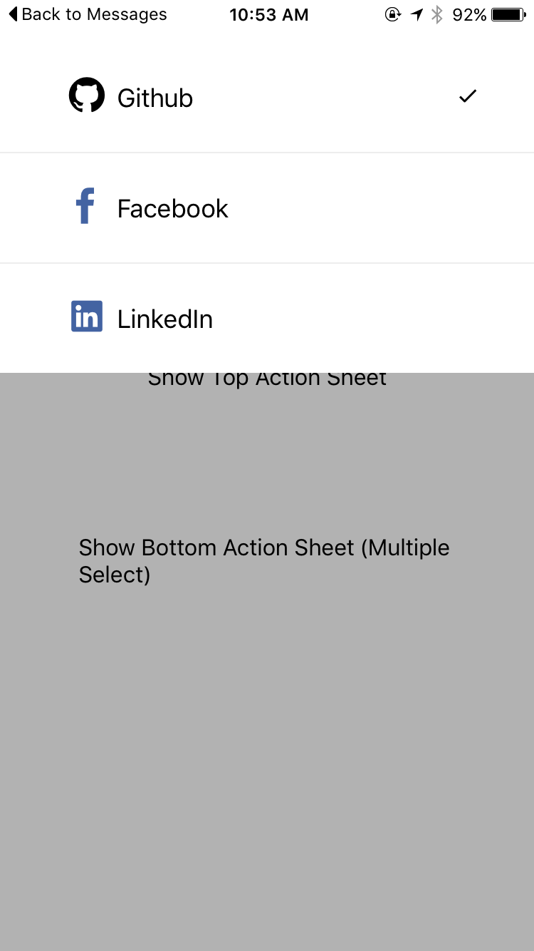
#### Preview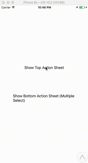
Installation
##### yarn
yarn add react-native-action-sheet-component##### npm
npm install --save react-native-action-sheet-componentUsage with ActionSheetManager
``
javascript
import { EvilIcons, Ionicons } from '@exponent/vector-icons';
import ActionSheetManager { ActionSheet, ActionSheetItem } from 'react-native-action-sheet-component';
`##### Options
javascript
const actionSheetItems = [
text="Github"
value="github"
selectedIcon={checkedIcon}
icon={
}
onPress={this.onItemPress}
/>,
text="Facebook"
value="facebook"
selectedIcon={checkedIcon}
icon={
}
onPress={this.onItemPress}
/>,
];const options = {
defaultValue: ['github'],
children: actionSheetItems,
onChange: (value, index, selectedData) => {
},
}
`##### Show
javascript
ActionSheetManager.show(options, () => {
  console.log('callback');
});
`##### Update
javascript
ActionSheetManager.update(options, () => {
  console.log('callback');
});
`##### Hide
javascript
ActionSheetManager.hide(() => {
  console.log('callback');
});
`
Usage with
javascript
import { EvilIcons, Ionicons } from '@exponent/vector-icons';
import { ActionSheet, ActionSheetItem } from 'react-native-action-sheet-component';
`javascript
class Example extends Component {
constructor(props) {
super(props) { this.state = {
defaultSelectedValues: ['github'],
}
}
}
render() {
return (
position="top"
onChange={this.onChange}
defaultValue={this.state.defaultSelectedValues}
multiple
>
value="github"
selectedIcon={checkedIcon}
icon={
}
onPress={this.onItemPress}
/>
value="facebook"
selectedIcon={checkedIcon}
icon={
}
onPress={this.onItemPress}
/>
)
}
}
`
##### Show
javascript
actionSheet.show(() => {
  console.log('callback - show');
})
`##### Hide
javascript
actionSheet.hide(() => {
  console.log('callback - hide');
})
`Props
$3
| Prop | Type | Default | Note |
|---|---|---|---|
| | any | null | | |
| defaultValue? | any | null | | |
| onShow? | Function | () => {} | |
| onHide? | Function | () => {} | |
| style? | any | null | |
| onChange? | Function | () => {} | |
| show? | boolean | false | |
| showSelectedIcon? | boolean | true | | |
| multiple? | boolean | false | |
| hideOnSelceted? | boolean | true | |
| hideOnHardwareBackPress? | boolean | true | |
| showSparator? | boolean | true | |
| animationDuration? | number | 250 | |
| overlayOpacity? | number | 0.3 | |
| position? | string | top | |
| maxHeight? | number | Dimensions.get('window').height / 2 | |
| children? | any | null | |$3
| Prop | Type | Default | Note |
|---|---|---|---|
| text | any | null | | |
| icon? | any | null | | |
| index? | number | null | | |
| selectedIcon? | number | require('./img/checkmark.png') | | |
| selected? | boolean | false | | |
| showSelectedIcon? | boolean | true | | |
| onPress? | Function | () => {} | | |
| style? | any | null` | | |