react-native-awesome-pin
v1.3.4
A highly interactive and customisable PIN code screen for React Native.
0/weekUpdated 3 years agoMITUnpacked: 36.7 KB
Published by Luke Brandon Farrell
npm install react-native-awesome-pinreact-native-awesome-pin


A highly interactive and customizable PIN code screen for React Native.
- Plug and play PIN screen with dozens of props (can be themed to suit your brand).
- Keyboard and PIN components can be used independently for more fine-grained customization.
- Animations and micro-feedback included to create a great user experience.
Install
To get started install via npm:
``sh`
npm install react-native-awesome-pin --save
Usage
#### PinScreen
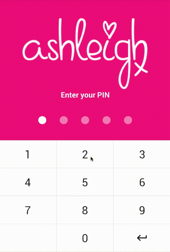
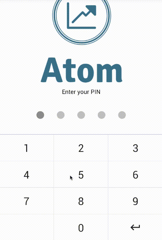
The will take up the full view. It is a plug and play component... pass your
logo, tagline, background colour, callback function and start verifying PINs.
Import:
`js`
import { PinScreen } from "react-native-awesome-pin";
Then add it to your code:
`js
tagline='Please enter your PIN'
logo={ require('../../img/mylogohere.png') }
containerStyle={{ backgroundColor: '#AAA' }}
keyDown={ this.recievePin.bind(this) }
/>
// Callback function which receives the current PIN value
recievePin(pin){
// Check if the PIN is correct here
}
`
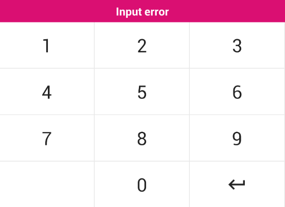
You need to add a ref to your PinScreen, this allows you to throw an error from the
parent component when a PIN is incorrect. Errors can be thrown using the throwError(message)
method. Keyboard errors can be cleared using
`js
recievePin(pin){
// Clear error on interaction
this.pinScreen.clearError();
if(pin != '56771'){
this.pinScreen.throwError('Your PIN is incorrect');
}
}
`
#### PinKeyboard
The on-screen keyboard can be used separately if you do not want to use the plug
and play component.
Import:
`js`
import { PinKeyboard } from "react-native-awesome-pin";
Then add it to your code:
`js
keyDown={this.keyDown.bind(this)}
/>
// Callback function which receives the key pressed
keyDown(key){
// Key pressed
}
`
The also has a throwError(message) method. This will create a popup above the
keyboard displaying the given error message. The style of the popup can be customized through props.
#### PinInput
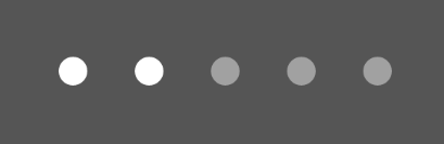
The PIN input circles can be used separately if you do not want to use the plug
and play component. They come with a shake animation and configurable
device vibration.
Import:
`js`
import { PinInput } from "react-native-awesome-pin";
Then add it to your code:
`js`
numberOfPins={5}
numberOfPinsActive={2}
/>
The has a shake() method which can be called through the reference this.pins.shake().
This will perform a shake animation and vibration if enabled. A callback can be passed through props which
will be fired when the animation is complete. See props below.
Props
#### PinScreen
The is a great plug and play solution for a PIN screen.
| Prop | Type | Optional | Default | Description |
| --------------------- | ------- | -------- | ------------------ | --------------------------------------------------------------------------------- |
| onRef | string | No | | onRef allows you to call the throwError(message) method. |
| keyDown | string | No | | Callback function triggered when a key is pressed. Returns the current PIN value. |
| tagline | string | Yes | 'Enter your PIN' | Tagline which sits above the PINS. |
| logo | object | Yes | | Logo to place at top of screen. |
| numberOfPins | number | Yes | 5 | Number of pins to render. |
| keyVibration | bool | Yes | true | Should vibration be enabled for key press. |
| shakeVibration | bool | Yes | true | Should vibration be enabled for shake. |
| headerBackgroundColor | string | Yes | #e2e2e2 | Header colour for the SafeAreaView. |
| footerBackgroundColor | string | Yes | #fff | Footer colour for the SafeAreaView. |
| ItemFooter | element | Yes | | A footer component to render below the PinScreen. |
| containerStyle | object | Yes | See PinScreen.js | Style applied to the container. Background colour can be set here. |
| logoStyle | object | Yes | | Style applied to your logo. |
| taglineStyle | object | Yes | See PinScreen.js | Style applied to the tagline. |
| pin | string | Yes | | The pin value. |
| pinContainerStyle | object | Yes | See PinInput.js | Style applied to PINS container. |
| pinStyle | object | Yes | See PinInput.js | Style applied to each circle PIN. |
| pinActiveStyle | object | Yes | See PinInput.js | Style applied to each circle PIN when it is active. |
| keyboard | array | Yes | See PinKeyboard.js | 4 x 3 matrix containing the value for each key. Image or text. |
| keyboardStyle | object | Yes | See PinKeyboard.js | Style applied to the keyboard. |
| keyboardDisabledStyle | object | Yes | See PinKeyboard.js | Style applied when the keyboard is disabled. |
| disableRippleEffect | bool | Yes | false | Disables the ripple effect from the keys. |
| keyStyle | object | Yes | See PinKeyboard.js | Style applied to each key on the keyboard. |
| keyTextStyle | object | Yes | See PinKeyboard.js | Style applied to the text inside each key. |
| keyImageStyle | object | Yes | See PinKeyboard.js | Style applied to image in a key. If an image is passed. |
| errorStyle | object | Yes | See PinKeyboard.js | Style applied to popup error. Can set the background colour here. |
| errorTextStyle | object | Yes | See PinKeyboard.js | Style applied to the text inside the popup error. |
#### PinKeyboard
The uses two arrays to allow you to set keys and define custom functions for each key. This is not the most fine-tune solution and will be upgraded
in the future.
| Prop | Type | Optional | Default | Description |
| --------------------- | ------ | -------- | ------------------ | --------------------------------------------------------------------------------- |
| onRef | string | No | | onRef allows you to call the throwError(message) method. |
| keyDown | string | No | | Callback function triggered when a key is pressed. Returns the key value. |
| keyboard | array | Yes | See PinKeyboard.js | 4 x 3 matrix containing the value for each key. Image or text. |
| keyboardFunc | array | Yes | See PinKeyboard.js | 4 x 3 matrix containing custom functions for each key. Pass null for no function. |
| keyboardStyle | object | Yes | See PinKeyboard.js | Style applied to the keyboard. |
| keyboardDisabledStyle | object | Yes | See PinKeyboard.js | Style applied when the keyboard is disabled. |
| disableRippleEffect | bool | Yes | false | Disables the ripple effect from the keys. |
| keyStyle | object | Yes | See PinKeyboard.js | Style applied to each key on the keyboard. |
| keyTextStyle | object | Yes | See PinKeyboard.js | Style applied to the text inside each key. |
| keyImageStyle | object | Yes | See PinKeyboard.js | Style applied to image in a key. If an image is passed. |
| errorStyle | object | Yes | See PinKeyboard.js | Style applied to popup error. Can set the background colour here. |
| errorTextStyle | object | Yes | See PinKeyboard.js | Style applied to the text inside the popup error. |
#### PinInput
| Prop | Type | Optional | Default | Description |
| ---------------------- | ------ | -------- | --------------- | --------------------------------------------------------------- |
| onRef | any | No | | onRef allows you to call the shake() method. |pin.length` here. |
| numberOfPins | number | Yes | 5 | Number of pins to render. |
| numberOfPinsActive | number | Yes | 0 | Number of active pins. You can pass the
| vibration | bool | Yes | true | Should vibration be enabled on shake? |
| animationShakeCallback | func | Yes | | A callback triggered when the pin shake animation has finished. |
| containerStyle | object | Yes | See PinInput.js | Style applied to PINS container. |
| pinStyle | object | Yes | See PinInput.js | Style applied to each circle PIN. |
| pinActiveStyle | object | Yes | See PinInput.js | Style applied to each circle PIN when it is active. |
Contributing
If you want to issue a PR, go ahead ;)
License
This project is licensed under the MIT License
Contributors ✨
Thanks goes to these wonderful people (emoji key):
 Gerwim 🐛 🤔 |  Luke Brandon Farrell 💻 📖 🤔 👀 |
This project follows the all-contributors specification. Contributions of any kind welcome!