react-native-collapsible-header-views
v1.1.2TypeScript
Set of react-native views with collapsible headers
0/weekUpdated 3 years agoMITUnpacked: 474.2 KB
Published by iyegoroff
npm install react-native-collapsible-header-viewsreact-native-collapsible-header-views


ScrollView, FlatList, SectionList with collapsible headers + HOC for wrapping custom scrollables
Getting started
$ npm install react-native-collapsible-header-views --save
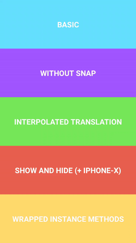
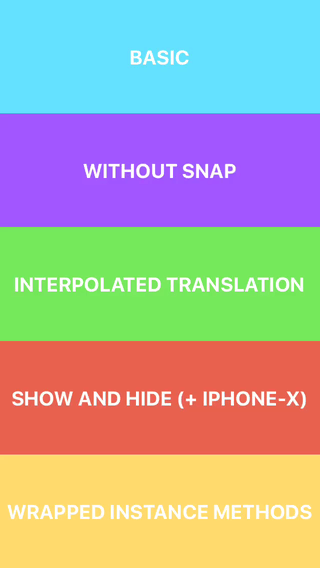
Demo
Android | iOS
:---------------------------------------------:|:---------------------------------------------: |
| 
Example
``javascript
import * as React from 'react';
import { View, Platform } from 'react-native';
import { CollapsibleHeaderScrollView } from 'react-native-collapsible-header-views';
export const Basic = () => (
headerHeight={100}
statusBarHeight={Platform.OS === 'ios' ? 20 : 0}
>
);
`
Description
Library exports three components CollapsibleHeaderScrollView, CollapsibleHeaderFlatList,CollapsibleHeaderSectionList and a HOC withCollapsibleHeader for wrapping custom scrollableAnimated.createAnimatedComponent
components. Provided components support all props and instance methods of corresponding wrapped
components. Note that components are also wrapped with under the
hood.
Reference
$3
#### CollapsibleHeaderScrollViewProps, CollapsibleHeaderFlatListProps, CollapsibleHeaderSectionListProps
- CollapsibleHeaderComponent: React.ReactElement -CollapsibleHeaderProps
React element or component/function that receives object. Required;headerHeight: number
- - height of CollapsibleHeaderComponent. Required;statusBarHeight?: number
- - height of status bar. Defaults to 0;headerContainerBackgroundColor?: string
- - background color for CollapsibleHeaderComponent and'white'
status bar container. Defaults to ;disableHeaderSnap?: boolean
- - pass true to disable header snap animations. Defaults to false;headerAnimationDuration?: number
- - duration of snap and showHeader, hideHeader animations.350
Defaults to ;clipHeader?: boolean
- - if true header will be clipped with overflow: 'hidden' style.
Also some of ScrollView props have new defaults: bounces defaults to false, overScrollMode
to and scrollEventThrottle to 1.
#### CollapsibleHeaderProps
- interpolatedHeaderTranslation: (from: number, to: number) => Animated.AnimatedInterpolation -AnimatedInterpolation
creates new object, whose input range corresponds to header translation andfrom
output range is specified by and to params. Can be used for custom animations, like settingshowHeader: (options: { animated: boolean } | unknown) => void
opacity etc.;
- - pushes header down with animationhideHeader: (options: { animated: boolean } | unknown) => void
enabled by default;
- - pulls header up with animation
enabled by default.
$3
#### CollapsibleHeaderScrollView, CollapsibleHeaderFlatList, CollapsibleHeaderSectionList
- animatedComponent: () => any | null - returns result of Animated.createAnimatedComponent appliedshowHeader: (options: { animated: boolean } | unknown) => void
to original component;
- - pushes header down with animationhideHeader: (options: { animated: boolean } | unknown) => void
enabled by default;
- - pulls header up with animation
enabled by default.
#### withCollapsibleHeader
- function withCollapsibleHeader -ScrollView` props.
creates new component with collapsible header, it is assumed that input component has all of
Credits
- Key concepts were taken from collapsible-navbar
demo by @janicduplessis