react-native-color-picker-palette
v1.0.3TypeScript
A versatile color picker for React Native with two flavors: Full (with react-native-svg) and Lite (zero dependencies)
22/weekUpdated 2 weeks agoMITUnpacked: 125.5 KB
Published by Sabri Ghazali
npm install react-native-color-picker-paletteReact Native Color Palette
A versatile, customizable color picker for React Native with two flavors:
- Full Version: Uses react-native-svg for smooth gradients and precise rendering
- Lite Version: Zero external dependencies, uses pure React Native Views
Features
- Circular color wheel (hue + saturation)
- Rectangle saturation/value picker
- Hue slider bar
- Alpha slider with checkerboard background
- Value/Brightness slider
- HEX and RGB input fields
- Fully customizable (size, colors, visibility)
- TypeScript support
- iOS and Android compatible
Installation
``bashUsing npm
npm install react-native-color-picker-palette
Using yarn
yarn add react-native-color-picker-palette
`
$3
If you want to use the full version with smooth SVG gradients:
bash
npm install react-native-svg
cd ios && pod install
`$3
The lite version works out of the box - no additional dependencies needed!
Usage
$3
tsx
import React from 'react';
import { View } from 'react-native';
import { ColorPicker, useColor } from 'react-native-color-picker-palette';function MyColorPicker() {
const [color, setColor] = useColor('#FF0000');
return (
onChange={setColor}
onChangeComplete={(c) => console.log('Selected:', c.hex)}
/>
);
}
`$3
tsx
import React from 'react';
import { View } from 'react-native';
import { ColorPicker, useColor } from 'react-native-color-picker-palette/lite';function MyColorPicker() {
const [color, setColor] = useColor('#FF0000');
return (
onChange={setColor}
onChangeComplete={(c) => console.log('Selected:', c.hex)}
/>
);
}
`Picker Variants
$3
tsx
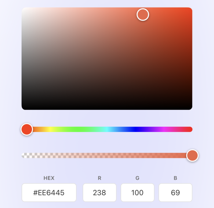
`- Saturation/Value rectangle with current hue
- Hue slider is always visible (required to change hue)
- Value slider is NOT shown (value is controlled in the rectangle)
$3
tsx
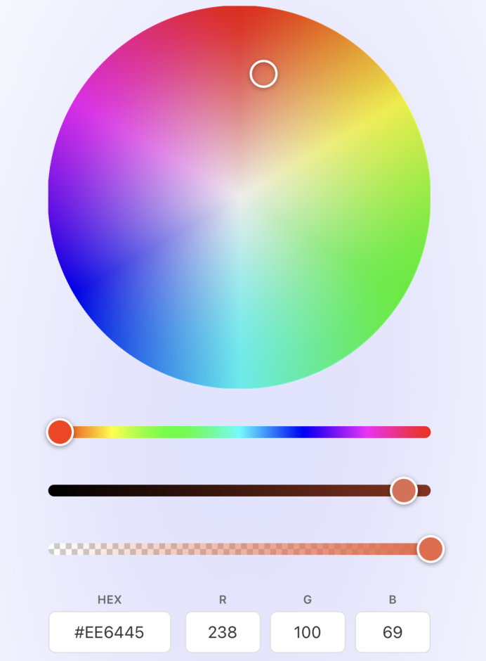
`- Color wheel with hue around the circle and saturation from center
- Value/Brightness slider is shown (to control brightness)
-
prop works to hide the hue sliderAPI Reference
$3
| Prop | Type | Default | Variant | Description |
|------|------|---------|---------|-------------|
|
color | IColor | required | Both | Current color value |
| onChange | (color: IColor) => void | required | Both | Called on every color change during interaction |
| onChangeComplete | (color: IColor) => void | - | Both | Called when interaction ends (finger lifted) |
| variant | 'circle' \| 'rectangle' | 'rectangle' | - | Picker variant |
| width | number | 250 | Both | Width of the picker (diameter for circle) |
| barHeight | number | 10 | Both | Height of slider bars |
| thumbSize | number | 24 | Both | Size of thumb indicators |
| hideHue | boolean | false | Circle only | Hide the hue slider (ignored for rectangle) |
| hideAlpha | boolean | false | Both | Hide the alpha slider |
| hidePreview | boolean | false | Both | Hide the color preview |
| hideInput | boolean | false | Both | Hide the input fields |
| disabled | boolean | false | Both | Disable all interactions |$3
| Feature | Rectangle | Circle |
|---------|-----------|--------|
| Hue selection | Via Hue slider (always shown) | Via color wheel angle |
| Saturation selection | X-axis of rectangle | Distance from center |
| Value/Brightness selection | Y-axis of rectangle | Via Value slider |
| Hue slider | Always visible | Optional (use
hideHue) |
| Value slider | Not shown | Always shown |$3
`typescript
interface IColor {
hex: string; // e.g., "#FF0000" or "#FF0000FF" with alpha
rgb: IRGB;
hsv: IHSV;
}interface IRGB {
r: number; // 0-255
g: number; // 0-255
b: number; // 0-255
a: number; // 0-1
}
interface IHSV {
h: number; // 0-360
s: number; // 0-100
v: number; // 0-100
a: number; // 0-1
}
`$3
#### useColor
tsx
const [color, setColor] = useColor('#FF0000');
`Manages color state with automatic conversion from hex string.
#### useColorWithCallback
tsx
const {
  color,
  setColor,
  handleChange,
  handleChangeComplete,
} = useColorWithCallback('#FF0000', (color) => {
  console.log('Color changed:', color.hex);
});
`Manages color state with a callback for change completion.
$3
Utility for color conversions:
tsx
import { ColorService } from 'react-native-color-picker-palette';// Create color from hex
const color = ColorService.fromHex('#FF5500');
// Create color from RGB
const color = ColorService.fromRgb({ r: 255, g: 85, b: 0, a: 1 });
// Create color from HSV
const color = ColorService.fromHsv({ h: 20, s: 100, v: 100, a: 1 });
// Get string representations
ColorService.toRgbString(color.rgb); // "rgb(255, 85, 0)"
ColorService.toRgbaString(color.rgb); // "rgba(255, 85, 0, 1)"
ColorService.toHslString(color.hsv); // "hsl(20, 100%, 50%)"
`Individual Components
For custom layouts, you can use individual components:
tsx
import {
  Saturation,           // Circular color wheel (for circle variant)
  RectangleSaturation,  // Rectangle saturation/value picker
  Hue,                  // Hue slider
  Alpha,                // Alpha slider
  Value,                // Brightness slider (for circle variant)
  Fields,               // HEX + RGB inputs
  HexField,             // HEX input only
  RgbFields,            // RGB inputs only
  Thumb,                // Thumb indicator
} from 'react-native-color-picker-palette';
`$3
tsx
import React from 'react';
import { View } from 'react-native';
import {
RectangleSaturation,
Hue,
Alpha,
useColor,
} from 'react-native-color-picker-palette';function CustomColorPicker() {
const [color, setColor] = useColor('#FF0000');
return (
onChange={setColor}
width={300}
height={200}
thumbSize={28}
/>
onChange={setColor}
barHeight={12}
thumbSize={24}
/>
onChange={setColor}
barHeight={12}
thumbSize={24}
/>
);
}
`Full vs Lite: When to Use Which?
$3
- You need the smoothest possible gradients
- You're already using in your project
- Visual quality is the top priority$3
- You want zero additional dependencies
- You're using Expo and want to avoid native modules
- Bundle size is a concern
- You need a quick setup without pod installScreenshots
$3
| Rectangle | Circle |
|:---------:|:------:|
| | |
$3
| Rectangle | Circle |
|:---------:|:------:|
|  |
|  |
|
TypeScript Support
This package is written in TypeScript and includes full type definitions:
`tsx
import type {
IColor,
IRGB,
IHSV,
ColorModel,
IColorPickerProps,
ISaturationProps,
IRectangleSaturationProps,
IHueProps,
IAlphaProps,
IValueProps,
IThumbProps,
IFieldsProps,
ILayout,
} from 'react-native-color-picker-palette';
``Contributing
Contributions are welcome! Please feel free to submit a Pull Request.
License
MIT License - see the LICENSE file for details.
Author
Sabri Ghazali
---
Made with React Native