react-native-curved-tab-bar
v0.4.5TypeScript
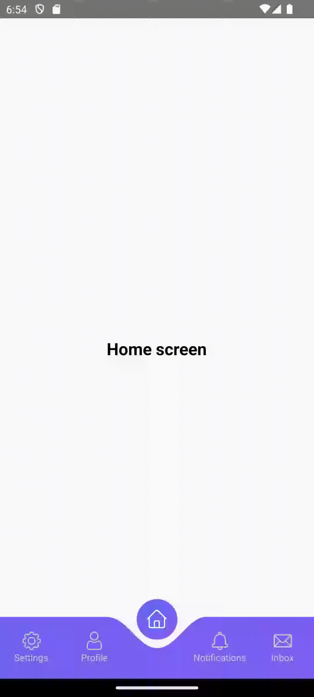
A customizable curved tab bar component for React Native with smooth animations
0/weekUpdated 8 months agoMITUnpacked: 62.9 KB
Published by Ashhar Imam
npm install react-native-curved-tab-barReact Native Curved Tab Bar
A beautiful, customizable curved tab bar component for React Native with smooth animations and floating active tab button.
Features
- 🎨 Customizable gradient backgrounds (pure SVG, no external dependencies)
- 🎯 Smooth spring animations
- 📱 Responsive design that adapts to different screen sizes
- 🔧 Highly configurable with TypeScript support
- 📋 Badge support for notifications
- ⌨️ Optional keyboard hiding
- 🎭 Custom icons and styling
- 📱 iOS and Android compatible
- 🚀 Lightweight with minimal dependencies (only react-native-svg required)
📱 Demo
Installation
``bash`
npm install react-native-curved-tab-baror
yarn add react-native-curved-tab-bar
$3
Make sure you have this peer dependency installed:
`bash`
npm install react-native-svgor
yarn add react-native-svg
#### Additional Setup
For react-native-svg:
- Follow the installation guide: https://github.com/react-native-svg/react-native-svg
Basic Usage
`tsx
import React, { useState } from 'react';
import { View } from 'react-native';
import { CurvedTabBar, TabItem } from 'react-native-curved-tab-bar';
const tabs: TabItem[] = [
{
key: 'home',
label: 'Home',
icon: require('./assets/home-icon.png'),
},
{
key: 'search',
label: 'Search',
icon: require('./assets/search-icon.png'),
},
{
key: 'profile',
label: 'Profile',
icon: require('./assets/profile-icon.png'),
badgeCount: 3,
},
];
const App = () => {
const [activeTab, setActiveTab] = useState(0);
const handleTabPress = (index: number, tab: TabItem) => {
setActiveTab(index);
// Handle navigation or other logic here
console.log('Tab pressed:', tab.key);
};
return (
{/ Your app content /}
activeIndex={activeTab}
onTabPress={handleTabPress}
gradientColors={['#6366f1', '#8b5cf6']}
/>
);
};
export default App;
`
Advanced Usage
`tsx
import React, { useState } from 'react';
import { CurvedTabBar, TabItem } from 'react-native-curved-tab-bar';
const tabs: TabItem[] = [
{
key: 'dashboard',
label: 'Dashboard',
icon: require('./assets/dashboard.png'),
},
{
key: 'analytics',
label: 'Analytics',
icon: require('./assets/analytics.png'),
badgeCount: 12,
},
{
key: 'settings',
label: 'Settings',
icon: require('./assets/settings.png'),
},
];
const AdvancedExample = () => {
const [activeTab, setActiveTab] = useState(0);
return (
activeIndex={activeTab}
onTabPress={(index, tab) => {
setActiveTab(index);
// Custom logic for each tab
if (tab.key === 'analytics') {
// Navigate to analytics screen
}
}}
gradientColors={['#ff6b6b', '#feca57']}
heightPercentage={10}
floatingButtonSize={7}
activeIconColor="#ffffff"
inactiveIconColor="#999999"
activeTextColor="#333333"
inactiveTextColor="#999999"
fontSize={14}
fontFamily="Arial"
hideOnKeyboard={true}
springConfig={{
damping: 15,
stiffness: 150,
}}
shadowConfig={{
shadowColor: '#000',
shadowOffset: { width: 0, height: 5 },
shadowOpacity: 0.3,
shadowRadius: 25,
elevation: 10,
}}
/>
);
};
`
Props
| Prop | Type | Default | Description |
| -------------------- | --------------------------------------- | ------------------------------- | --------------------------------------------------- |
| tabs | TabItem[] | Required | Array of tab items |activeIndex
| | number | Required | Currently active tab index |onTabPress
| | (index: number, tab: TabItem) => void | Required | Callback when tab is pressed |gradientColors
| | string[] | ['#6366f1', '#8b5cf6'] | Background gradient colors |heightPercentage
| | number | 9 | Tab bar height as percentage of screen height |floatingButtonSize
| | number | 6 | Floating button size as percentage of screen height |activeIconColor
| | string | '#ffffff' | Active tab icon tint color |inactiveIconColor
| | string | '#cccccc' | Inactive tab icon tint color |activeTextColor
| | string | activeIconColor | Active tab text color |inactiveTextColor
| | string | '#cccccc' | Inactive tab text color |fontSize
| | number | 12 | Tab label font size |fontFamily
| | string | undefined | Custom font family for labels |hideOnKeyboard
| | boolean | false | Hide tab bar when keyboard is visible |springConfig
| | object | {damping: 12, stiffness: 120} | Animation spring configuration |shadowConfig
| | object | See below | Shadow configuration for floating button |
$3
`tsx`
interface TabItem {
key: string; // Unique identifier
label: string; // Display label
icon: any; // Icon source (require() or URI)
badgeCount?: number; // Optional badge count
}
$3
`tsx`
shadowConfig?: {
shadowColor?: string;
shadowOffset?: { width: number; height: number };
shadowOpacity?: number;
shadowRadius?: number;
elevation?: number; // Android only
}
Default shadow configuration:
`tsx`
{
shadowColor: '#000',
shadowOffset: { width: 0, height: 3 },
shadowOpacity: 0.2,
shadowRadius: 20,
elevation: 8,
}
Customization Examples
$3
`tsx`
gradientColors={['#ff6b6b']} // Will use same color for both ends
/>
$3
`tsx`
gradientColors={['#667eea', '#764ba2']}
activeIconColor="#ffffff"
inactiveIconColor="#a0a0a0"
activeTextColor="#333333"
inactiveTextColor="#888888"
/>
$3
`tsx`
heightPercentage={12} // Taller tab bar
floatingButtonSize={8} // Larger floating button
fontSize={16} // Larger text
/>
Integration with Navigation Libraries
$3
`tsx
import { createBottomTabNavigator } from '@react-navigation/bottom-tabs';
import { CurvedTabBar } from 'react-native-curved-tab-bar';
const Tab = createBottomTabNavigator();
function MyTabs() {
return (
);
}
function CustomTabBar({ state, navigation }) {
const tabs = state.routes.map((route) => ({
key: route.key,
label: route.name,
icon: getIconForRoute(route.name), // Your icon mapping function
}));
return (
activeIndex={state.index}
onTabPress={(index) => {
const route = state.routes[index];
navigation.navigate(route.name);
}}
gradientColors={['#6366f1', '#8b5cf6']}
/>
);
}
`
Troubleshooting
$3
Make sure your icon images are properly imported and accessible:
`tsx
// Correct
icon: require('./assets/home.png');
// Also correct for remote images
icon: {
uri: 'https://example.com/icon.png';
}
`
$3
Try adjusting the spring configuration:
`tsx`
springConfig={{
damping: 15, // Higher = less bouncy
stiffness: 100, // Higher = faster animation
}}
$3
The tab bar uses absolute positioning. Make sure your content has appropriate bottom padding:
`tsx``
License
MIT
Contributing
Contributions are welcome! Please feel free to submit a Pull Request.