react-native-earl-toastify
v1.2.2TypeScript
A beautiful, customizable toast notification library for React Native with animations, multiple toast types, and accessibility support
0/weekUpdated 6 days agoMITUnpacked: 388.5 KB
Published by Ordovez, Earl Romeo
npm install react-native-earl-toastifyreact-native-earl-toastify
A beautiful, customizable toast notification and confirmation modal library for React Native with smooth animations, multiple types, and full accessibility support.
!GitHub stars
!npm
!downloads
!license
✨ Features
$3
- 🎬 6 Animation Types: fade, slide-up, slide-down, slide-left, slide-right, none
- 🎨 5 Toast Types: success, warning, error, info, default + fully customizable
- 📍 3 Positions: top, bottom, center
- 🎯 Always on Top: Toasts render above all other content
- 📱 Full-Width Edge Styling: No rounded corners for top/bottom toasts
$3
- 🎉 Promise-based API:
await modal.confirm() returns true/false
- 🎨 5 Modal Types: confirm, warning, danger, info, custom
- 🎬 4 Animation Types: scale, fade, slide, none
- 🔘 Customizable Buttons: Text, colors, and styles
$3
- 📝 Text Input Mode: Standard text input with validation
- 🔢 OTP/PIN Mode: Separate input boxes for verification codes
- 🔒 Input Restrictions: Letters only, numbers only, no copy/paste, and more
- ✅ Confirmation Text: Require user to type exact text (e.g., "DELETE")
- 🎨 Fully Customizable: Box styles, colors, sizes, and validation
$3
- ♿ WCAG 2.1 AA Accessible: Proper contrast ratios, screen reader support, 48px touch targets
- 🔧 Highly Configurable: Custom icons, colors, styles, and callbacks
- 🪶 Lightweight: Zero external animation dependencies
- 🏛️ New Architecture Ready: Fully compatible with React Native's New Architecture (Fabric)
Snack Preview
https://snack.expo.dev/@rinubi/react-native-earl-toastify
🍞 Toast Preview
|
Success 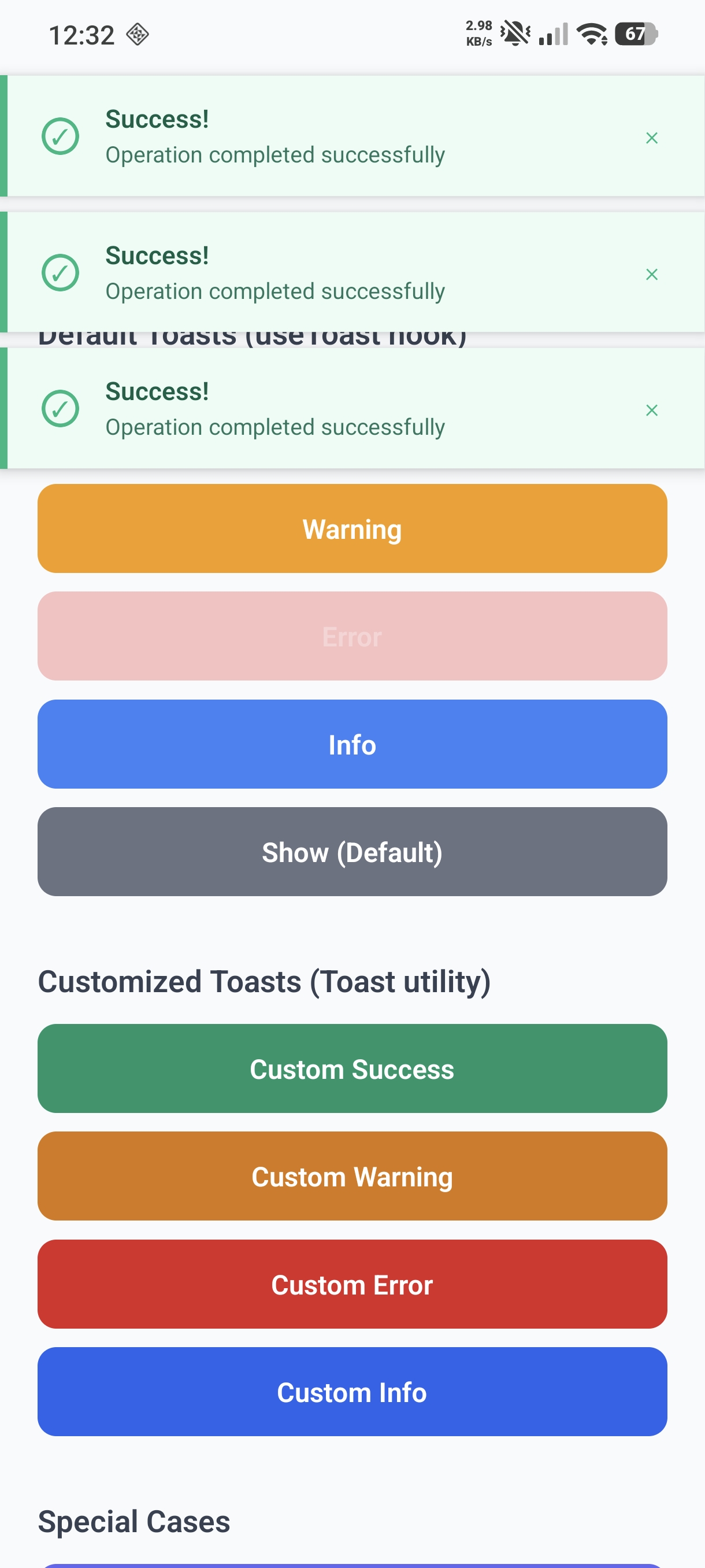
|
Warning 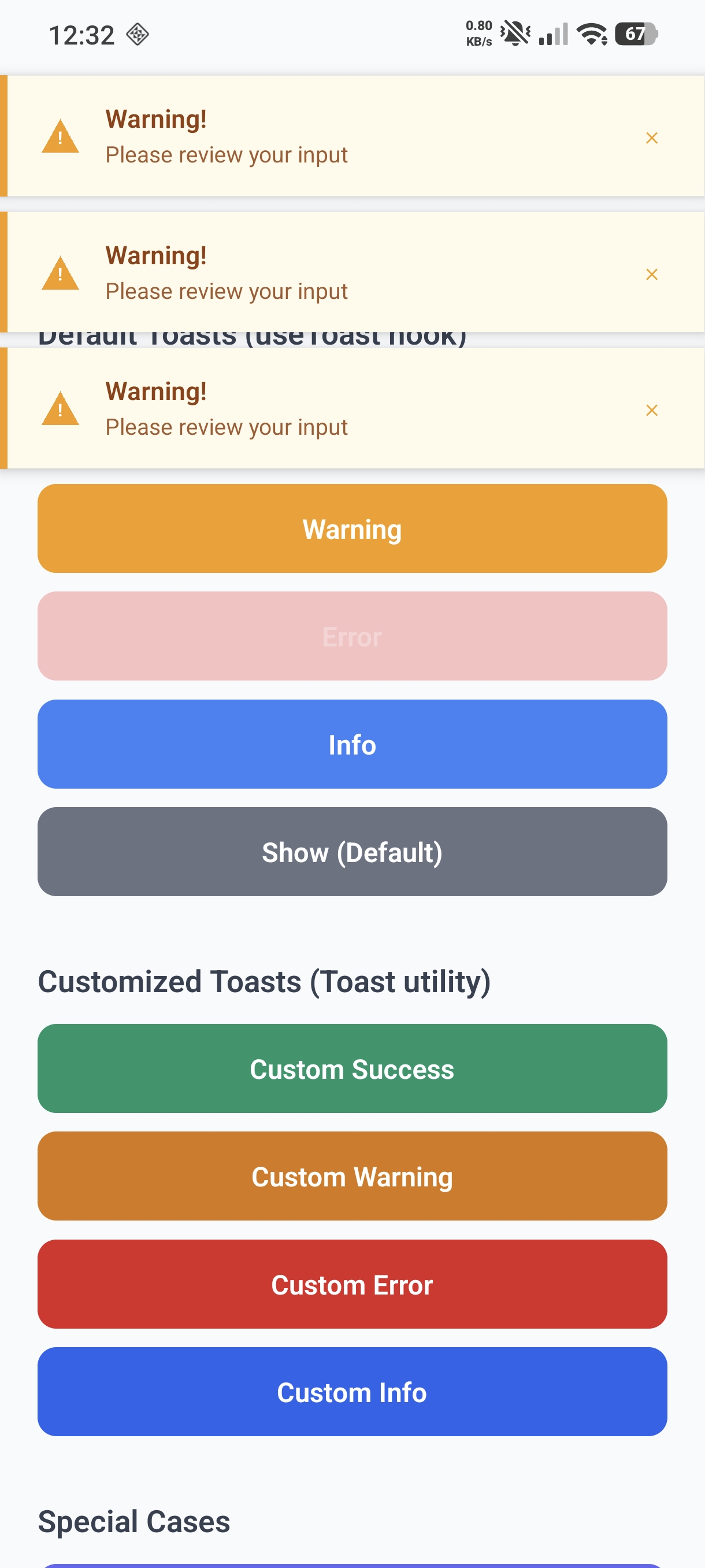
|
Error 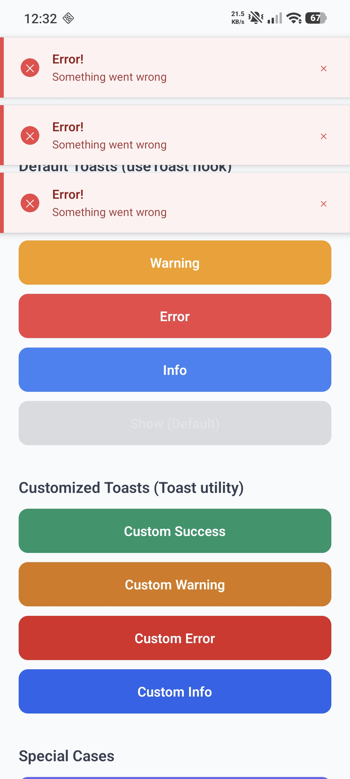
|
|
Info 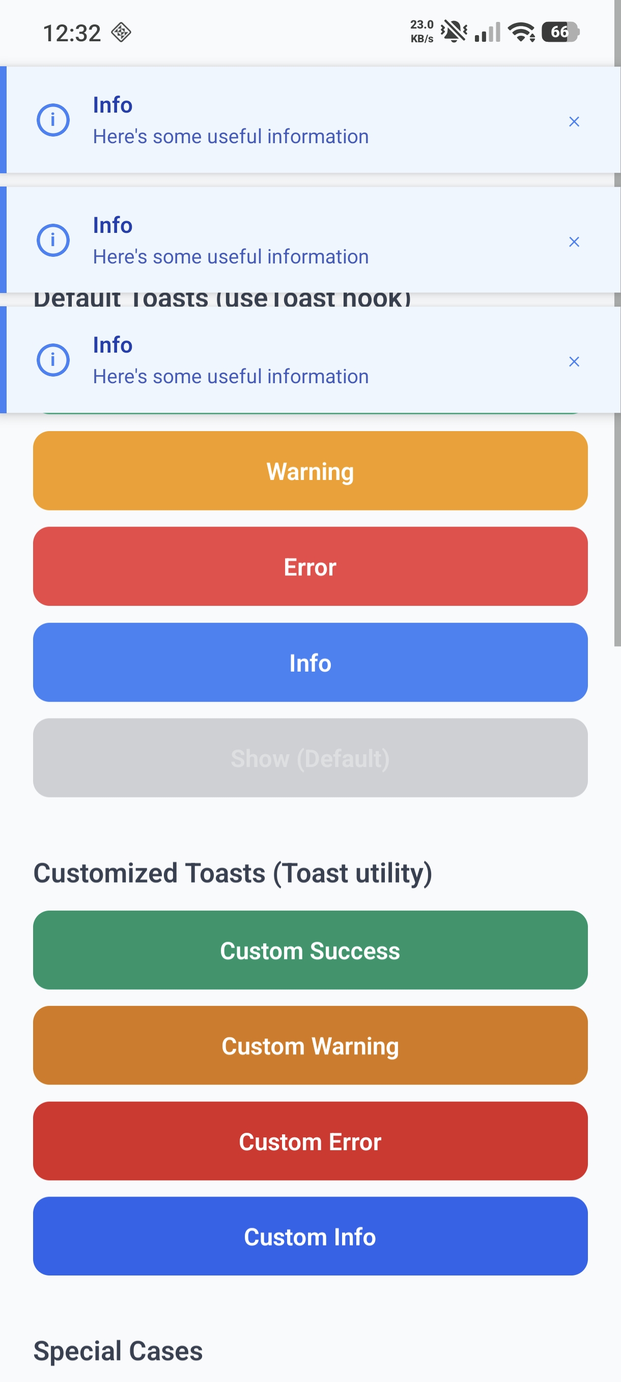
|
Show 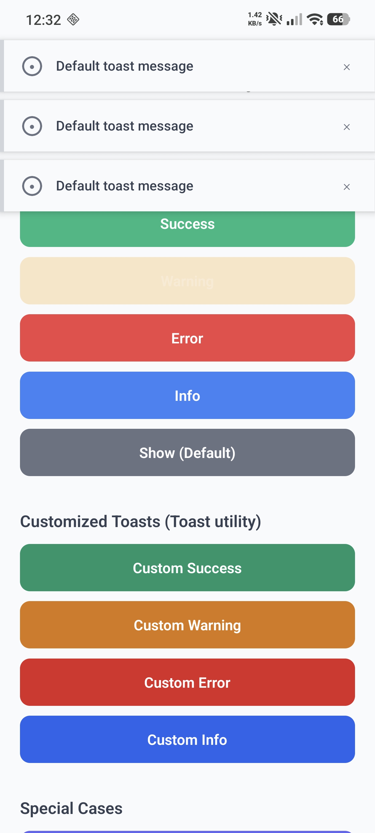
|
🪟 Modal Preview
|
Confirm 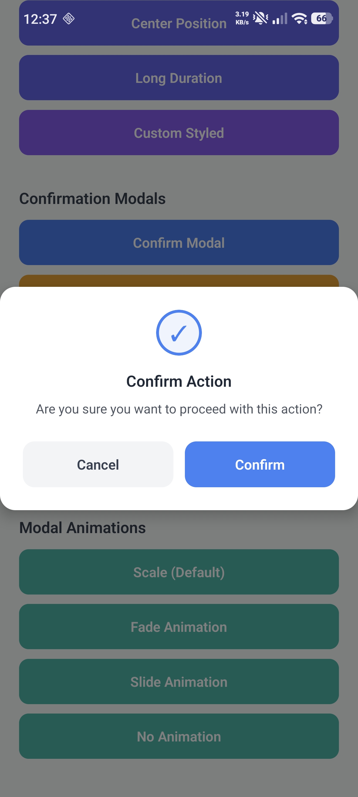
|
Warning 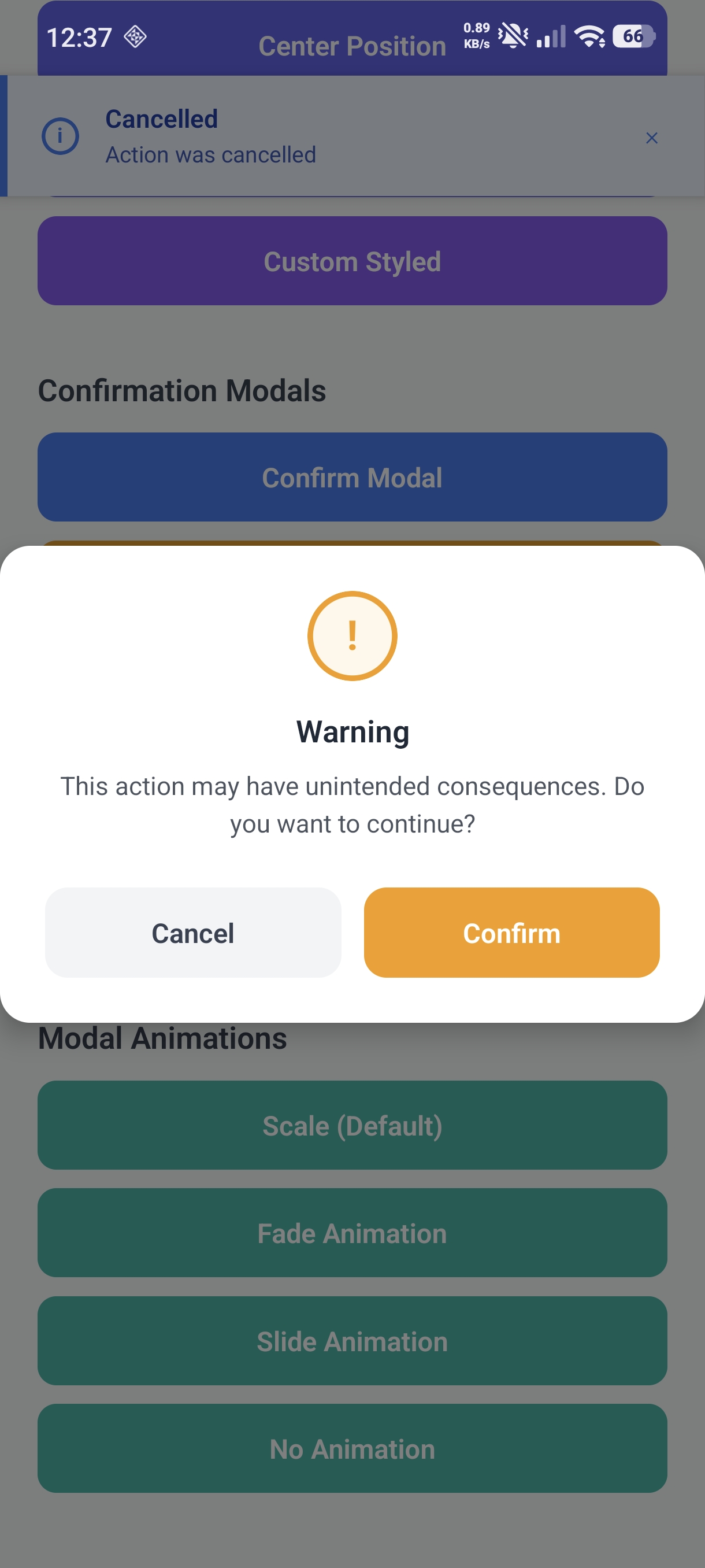
|
Danger 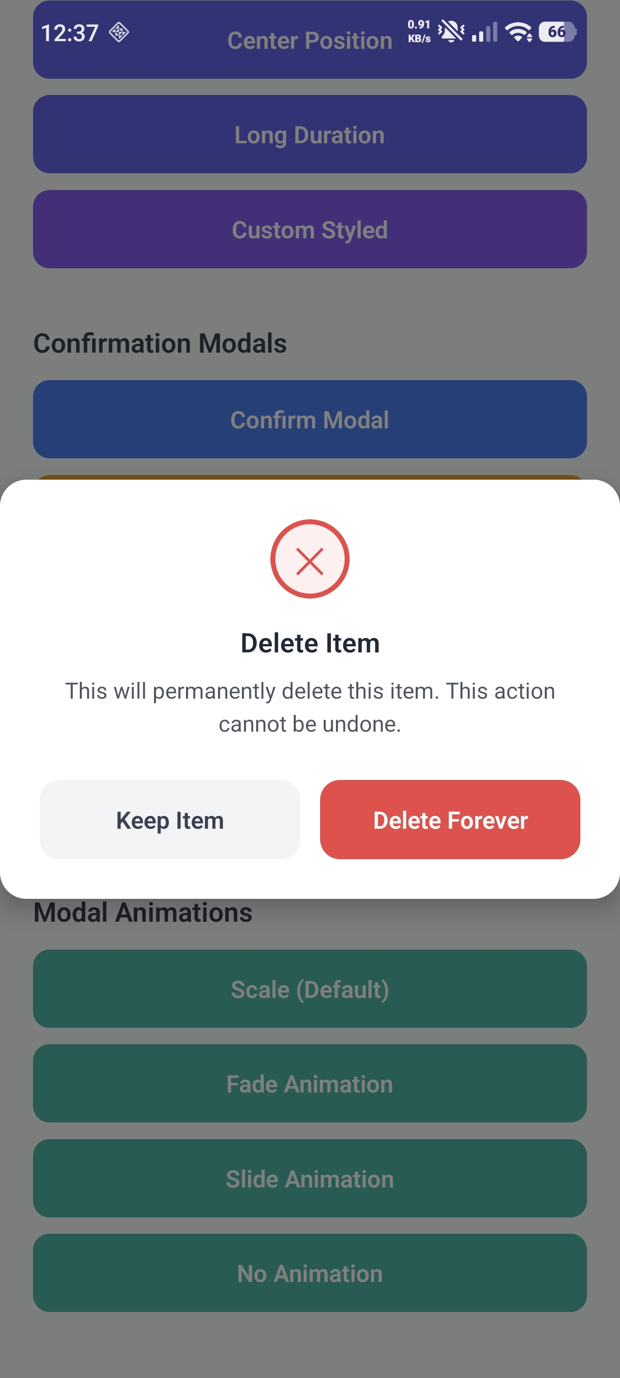
|
|
Info 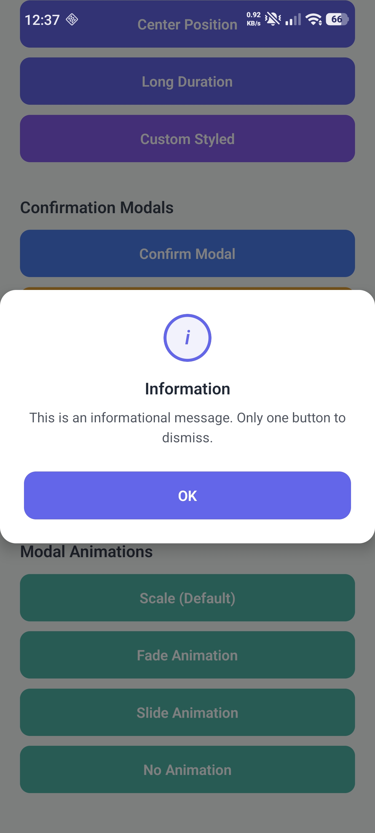
|
Custom 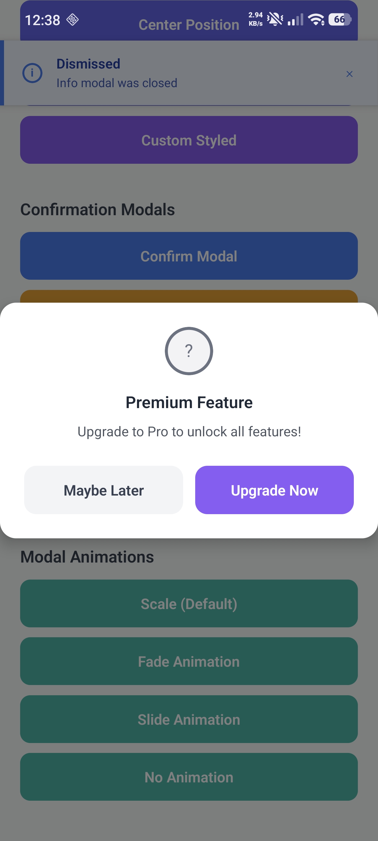
|
✔️ Input Modal Preview
|
Confirm 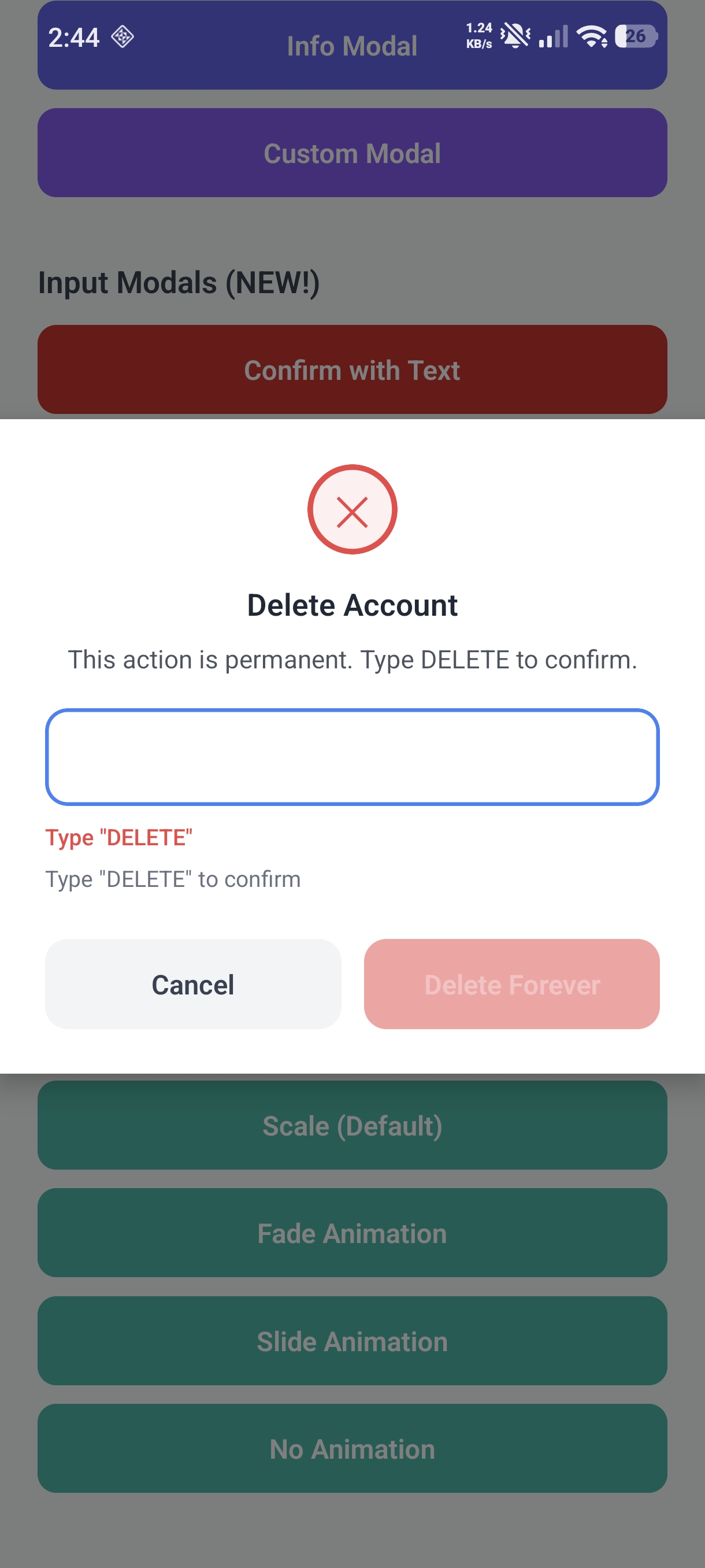
|
Warning 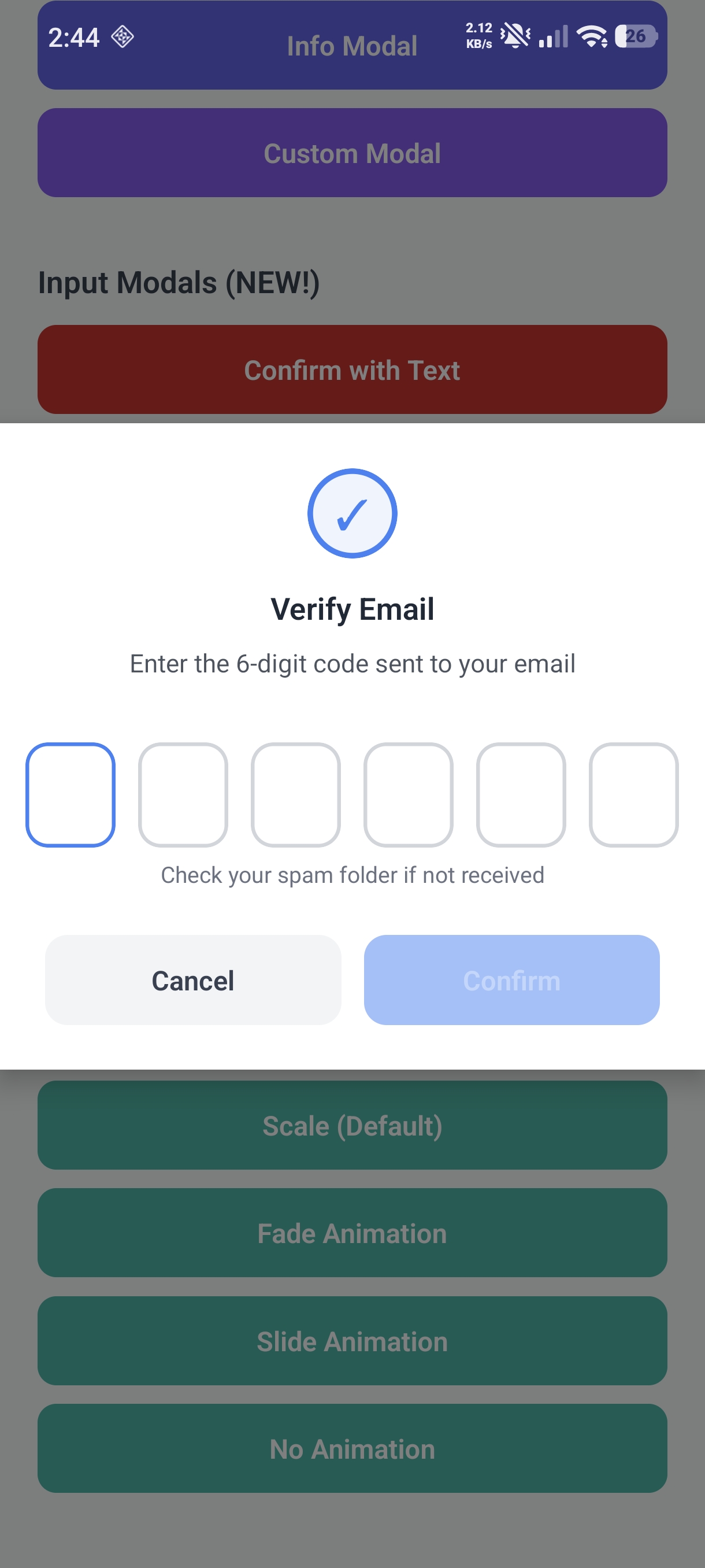
|
Danger 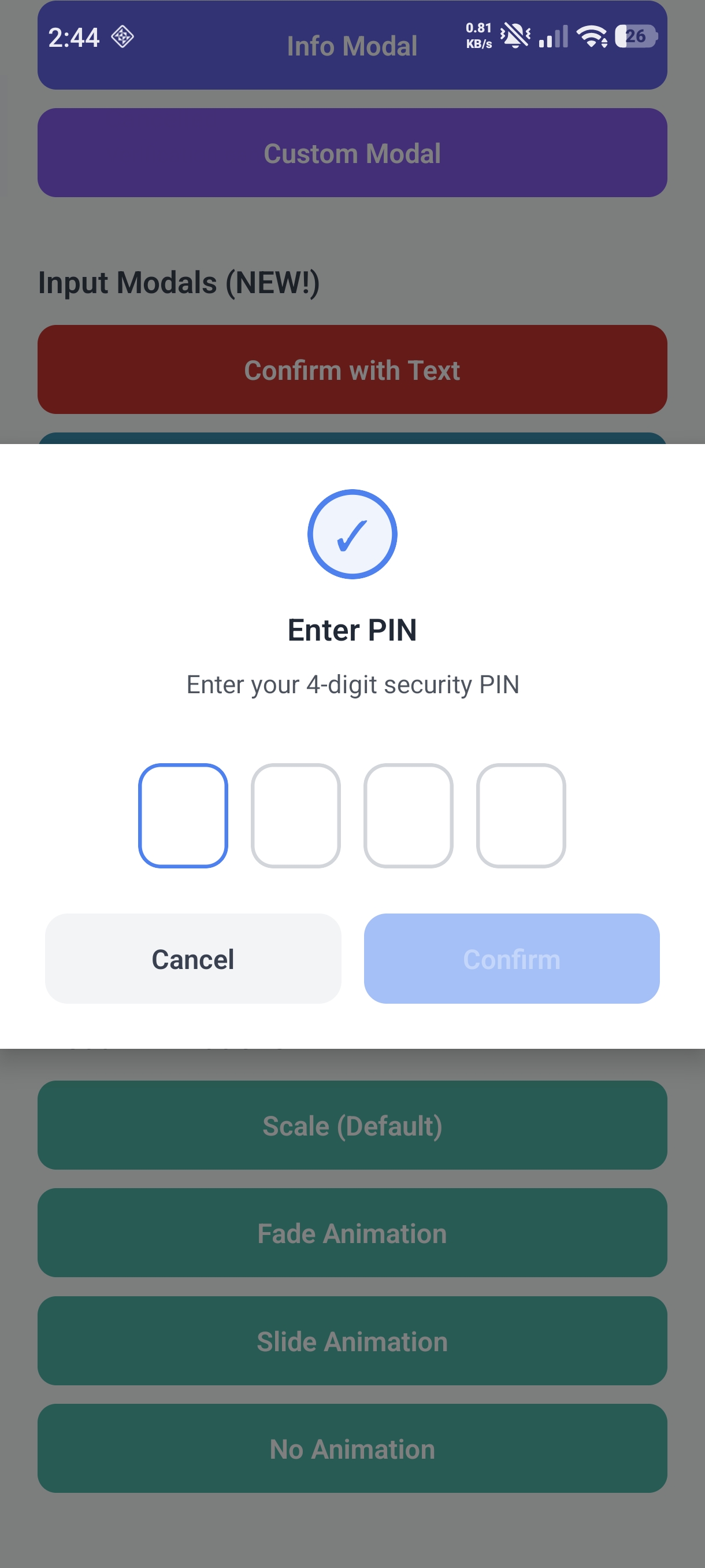
|
|
Info 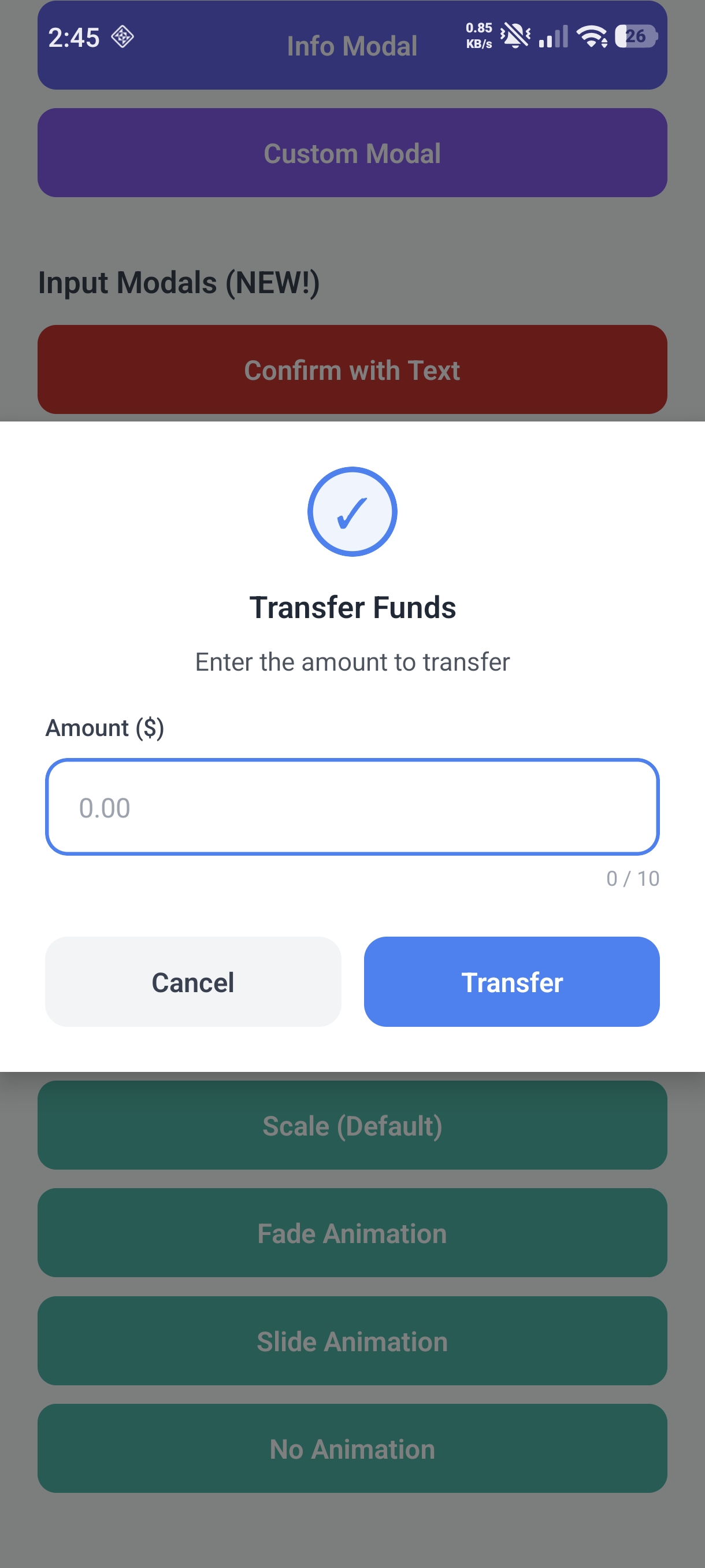
|
Custom 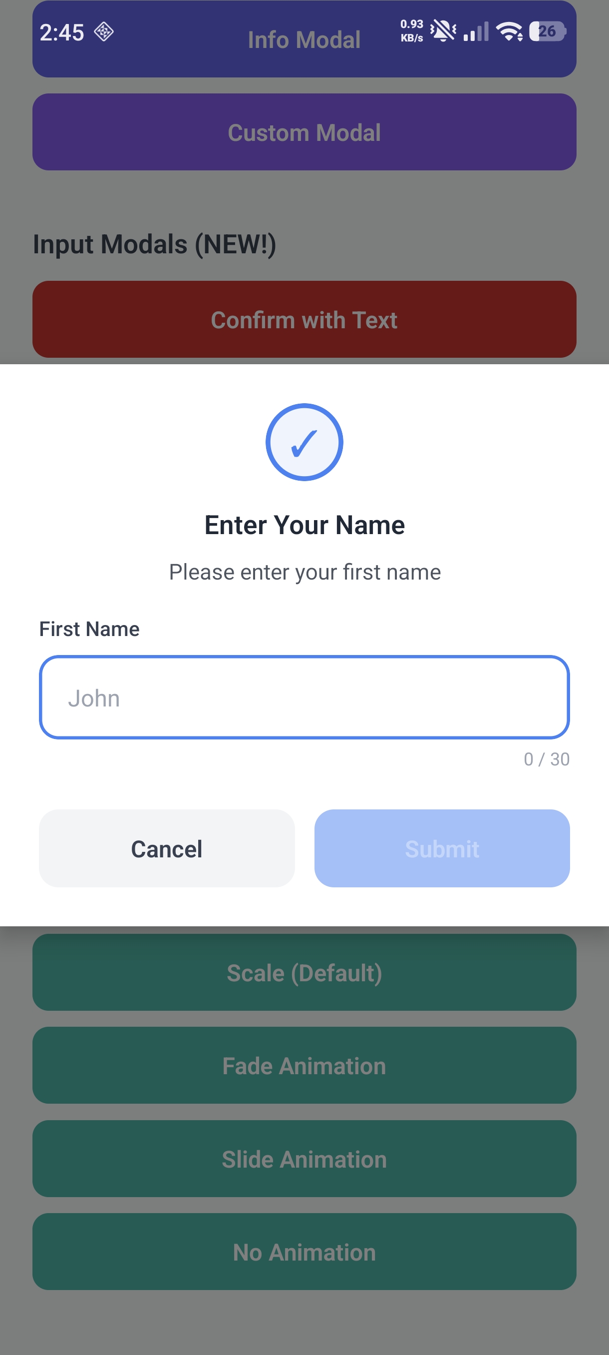
|
Custom 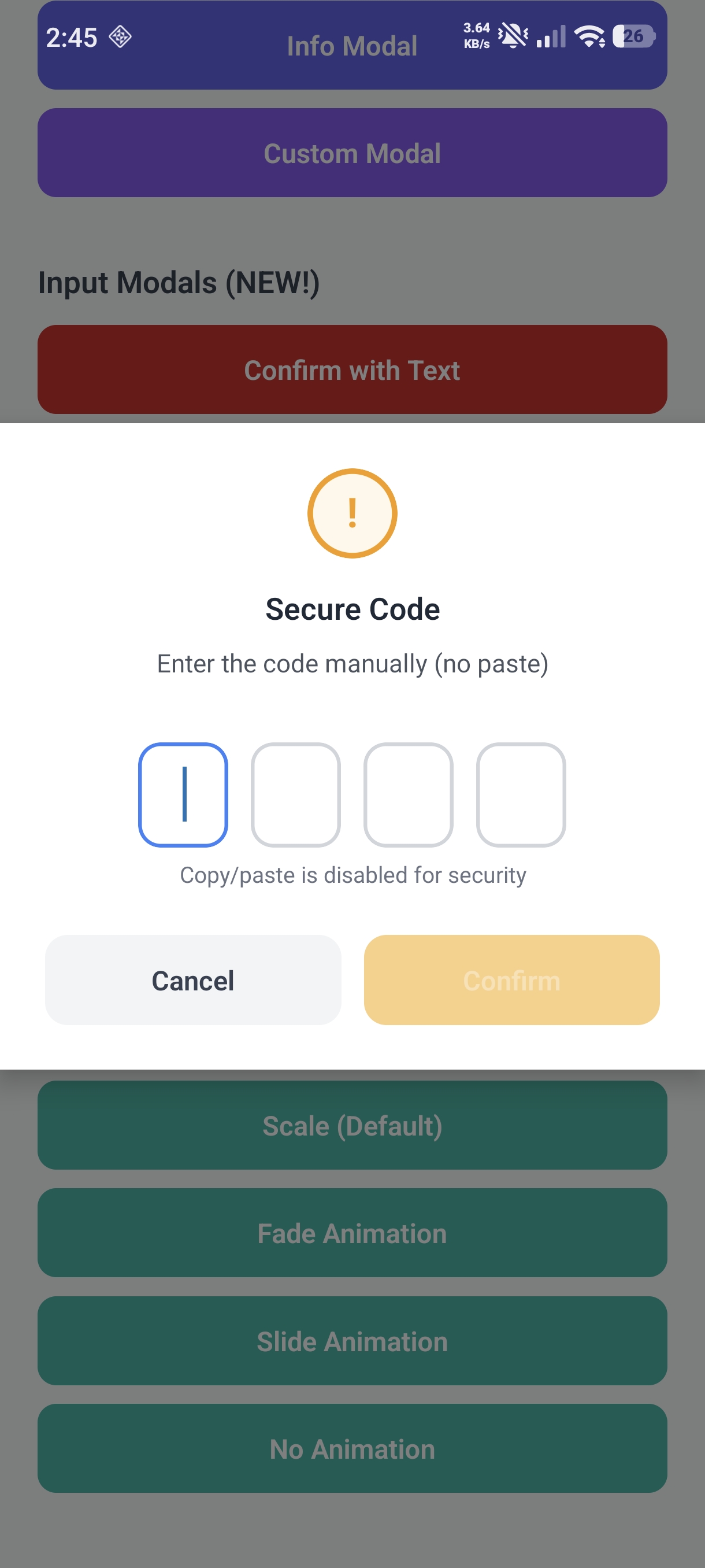
|
$3
https://github.com/user-attachments/assets/0c96e622-eb7e-4074-ac0a-97a0d04a5d31
$3
https://github.com/user-attachments/assets/1b98e721-0aa6-488b-b30b-cc2af8d162cd
$3
https://github.com/user-attachments/assets/1dc2e2bd-8f17-497e-9bb9-82d458f19dc5
📦 Installation
``
bash

npm install react-native-earl-toastify react-native-safe-area-context

or

yarn add react-native-earl-toastify react-native-safe-area-context
`
> [!IMPORTANT]

> This library requires
react-native-safe-area-context as a peer dependency for proper safe area handling across all devices.
🚀 Quick Start
$3
`tsx
import { SafeAreaProvider } from "react-native-safe-area-context";
import { ToastProvider, ModalProvider } from "react-native-earl-toastify";
export default function App() {
return (
);
}
`
$3
`tsx
import { useToast } from "react-native-earl-toastify";
function MyComponent() {
const toast = useToast();
const handleSuccess = () => {
toast.success("Operation completed successfully!");
};
const handleError = () => {
toast.error("Something went wrong");
};
return (
);
}
`
🛠️ Creating a Toast Utility (Recommended)


For easier usage across your app, create a utility file that exposes toast functions globally:


$3
`tsx
// utils/Toast.tsx
import { ToastContextValue, ToastConfig } from "react-native-earl-toastify";
import { CheckCircle, AlertTriangle, XCircle, Info } from "lucide-react-native";
// Store toast context
let toastContext: ToastContextValue | null = null;
export const setToastContext = (context: ToastContextValue) => {
toastContext = context;
};
// Custom defaults for each toast type
const CUSTOM_DEFAULTS: Record> = {
success: {
backgroundColor: "#D1FAE5",
textColor: "#065F46",
borderColor: "#10B981",
animationIn: "up",
animationOut: "down",
position: "bottom",
duration: 3000,
icon:
},
error: {
backgroundColor: "#FEE2E2",
textColor: "#991B1B",
borderColor: "#EF4444",
animationIn: "fade",
animationOut: "fade",
position: "top",
duration: 5000,
icon:
},
warning: {
backgroundColor: "#FEF3C7",
textColor: "#92400E",
borderColor: "#F59E0B",
animationIn: "right",
animationOut: "left",
position: "top",
duration: 4000,
icon:
},
info: {
backgroundColor: "#DBEAFE",
textColor: "#1E40AF",
borderColor: "#3B82F6",
animationIn: "left",
animationOut: "right",
position: "top",
duration: 3000,
icon:
},
};
const parseArgs = (
titleOrMessage: string,
descriptionOrConfig?: string | Partial,
config?: Partial,
) => {
if (typeof descriptionOrConfig === "string") {
return { title: titleOrMessage, message: descriptionOrConfig, config };
}
return { message: titleOrMessage, config: descriptionOrConfig };
};
const Toast = {
success: (
titleOrMessage: string,
descriptionOrConfig?: string | Partial,
config?: Partial,
) => {
const {
title,
message,
config: cfg,
} = parseArgs(titleOrMessage, descriptionOrConfig, config);
toastContext?.show({
...CUSTOM_DEFAULTS.success,
...cfg,
title,
message,
type: "custom",
});
},
error: (
titleOrMessage: string,
descriptionOrConfig?: string | Partial,
config?: Partial,
) => {
const {
title,
message,
config: cfg,
} = parseArgs(titleOrMessage, descriptionOrConfig, config);
toastContext?.show({
...CUSTOM_DEFAULTS.error,
...cfg,
title,
message,
type: "custom",
});
},
warning: (
titleOrMessage: string,
descriptionOrConfig?: string | Partial,
config?: Partial,
) => {
const {
title,
message,
config: cfg,
} = parseArgs(titleOrMessage, descriptionOrConfig, config);
toastContext?.show({
...CUSTOM_DEFAULTS.warning,
...cfg,
title,
message,
type: "custom",
});
},
info: (
titleOrMessage: string,
descriptionOrConfig?: string | Partial,
config?: Partial,
) => {
const {
title,
message,
config: cfg,
} = parseArgs(titleOrMessage, descriptionOrConfig, config);
toastContext?.show({
...CUSTOM_DEFAULTS.info,
...cfg,
title,
message,
type: "custom",
});
},
show: (config: ToastConfig) => toastContext?.show(config),
hide: (id: string) => toastContext?.hide(id),
hideAll: () => toastContext?.hideAll(),
};
export default Toast;
`
$3
`tsx
// components/ToastWrapper.tsx
import React, { useEffect } from "react";
import { useToast } from "react-native-earl-toastify";
import { setToastContext } from "../../utils/Toast";
export const ToastWrapper: React.FC<{ children: React.ReactNode }> = ({
children,
}) => {
const toast = useToast();
useEffect(() => {
setToastContext(toast);
}, [toast]);
return <>{children};
};
`
$3
`tsx
// App.tsx
import { SafeAreaProvider } from "react-native-safe-area-context";
import { ToastProvider } from "react-native-earl-toastify";
import { ToastWrapper } from "./components/ToastWrapper";
export default function App() {
return (
);
}
`
$3
`tsx
// ANY file - no hooks needed!
import Toast from "../utils/Toast";
// Simple message (no title)
Toast.success("Data loaded successfully!");
// With title + description
Toast.success("Success!", "Data loaded successfully");
Toast.error("Error", "Failed to load data");
Toast.warning("Warning", "Please review before submitting");
Toast.info("Info", "New update available");
// With title, description, AND config
Toast.success("Uploaded!", "Your file is ready", { position: "bottom" });
// Custom toast
Toast.show({
message: "Custom notification",
type: "custom",
backgroundColor: "#8B5CF6",
textColor: "#FFFFFF",
position: "bottom",
animationIn: "up",
});
`
> [!TIP]

> This pattern lets you call Toast.success(), Toast.error(), etc. from anywhere - including utility functions, API handlers, and non-component files!
$3
| Prop | Type | Default | Description |
| -------- | --------------------- | ------- | ----------------------------------- |
| config | ToastProviderConfig | {} | Global configuration for all toasts |
#### ToastProviderConfig
`typescript
interface ToastProviderConfig {
defaultPosition?: "top" | "bottom" | "center"; // Default: 'top'
defaultDuration?: number; // Default: 3000 (ms)
defaultAnimationIn?: ToastAnimation; // Default: 'fade'
defaultAnimationOut?: ToastAnimation; // Default: 'fade'
defaultAnimationDuration?: number; // Default: 300 (ms)
maxToasts?: number; // Default: 5
}
`
$3
`typescript
const toast = useToast();
// Quick methods - flexible API
// Option 1: Message only
toast.success("Operation completed!");
// Option 2: Title + Description (both inline or variables)
toast.success("Success!", "Operation completed successfully");
// Option 3: With variables
const title = "Upload Complete";
const message = "Your file has been uploaded";
toast.success(title, message); // Works with variables too!
// Option 4: Message + Config
toast.success("Saved!", { duration: 5000, position: "bottom" });
// Option 5: Title + Description + Config
toast.success("Saved!", "Changes have been applied", { position: "bottom" });
// Same API for all types:
toast.warning(title, message);
toast.error(title, message);
toast.info(title, message);
// Custom toast with full config
toast.show(config: ToastConfig);
// Control methods
toast.hide(id: string); // Hide specific toast
toast.hideAll(); // Hide all toasts
`
$3


| Option              | Type                                                                   | Default      | Description                                   |

| ------------------- | ---------------------------------------------------------------------- | ------------ | --------------------------------------------- |

|
message | string | required | Toast message |
| type | 'success' \| 'warning' \| 'error' \| 'info' \| 'default' \| 'custom' | 'default' | Toast type |
| position | 'top' \| 'bottom' \| 'center' | 'top' | Screen position |
| duration | number | 3000 | Auto-dismiss time in ms (0 = no auto-dismiss) |
| animationIn | ToastAnimation | 'fade' | Enter animation |
| animationOut | ToastAnimation | 'fade' | Exit animation |
| animationDuration | number | 300 | Animation duration in ms |
| dismissable | boolean | true | Can dismiss by tapping |
| icon | ReactNode | - | Custom icon element |
| hideIcon | boolean | false | Hide the icon |
| backgroundColor | string | - | Custom background color |
| textColor | string | - | Custom text color |
| borderColor | string | - | Custom border color |
| style | ViewStyle | - | Custom container style |
| textStyle | TextStyle | - | Custom text style |
| onShow | () => void | - | Callback when shown |
| onHide | () => void | - | Callback when hidden |
| onPress | () => void | - | Callback when pressed |
$3
`typescript
type ToastAnimation = "fade" | "up" | "down" | "left" | "right" | "none";
`
| Animation | Description              |

| --------- | ------------------------ |

|
fade | Fade in/out |
| up | Slide from bottom |
| down | Slide from top |
| left | Slide from right |
| right | Slide from left |
| none | Instant appear/disappear |
🎨 Examples
$3
`tsx
toast.show({
message: "Custom purple toast!",
type: "custom",
backgroundColor: "#8B5CF6",
textColor: "#FFFFFF",
borderColor: "#7C3AED",
position: "bottom",
animationIn: "up",
animationOut: "down",
});
`
$3
`tsx
import { CheckCircle } from "lucide-react-native";
toast.success("Saved!", {
icon:
});
`
$3
`tsx
toast.info("Please wait...", {
dismissable: false,
duration: 0, // Won't auto-dismiss
});
// Later, dismiss programmatically
const id = toast.info("Loading...", { dismissable: false, duration: 0 });
// ... after loading complete
toast.hide(id);
`
$3
`tsx
toast.warning("Session expiring soon", {
position: "center",
duration: 5000,
onPress: () => {
// Handle press - e.g., refresh session
refreshSession();
},
onHide: () => {
console.log("Toast dismissed");
},
});
`
$3
`tsx
// Slide from bottom
toast.success("Uploaded!", {
position: "bottom",
animationIn: "up",
animationOut: "down",
});
// Slide from side
toast.info("New message", {
animationIn: "right",
animationOut: "left",
});
// Instant (no animation)
toast.error("Error!", {
animationIn: "none",
animationOut: "none",
});
`
🎯 Positioning Behavior


| Position | Behavior                                                               |

| -------- | ---------------------------------------------------------------------- |

|
top | Full-width, no rounded corners, uses SafeAreaView for safe area insets |
| bottom | Full-width, no rounded corners, uses SafeAreaView for safe area insets |
| center | Centered with margins and rounded corners |
🎨 Default Color Schemes
| Type | Background | Text | Border |
| ------- | ---------- | --------- | --------- |
| Success | #ECFDF5 | #065F46 | #10B981 |
| Warning | #FFFBEB | #92400E | #F59E0B |
| Error | #FEF2F2 | #991B1B | #EF4444 |
| Info | #EFF6FF | #1E40AF | #3B82F6 |
| Default | #F9FAFB | #374151 | #D1D5DB |
All color combinations meet WCAG 2.1 AA contrast requirements (4.5:1 minimum).
♿ Accessibility
- All toasts are announced to screen readers via AccessibilityInfo.announceForAccessibility
- Proper accessibilityRole="alert" and accessibilityLiveRegion="polite" attributes
- Dismissable toasts have clear accessibility hints
- Color contrasts meet WCAG 2.1 AA standards
---
🔔 Confirmation Modal
Modal Quick Start
$3
`tsx
import { useModal, useToast } from "react-native-earl-toastify";
function MyComponent() {
const toast = useToast();
const modal = useModal();
const handleDelete = async () => {
const confirmed = await modal.confirm(
"Delete Item",
"Are you sure you want to delete this item?",
);
if (confirmed) {
toast.success("Item deleted successfully!");
}
};
return ;
}
`
Modal Methods
`typescript
const modal = useModal();
// Confirmation modal (blue)
const confirmed = await modal.confirm("Title", "Message");
// Warning modal (amber)
const proceed = await modal.warning(
"Warning",
"This action may have consequences",
);
// Danger modal (red) - for destructive actions
const deleted = await modal.danger("Delete Account", "This cannot be undone");
// Info modal (purple) - single "OK" button
await modal.info("Information", "Your changes have been saved");
// Custom modal with full configuration
await modal.show({
title: "Custom Modal",
message: "Fully customizable message",
type: "custom",
confirmText: "Accept",
cancelText: "Decline",
confirmButtonColor: "#8B5CF6",
});
`
ModalConfig


| Option                   | Type             | Default      | Description                      |

| ------------------------ | ---------------- | ------------ | -------------------------------- |

|
title | string | required | Modal title |
| message | string | required | Modal message |
| type | ModalType | 'confirm' | Modal type |
| confirmText | string | 'Confirm' | Confirm button text |
| cancelText | string | 'Cancel' | Cancel button text |
| showCancel | boolean | true | Show cancel button |
| dismissOnBackdrop | boolean | true | Tap backdrop to dismiss |
| animationIn | ModalAnimation | 'scale' | Enter animation |
| animationOut | ModalAnimation | 'scale' | Exit animation |
| icon | ReactNode | - | Custom icon element |
| hideIcon | boolean | false | Hide the icon |
| backgroundColor | string | - | Custom background color |
| textColor | string | - | Custom text color |
| confirmButtonColor | string | - | Custom confirm button color |
| confirmButtonTextColor | string | - | Custom confirm button text color |
| cancelButtonColor | string | - | Custom cancel button color |
| cancelButtonTextColor | string | - | Custom cancel button text color |
Modal Types
| Type | Icon | Confirm Button | Use Case |
| --------- | ---- | -------------- | ---------------------------- |
| confirm | ✓ | Blue | Standard confirmations |
| warning | ! | Amber | Warning/caution dialogs |
| danger | ✕ | Red | Destructive actions (delete) |
| info | i | Purple | Informational dialogs |
| custom | ? | Blue | Fully customizable |
Modal Animation Types
| Animation | Description |
| --------- | ------------------------ |
| scale | Scale and fade (default) |
| fade | Fade in/out |
| slide | Slide from bottom |
| none | Instant appear/disappear |
Modal Examples
$3
`tsx
const handleDelete = async () => {
const confirmed = await modal.danger(
"Delete Account",
"This will permanently delete your account and all data. This action cannot be undone.",
{
confirmText: "Delete Forever",
cancelText: "Keep Account",
},
);
if (confirmed) {
await deleteAccount();
}
};
`
$3
`tsx
await modal.show({
title: "Premium Feature",
message: "Upgrade to Pro to unlock this feature!",
type: "custom",
confirmText: "Upgrade Now",
cancelText: "Maybe Later",
confirmButtonColor: "#8B5CF6",
confirmButtonTextColor: "#FFFFFF",
hideIcon: true,
});
`
$3
`tsx
await modal.info("Success!", "Your profile has been updated successfully.");
// User clicks "OK" to dismiss
`
---


📝 Input Modal (NEW!)


Input modals allow you to collect user input for sensitive confirmations such as:


- Confirmation text: E.g., type "DELETE" to confirm account deletion

- OTP/Verification codes: 6-digit codes sent via email or SMS

- PIN entry: 4-digit secure PIN input


Input Modal Methods
`typescript
const modal = useModal();
// Text input with confirmation text (user must type exact text)
const result = await modal.confirmWithText(
"Delete Account",
"Type DELETE to confirm account deletion",
"DELETE",
{ caseSensitive: false },
);
if (result.confirmed) {
// User typed "DELETE" and confirmed
console.log("User typed:", result.value);
}
// OTP/Verification code input
const otpResult = await modal.otp(
"Verify Email",
"Enter the 6-digit code sent to your email",
);
if (otpResult.confirmed) {
console.log("Code entered:", otpResult.value); // e.g., "123456"
}
// PIN input (masked by default)
const pinResult = await modal.pin("Enter PIN", "Enter your 4-digit PIN");
// Custom input modal with full configuration
const customResult = await modal.input({
title: "Enter Amount",
message: "How much would you like to transfer?",
placeholder: "0.00",
keyboardType: "numeric",
restrictions: {
numbersOnly: true,
maxLength: 10,
},
});
`
InputModalConfig


| Option              | Type                | Default      | Description                                   |

| ------------------- | ------------------- | ------------ | --------------------------------------------- |

|
title | string | required | Modal title |
| message | string | required | Modal message |
| inputMode | InputMode | 'text' | Input type: text, otp, or pin |
| placeholder | string | - | Placeholder text for text input |
| defaultValue | string | - | Pre-filled value |
| restrictions | InputRestrictions | - | Validation and input restrictions |
| otpConfig | OtpConfig | - | OTP/PIN box configuration |
| validateOnChange | boolean | false | Show validation errors as user types |
| customValidator | function | - | Custom validation function |
| inputLabel | string | - | Label text above the input |
| helperText | string | - | Helper text below the input |
| keyboardType | KeyboardType | 'default' | Keyboard type |
| secureTextEntry | boolean | false | Mask input (for text mode) |
| autoFocus | boolean | true | Auto-focus input when modal opens |
| dismissOnBackdrop | boolean | false | Tap backdrop to dismiss (defaults to false) |
| rounded | boolean | false | Enable rounded corners with margins |
> [!TIP]
> Input modals automatically move up when the keyboard appears to keep input fields and buttons visible.
InputRestrictions
| Option | Type | Description |
| ------------------ | --------- | ------------------------------------------- |
| lettersOnly | boolean | Allow only letters (a-zA-Z) |
| numbersOnly | boolean | Allow only numbers (0-9) |
| alphanumericOnly | boolean | Allow only alphanumeric (a-zA-Z0-9) |
| disableCopyPaste | boolean | Disable copy/paste functionality |
| uppercase | boolean | Force uppercase input |
| lowercase | boolean | Force lowercase input |
| minLength | number | Minimum character length |
| maxLength | number | Maximum character length |
| pattern | RegExp | Custom regex pattern for validation |
| patternError | string | Error message when pattern doesn't match |
| confirmationText | string | Required text (user must type exactly this) |
| caseSensitive | boolean | Case-sensitive confirmation text matching |
| trimOnSubmit | boolean | Trim whitespace from value on submit |
OtpConfig (for OTP/PIN modes)
| Option | Type | Default | Description |
| ----------------------- | --------- | -------------- | ------------------------------------ |
| length | number | 6/4 | Number of input boxes (6 OTP, 4 PIN) |
| masked | boolean | false/true | Mask input with dots (true for PIN) |
| autoSubmit | boolean | false | Auto-submit when all boxes filled |
| boxWidth | number | 48 | Input box width in pixels |
| boxHeight | number | 56 | Input box height in pixels |
| boxGap | number | 12 | Gap between boxes in pixels |
| boxBorderRadius | number | 12 | Box border radius |
| activeBorderColor | string | #3B82F6 | Focused box border color |
| inactiveBorderColor | string | #D1D5DB | Unfocused box border color |
| filledBackgroundColor | string | #F3F4F6 | Filled box background color |
| textColor | string | #1F2937 | Text color inside boxes |
| fontSize | number | 24 | Font size inside boxes |
Input Modal Examples
$3
`tsx
const handleDeleteAccount = async () => {
const result = await modal.confirmWithText(
"Delete Account",
"This action is permanent. Type DELETE to confirm.",
"DELETE",
{
type: "danger",
confirmText: "Delete Forever",
restrictions: {
uppercase: true, // Force uppercase
caseSensitive: false, // "delete" or "DELETE" both work
},
},
);
if (result.confirmed) {
await deleteUserAccount();
toast.success("Account deleted");
}
};
`
$3
`tsx
const handleVerifyEmail = async () => {
const result = await modal.otp(
"Verify Your Email",
"Enter the 6-digit code we sent to you",
{
type: "confirm",
confirmText: "Verify",
helperText: "Didn't receive the code? Check your spam folder",
otpConfig: {
length: 6,
autoSubmit: true, // Submit automatically when 6 digits entered
},
restrictions: {
numbersOnly: true,
disableCopyPaste: false, // Allow pasting code
},
},
);
if (result.confirmed) {
const isValid = await verifyOtpCode(result.value);
if (isValid) {
toast.success("Email verified!");
} else {
toast.error("Invalid code. Please try again.");
}
}
};
`
$3
`tsx
const handleEnterPin = async () => {
const result = await modal.pin(
"Enter Your PIN",
"Enter your 4-digit security PIN",
{
otpConfig: {
length: 4,
masked: true, // Shows dots instead of numbers
},
restrictions: {
numbersOnly: true,
disableCopyPaste: true, // Prevent copy/paste for security
},
},
);
if (result.confirmed) {
const isCorrect = await validatePin(result.value);
if (isCorrect) {
// Proceed with secure action
}
}
};
`
$3
`tsx
const handleTransfer = async () => {
const result = await modal.input({
title: "Transfer Funds",
message: "Enter the amount to transfer",
inputMode: "text",
inputLabel: "Amount ($)",
placeholder: "0.00",
keyboardType: "decimal-pad",
restrictions: {
pattern: /^\d+(\.\d{0,2})?$/,
patternError: "Please enter a valid amount (e.g., 10.00)",
maxLength: 10,
},
customValidator: (value) => {
const amount = parseFloat(value);
if (amount < 1) return "Minimum transfer is $1.00";
if (amount > 10000) return "Maximum transfer is $10,000.00";
return null; // Valid
},
confirmText: "Transfer",
type: "confirm",
});
if (result.confirmed) {
await processTransfer(parseFloat(result.value));
toast.success(Transferred $${result.value});
}
};
`
$3
`tsx
const result = await modal.input({
title: "Enter Your Name",
message: "Please enter your first name",
inputLabel: "First Name",
placeholder: "John",
restrictions: {
lettersOnly: true, // Only a-z, A-Z allowed
minLength: 2,
maxLength: 50,
},
});
``
---
📄 License
MIT © Earl