react-native-flash-message
v0.4.2TypeScript
React Native flashbar and top notification alert utility
0/weekUpdated 2 years agoMITUnpacked: 61.7 KB
Published by Lucas Ferreira
npm install react-native-flash-messagereact-native-flash-message
Flash Message is a React Native module to help you easily create highly customizable flashbars, top notifications or alerts (with iPhone X, XR, XS and XS Max "notch" support).


Installation
Since the library is a JS-based solution, to install the latest version of react-native-flash-message you only need to run:
``bash`
npm install --save react-native-flash-message
or
`bash`
yarn add react-native-flash-message
Try it out
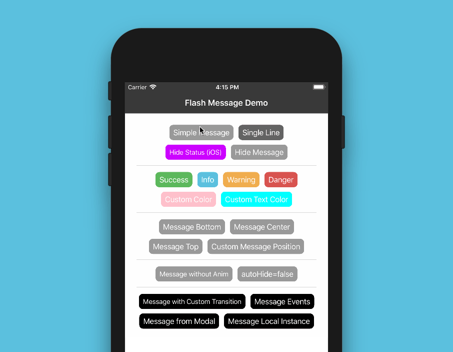
You can try out the Flash Message Playground app to get a tease of the functionalities in this lib.
Basic Usage
The _FlashMessage component_ is built for global use, so you have to instance this component once in your main app screen always as the last inserted component:
`jsx
import React from "react";
import { View } from "react-native";
import FlashMessage from "react-native-flash-message";
function App() {
return (
{/ GLOBAL FLASH MESSAGE COMPONENT INSTANCE /}
);
}
`
After that you only need to call showMessage or hideMessage methods from anywhere in your app.
If you don't need a global use for _(e.g. will use only in one screen)_ you can instance your _FlashMessage Component_ with a ref ID _(or other capture ref method)_:
`jsxref
as a prop /}`
$3
Now that you already instantiated the global _FlashMessage component_, when you need to show some message in your app you could use the showMessage method in any screen or view. This is a global method that receive a _message object_ with your message detail:
`jsx
import React from "react";
import { View, Button } from "react-native";
import { showMessage, hideMessage } from "react-native-flash-message";
function MyScreen() {
return (
/ HERE IS WHERE WE'RE GOING TO SHOW OUR FIRST MESSAGE /
showMessage({
message: "Simple message",
type: "info",
});
}}
title="Request Details"
color="#841584"
/>
);
}
`
The message object obligatorily requires some message attribute. If you need to show a message with two lines _(title and more details)_ you could use message attr for title and description attr for details line:
`javascript`
showMessage({
message: "Hello World",
description: "This is our second message",
type: "success",
});
The type attribute set the type and color of your flash message, default options are _"success" (green), "warning" (orange), "danger" (red), "info" (blue) and "default" (gray)_.
By default all of the messages will be displayed with transitions and with autoHide after _1850 ms_ enabled. If you need to programmatically hide any message, you can call hideMessage() .
Other message object attributes will be detailed below.
Props
| Property | Default | In Message Object | Description |
| ---------------------- | ------------------------ | ----------------- | ---------------------------------------------------------------------------------------------------------------------------------------------------------------------------------------------------------------------------------------------------------------------------------------------------------------------------------------------------------------------------------------------------------------------------------------- |
| hideOnPress | true | Yes | Controls if the flash message can be closed on press |none
| onPress | | Yes | onPress callback for flash message press |none
| onLongPress | | Yes | onLongPress callback for flash message press |true
| animated | | Yes | Controls if the flash message will be shown with animation or not |225
| animationDuration | | Yes | Animations duration/speed |true
| autoHide | | Yes | Controls if the flash message can hide itself after some duration time |1850
| duration | | Yes | How many milliseconds the flash message will be shown if the autoHide it's true |false
| hideStatusBar | | Yes | Controls if the flash message will auto hide the native status bar. _Note: Works OK in iOS, not all Android versions support this._ |none
| statusBarHeight | | Yes | Use this prop to set a custom status bar height that will be add in flash message padding top calc |false
| floating | | Yes | The floating prop unstick the message from the edges and applying some border radius to component |top
| position | | Yes | The position prop set the position of a flash message. _Expected options: "top" (default), "bottom", "center" or a custom object with { top, left, right, bottom } position_ |none
| icon | | Yes | The icon prop could be a render function that return a new JSX Element to be placed in icon position OR a definition of the graphical icon of a flash message. _Expected options: "none" (default), "auto" (guided by type), "success", "info", "warning", "danger", a custom icon (render function) or a custom object with icon type/name and position (left or right) attributes, e.g.: { icon: "success", position: "right" }_ |none
| style | | Yes | Apply a custom style object in flash message container |none
| textStyle | | Yes | Apply a custom style object in flash message descript/text text label |none
| titleStyle | | Yes | Apply a custom style object in flash message title text label |none
| titleProps | | Yes | Set a custom props object in flash message title text label |none
| textProps | | Yes | Set a custom props object in flash message all text components |none
| iconProps | | Yes | Set a custom props object to use inside the renderFlashMessageIcon method as third argument |none
| renderBeforeContent | | Yes | Render custom JSX before title in flash message. |none
| renderCustomContent | | Yes | Render custom JSX below title in flash message. |none
| renderAfterContent | | Yes | Render custom JSX after the title (or description) of a flash message. |renderFlashMessageIcon
| renderFlashMessageIcon | | Yes | Set a custom render function for inside message icons |FlashMessageTransition
| transitionConfig | | No | Set the transition config function used in shown/hide anim interpolations |true
| canRegisterAsDefault | | No | Use to handle if the instance can be registed as default/global instance |DefaultFlash
| MessageComponent | | No | Set the default flash message render component used to show all the messages |
Message Object
When you call showMessage method you'll need to pass a _message object_ to show your message. In this _call_ you could pass some custom attributes to customize your message. Most of the FlashMessage Component props can be passed in runtime calls of showMessage. This common props/attributes are identified in Props table as _In Message Object_.
If you need to customize de background color or text color of your message beyond the default types _(success, warning, info and danger)_ you could use the backgroundColor or/and color attributes in your _message object_:
`javascript`
showMessage({
message: "My message title",
description: "My message description",
type: "default",
backgroundColor: "purple", // background color
color: "#606060", // text color
});
If you need to handle the press/touch event in your message, you could use the onPress attribute to take some action:
`javascript`
showMessage({
message: "My message title",
description: "My message description",
type: "success",
onPress: () => {
/ THIS FUNC/CB WILL BE CALLED AFTER MESSAGE PRESS /
},
});
Message with custom icon
To show a custom/diferent icon in a showMessage call you could simple pass a render function with a new JSX element to shown:
`javascript`
showMessage({
message: "Hello World",
description: "This is our custom icon message",
icon: props =>
type: "success",
});
Disable all messages
If you need to, for some reason, "turn off" all the flash messages, you could use the FlashMessageManager utility class:
`javascript
import { FlashMessageManager } from "react-native-flash-message";
// true to disable, false to enable
FlashMessageManager.setDisabled(true);
`
iPhone X (and above)
The main _MessageComponent_ (responsible for rendering the messages) is DefaultFlash. This component is wrapped in another component called FlashMessageWrapper` that handles device orientations, statusbar heights and principal whether or not include the iPhone X "notch" inset padding:


Documentation
More details and use cases coming soon.
Donation
If this project helped you to reduce your developing time, you can give me a cup of coffee :)
Please, consider becoming a sponsor.