react-native-platform-components
v0.8.5TypeScript
Native UI components for React Native: DatePicker, ContextMenu, SelectionMenu, SegmentedControl, LiquidGlass.
0/weekUpdated 6 days agoMITUnpacked: 544.8 KB
Published by Andrew Tosh
npm install react-native-platform-componentsreact-native-platform-components


High-quality native UI components for React Native, implemented with platform-first APIs and exposed through clean, typed JavaScript interfaces.
This library focuses on true native behavior, not JavaScript re-implementations.
Have a component request? If there's a native UI component you'd like to see added, open an issue describing the component and its native APIs on iOS and Android.
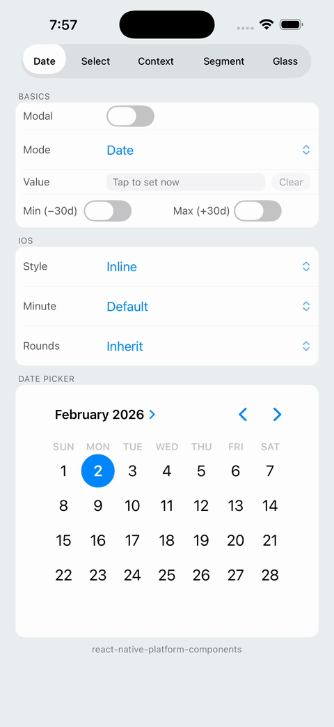
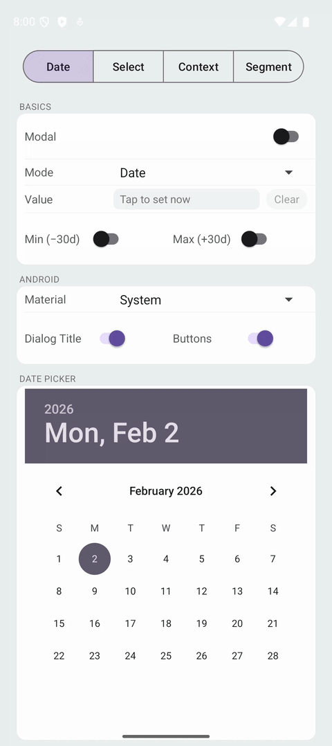
| iOS DatePicker | Android DatePicker |
 |  |
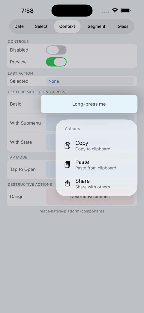
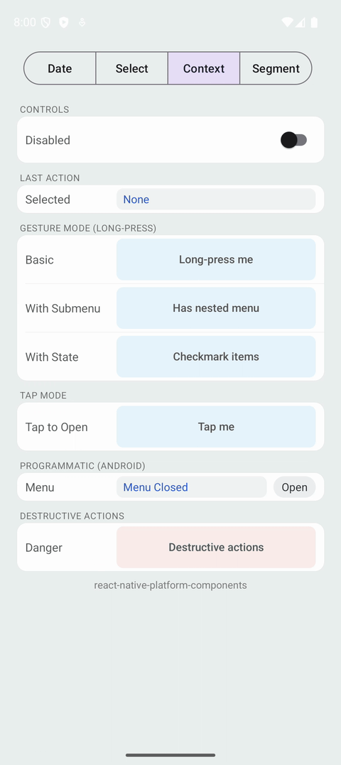
| iOS ContextMenu | Android ContextMenu |
 |  |
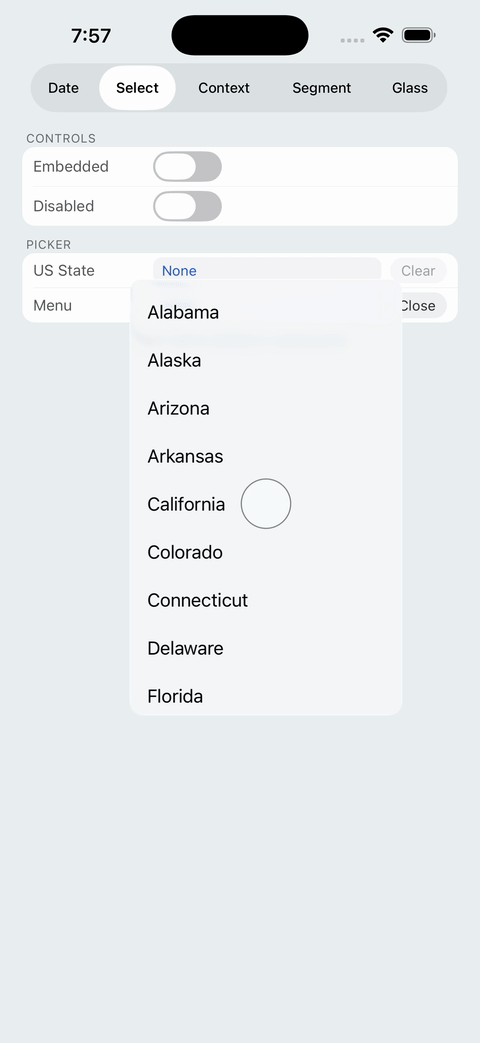
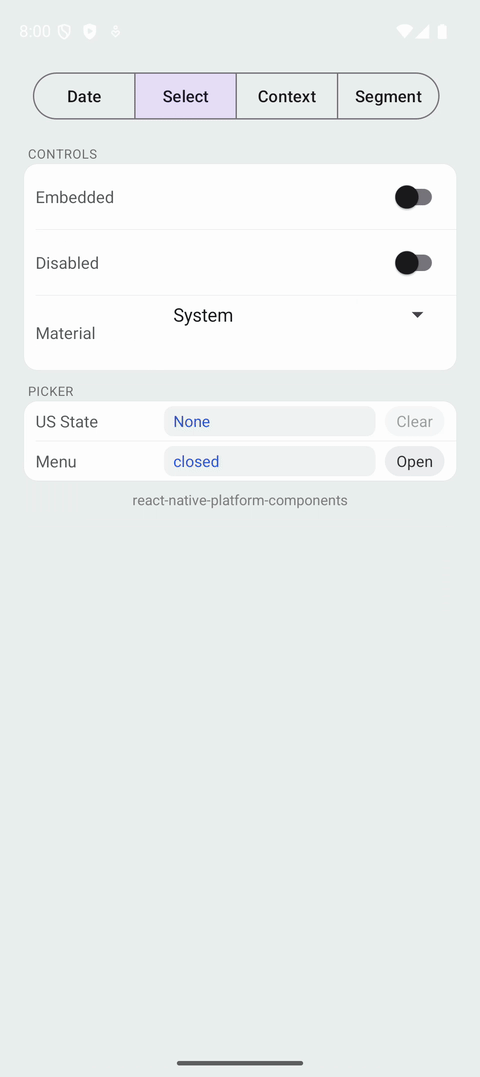
| iOS SelectionMenu | Android SelectionMenu |
 |  |
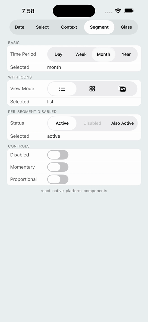
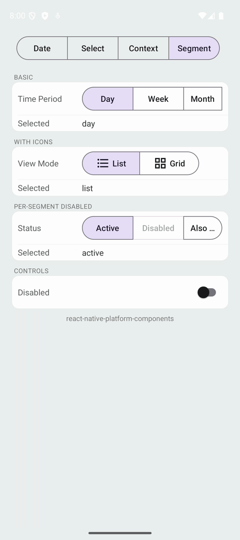
| iOS SegmentedControl | Android SegmentedControl |
 |  |
| iOS LiquidGlass | Android LiquidGlass |
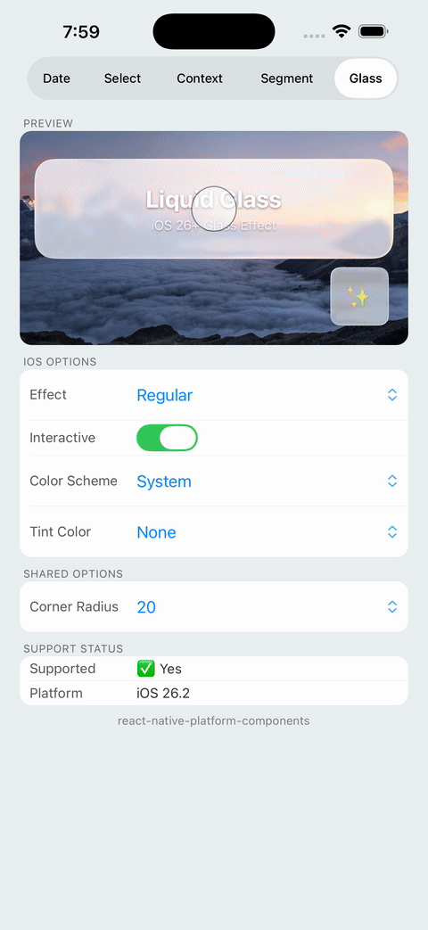 | iOS 26+ only On Android, renders as a regular View with optional fallback background color. |
$3
- DatePicker – native date & time pickers with modal and embedded presentations
- ContextMenu – native context menus with long-press activation (UIContextMenuInteraction on iOS, PopupMenu on Android)
- SelectionMenu – native selection menus (Material on Android, system menus on iOS)
- SegmentedControl – native segmented controls (UISegmentedControl on iOS, MaterialButtonToggleGroup on Android)
- LiquidGlass – iOS 26+ glass morphism effects (UIGlassEffect on iOS, fallback View on Android)
$3
- Feel 100% native on each platform
- Support modern platform design systems (Material 3 on Android, system pickers on iOS)
- Offer headless and inline modes for maximum layout control
- Integrate cleanly with React Native Codegen / Fabric
---
Installation
``sh`
npm install react-native-platform-componentsor
yarn add react-native-platform-components
$3
`sh`
cd ios
pod install
- Minimum iOS version: iOS 13+
- Uses UIDatePicker, SwiftUI Menu, and UIContextMenuInteraction
$3
- Uses native Android Views with Material Design (including PopupMenu for context menus)
- Supports Material 3 styling
- ⚠️ Your app may crash if theme is not configured — See Android Theme Configuration below
$3
> Note: This library is not supported in Expo Go. It requires native code and must be used with Expo Dev Client or EAS Build.
`sh`
npx expo install react-native-platform-components
npx expo prebuild
npx expo run:iosor
npx expo run:android
The library includes an Expo config plugin that handles all native configuration automatically. No manual native setup is required.
EAS Build:
`sh`
eas build --platform ios
eas build --platform android
Config Plugin:
Add to your app.json:
`json`
{
"expo": {
"plugins": [["react-native-platform-components/app.plugin", {}]]
}
}
For a complete working example, see the example-expo/ directory.
---
React Native New Architecture
This library is built for the React Native New Architecture (Fabric + TurboModules).
| Feature | Status |
| --------------------- | ---------------------------------- |
| Fabric (New Renderer) | Supported |
| Codegen | Used for type-safe native bindings |
| TurboModules | N/A (view components only) |
| Old Architecture | Not supported |
Tested with:
- React Native 0.81+ (bare and Expo)
- Expo SDK 54+
Requirements:
- New Architecture must be enabled in your app
- For bare React Native: set newArchEnabled=true in gradle.properties (Android) and use the RCT_NEW_ARCH_ENABLED flag (iOS)"newArchEnabled": true
- For Expo: set in app.json
---
Quick Start
$3
`tsx
import { DatePicker } from 'react-native-platform-components';
export function Example() {
const [date, setDate] = React.useState
const [visible, setVisible] = React.useState(false);
return (
<>
visible={visible}
presentation="modal"
mode="date"
onConfirm={(d) => {
setDate(d);
setVisible(false);
}}
onClosed={() => setVisible(false)}
ios={{ preferredStyle: 'inline' }}
android={{ material: 'system' }}
/>
);
}
`
$3
`tsx
import { DatePicker } from 'react-native-platform-components';
export function Example() {
const [date, setDate] = React.useState
return (
presentation="embedded"
mode="date"
onConfirm={(d) => setDate(d)}
ios={{ preferredStyle: 'inline' }}
android={{ material: 'system' }}
/>
);
}
`
---
$3
`tsx
import { ContextMenu } from 'react-native-platform-components';
import { Platform, View, Text } from 'react-native';
export function Example() {
const [lastAction, setLastAction] = React.useState
return (
actions={[
{
id: 'copy',
title: 'Copy',
image: Platform.OS === 'ios' ? 'doc.on.doc' : 'content_copy',
},
{
id: 'share',
title: 'Share',
image: Platform.OS === 'ios' ? 'square.and.arrow.up' : 'share',
},
{
id: 'delete',
title: 'Delete',
image: Platform.OS === 'ios' ? 'trash' : 'delete',
attributes: { destructive: true },
},
]}
onPressAction={(id, title) => setLastAction(title)}
>
>
);
}
`
$3
`tsx
import { ContextMenu } from 'react-native-platform-components';
import { View, Text } from 'react-native';
export function Example() {
return (
actions={[
{ id: 'edit', title: 'Edit' },
{ id: 'duplicate', title: 'Duplicate' },
{ id: 'delete', title: 'Delete', attributes: { destructive: true } },
]}
trigger="tap" // or "longPress" (default)
onPressAction={(id) => console.log('Selected:', id)}
>
);
}
`
---
$3
`tsx
import { SelectionMenu } from 'react-native-platform-components';
const options = [
{ label: 'Apple', data: 'apple' },
{ label: 'Banana', data: 'banana' },
{ label: 'Orange', data: 'orange' },
];
export function Example() {
const [visible, setVisible] = React.useState(false);
const [value, setValue] = React.useState
return (
<>
selected={value}
visible={visible}
onSelect={(data) => {
setValue(data);
setVisible(false);
}}
onRequestClose={() => setVisible(false)}
/>
);
}
`
$3
`tsx
import { SelectionMenu } from 'react-native-platform-components';
const options = [
{ label: 'Apple', data: 'apple' },
{ label: 'Banana', data: 'banana' },
{ label: 'Orange', data: 'orange' },
];
export function Example() {
const [value, setValue] = React.useState
return (
selected={value}
presentation="embedded"
placeholder="Select fruit"
onSelect={(data) => setValue(data)}
android={{ material: 'm3' }}
/>
);
}
`
---
$3
`tsx
import { SegmentedControl } from 'react-native-platform-components';
const segments = [
{ label: 'Day', value: 'day' },
{ label: 'Week', value: 'week' },
{ label: 'Month', value: 'month' },
];
export function Example() {
const [selected, setSelected] = React.useState('day');
return (
selectedValue={selected}
onSelect={(value) => setSelected(value)}
/>
);
}
`
$3
`tsx
import { SegmentedControl } from 'react-native-platform-components';
import { Platform } from 'react-native';
const segments = [
{
label: 'List',
value: 'list',
icon: Platform.OS === 'ios' ? 'list.bullet' : 'list_bullet',
},
{
label: 'Grid',
value: 'grid',
icon: Platform.OS === 'ios' ? 'square.grid.2x2' : 'grid_view',
},
];
export function Example() {
const [selected, setSelected] = React.useState('list');
return (
selectedValue={selected}
onSelect={(value) => setSelected(value)}
ios={{ apportionsSegmentWidthsByContent: true }}
/>
);
}
`
---
$3
`tsx
import {
LiquidGlass,
isLiquidGlassSupported,
} from 'react-native-platform-components';
import { View, Text, Image } from 'react-native';
export function Example() {
return (
{/ Background content /}
style={{ flex: 1 }}
/>
{/ Glass effect overlay /}
position: 'absolute',
top: 50,
left: 20,
right: 20,
padding: 20,
}}
cornerRadius={20}
ios={{
effect: 'regular',
interactive: true,
colorScheme: 'system',
}}
android={{
fallbackBackgroundColor: '#FFFFFF80',
}}
>
{isLiquidGlassSupported ? 'Glass Effect!' : 'Fallback View'}
);
}
`
---
Components
DatePicker
Native date & time picker using platform system pickers.
$3
| Prop | Type | Description |
| -------------- | ------------------------------------------------------- | ------------------------------------------- |
| date | Date \| null | Controlled date value |minDate
| | Date \| null | Minimum selectable date |maxDate
| | Date \| null | Maximum selectable date |locale
| | string | Locale identifier (e.g., 'en-US') |timeZoneName
| | string | Time zone identifier |mode
| | 'date' \| 'time' \| 'dateAndTime' \| 'countDownTimer' | Picker mode |presentation
| | 'modal' \| 'embedded' | Presentation style |visible
| | boolean | Controls modal visibility (modal mode only) |onConfirm
| | (date: Date) => void | Called when user confirms selection |onClosed
| | () => void | Called when modal is dismissed |
$3
| Prop | Type | Description |
| -------------------------- | -------------------------------------------------- | --------------------------------- |
| preferredStyle | 'automatic' \| 'compact' \| 'inline' \| 'wheels' | iOS date picker style |countDownDurationSeconds
| | number | Duration for countdown timer mode |minuteInterval
| | number | Minute interval (1-30) |roundsToMinuteInterval
| | 'inherit' \| 'round' \| 'noRound' | Rounding behavior |
$3
| Prop | Type | Description |
| --------------------- | ------------------ | ---------------------------------------------------------------------- |
| firstDayOfWeek | number | First day of week (1-7, Sunday=1) |material
| | 'system' \| 'm3' | Material Design style (modal only; embedded always uses system picker) |dialogTitle
| | string | Custom dialog title |positiveButtonTitle
| | string | Custom confirm button text |negativeButtonTitle
| | string | Custom cancel button text |
---
ContextMenu
Native context menu that wraps content and responds to long-press or tap gestures.
$3
| Prop | Type | Description |
| --------------- | --------------------------------- | ------------------------------------------- |
| title | string | Menu title (shown as header on iOS) |actions
| | ContextMenuAction[] | Array of menu actions |disabled
| | boolean | Disables the menu |trigger
| | 'longPress' \| 'tap' | How the menu opens (default: 'longPress') |onPressAction
| | (actionId, actionTitle) => void | Called when user selects an action |onMenuOpen
| | () => void | Called when menu opens |onMenuClose
| | () => void | Called when menu closes |children
| | ReactNode | Content to wrap (required) |
$3
| Property | Type | Description |
| ------------ | -------------------------------------- | ------------------------------------------------- |
| id | string | Unique identifier returned in callbacks |title
| | string | Display text |subtitle
| | string | Secondary text (iOS only) |image
| | string | Icon name (SF Symbol on iOS, drawable on Android) |imageColor
| | string | Tint color for the icon (hex string) |attributes
| | { destructive?, disabled?, hidden? } | Action attributes |state
| | 'off' \| 'on' \| 'mixed' | Checkmark state |subactions
| | ContextMenuAction[] | Nested actions for submenu |
$3
| Prop | Type | Description |
| --------------- | --------- | --------------------------------- |
| enablePreview | boolean | Enable preview when long-pressing |
$3
| Prop | Type | Description |
| ---------------- | ------------------- | ---------------------------------------------- |
| anchorPosition | 'left' \| 'right' | Anchor position for the popup menu |visible
| | boolean | Programmatic visibility control (Android only) |
$3
- Long-Press (default): Long-press on wrapped content triggers the menu.
- Tap (trigger="tap"): Single tap on wrapped content triggers the menu.android.visible
- Programmatic (Android only): Use to control menu visibility programmatically. iOS does not support programmatic menu opening due to platform limitations.
$3
- iOS: Use SF Symbol names (e.g., 'trash', 'square.and.arrow.up', 'doc.on.doc')
- Android: Use drawable resource names or Material icon names
---
SelectionMenu
Native selection menu with modal and embedded modes.
$3
| Prop | Type | Description |
| ------------------ | ----------------------------------- | ----------------------------------------------- |
| options | { label: string; data: string }[] | Array of options to display |selected
| | string \| null | Currently selected option's data value |disabled
| | boolean | Disables the menu |placeholder
| | string | Placeholder text when no selection |presentation
| | 'modal' \| 'embedded' | Presentation mode (default: 'modal') |visible
| | boolean | Controls modal mode menu visibility |onSelect
| | (data, label, index) => void | Called when user selects an option |onRequestClose
| | () => void | Called when menu is dismissed without selection |android.material
| | 'system' \| 'm3' | Material Design style preference |
$3
- Modal mode (default): Menu visibility controlled by visible prop. Use for custom trigger UI.presentation="embedded"
- Embedded mode (): Native picker UI rendered inline. Menu managed internally.
> Note: On iOS, modal mode uses a custom popover to enable programmatic presentation. For the full native menu experience (system animations, scroll physics), use embedded mode. This is an intentional trade-off: modal gives you control over the trigger UI, embedded gives you the complete system menu behavior.
---
SegmentedControl
Native segmented control using UISegmentedControl on iOS and MaterialButtonToggleGroup on Android.
$3
| Prop | Type | Description |
| --------------- | ---------------------------------------- | ------------------------------------ |
| segments | SegmentedControlSegment[] | Array of segments to display |selectedValue
| | string \| null | Currently selected segment's value |disabled
| | boolean | Disables the entire control |onSelect
| | (value: string, index: number) => void | Called when user selects a segment |
$3
| Property | Type | Description |
| ---------- | --------- | ------------------------------------------------- |
| label | string | Display text for the segment |value
| | string | Unique value returned in callbacks |disabled
| | boolean | Disables this specific segment |icon
| | string | Icon name (SF Symbol on iOS, drawable on Android) |
$3
| Prop | Type | Description |
| ---------------------------------- | --------- | --------------------------------------------------- |
| momentary | boolean | If true, segments don't show selected state |apportionsSegmentWidthsByContent
| | boolean | If true, segment widths are proportional to content |selectedSegmentTintColor
| | string | Tint color for selected segment (hex string) |
$3
| Prop | Type | Description |
| ------------------- | --------- | -------------------------------------------- |
| selectionRequired | boolean | If true, one segment must always be selected |
$3
Icons work the same as ContextMenu:
- iOS: Use SF Symbol names (e.g., 'list.bullet', 'square.grid.2x2')'list_bullet'
- Android: Use drawable resource names (e.g., , 'grid_view')
---
LiquidGlass
Native glass morphism effect using UIGlassEffect on iOS 26+. On Android and older iOS versions, renders as a regular View with optional fallback styling.
> Note: LiquidGlass requires iOS 26+ (Xcode 16+). On older iOS versions and Android, the component renders children without the glass effect. Use isLiquidGlassSupported to check availability and provide fallback UI.
$3
| Prop | Type | Description |
| -------------- | ----------- | ------------------------------------------------- |
| cornerRadius | number | Corner radius for the glass effect (default: 0) |children
| | ReactNode | Content to render inside the glass container |
$3
| Prop | Type | Description |
| --------------- | -------------------------------- | ---------------------------------------------------- |
| effect | 'clear' \| 'regular' \| 'none' | Glass effect intensity (default: 'regular') |interactive
| | boolean | Enable touch interaction feedback (default: false) |tintColor
| | string | Overlay tint color (hex string) |colorScheme
| | 'light' \| 'dark' \| 'system' | Appearance mode (default: 'system') |
$3
| Prop | Type | Description |
| ------------------------- | -------- | ---------------------------------------------- |
| fallbackBackgroundColor | string | Background color when glass effect unavailable |
$3
| Export | Type | Description |
| ------------------------ | --------- | ------------------------------------ |
| isLiquidGlassSupported | boolean | true on iOS 26+, false otherwise |
$3
- 'regular' (default): Standard glass blur intensity with full glass morphism effect
- 'clear': More transparent, subtle glass effect
- 'none': No glass effect (useful for animating materialization/dematerialization)
$3
| Platform | iOS 26+ | iOS < 26 | Android |
| ------------- | ------------------- | ----------- | ------------ |
| Glass Effect | Full glass morphism | No effect | No effect |
| Corner Radius | Applied | Applied | Applied |
| Tint Color | Supported | Ignored | Ignored |
| Interactive | Supported | Ignored | Ignored |
| Fallback BG | N/A | Transparent | Configurable |
$3
1. Check support first: Use isLiquidGlassSupported to conditionally render fallback UIandroid.fallbackBackgroundColor
2. Background content: Glass effects work best over images or colorful backgrounds
3. Interactive mode: Only applies on mount; cannot be toggled after initial render
4. Android fallback: Set for a semi-transparent background
---
Design Philosophy
- Native first — no JS re-implementation of pickers
- Headless-friendly — works with any custom UI
- Codegen-safe — string unions & sentinel values for type safety
- Predictable behavior — no surprise re-renders or layout hacks
- Platform conventions — respects native UX patterns
---
Theming
This library does not expose theming props. Components inherit their appearance from your app's native platform theme.
- iOS: Components follow system appearance (light/dark mode) and use system-defined styles (e.g., UIBlurEffect for menu backgrounds). These are not customizable per-component.styles.xml
- Android: Components respect your app's Material Theme. Customize via your or Material 3 theme configuration.
This is intentional. The goal is native fidelity, not pixel-level customization. If you need custom styling beyond what the platform theme provides, this library may not be the right fit.
---
Color Formats
All color props in this library support the same formats as React Native's backgroundColor:
| Format | Example | Description |
| --- | --- | --- |
| Hex | #RGB, #RRGGBB, #RRGGBBAA | Standard hex colors |rgb(255, 0, 0)
| RGB | | RGB values (0-255) |rgba(255, 0, 0, 0.5)
| RGBA | | RGB with alpha (0-1) |hsl(0, 100%, 50%)
| HSL | | Hue (0-360), saturation, lightness |hsla(0, 100%, 50%, 0.5)
| HSLA | | HSL with alpha (0-1) |red
| Named | , steelblue, transparent | CSS named colors |
Props that accept colors:
- ContextMenu: imageColor (icon tint)SegmentedControl
- : ios.selectedSegmentTintColor
- : ios.tintColor, android.fallbackBackgroundColor
`tsx`
// All of these are equivalent
---
Android Theme Configuration
> ⚠️ Your app may hard crash if you skip this section. Android components require specific theme configuration. Components can crash immediately on mount if the required theme attributes are missing.
$3
| Component | Mode | Required Theme | Crash if Missing |
| -------------------- | ---------------------------- | ------------------- | ---------------- |
| SegmentedControl | (always M3) | Theme.Material3.* | ✅ Yes |android.material: 'm3'
| DatePicker | | Theme.Material3.* | ✅ Yes |android.material: 'system'
| DatePicker | | Theme.AppCompat.* | ✅ Yes |android.material: 'm3'
| SelectionMenu | | Theme.Material3.* | ✅ Yes |android.material: 'system'
| SelectionMenu | | Theme.AppCompat.* | ✅ Yes |
| ContextMenu | — | Any | ❌ No |
| LiquidGlass | — | Any | ❌ No |
$3
SegmentedControl always uses Material 3 widgets (MaterialButtonToggleGroup). Your app must use a Material 3 theme or the app will crash on component mount.
1. Update your app theme in android/app/src/main/res/values/styles.xml:
`xml`
2. Define your Material 3 colors in android/app/src/main/res/values/colors.xml:
`xml`
> Tip: Use Google's Material Theme Builder to generate a complete color scheme.
$3
#### Crash: Cannot find theme attribute materialButtonOutlinedStyle
Cause: Using SegmentedControl without a Material 3 theme.
Fix: Update your theme to inherit from Theme.Material3.*:
`xml