react-native-smooth-slider
v1.3.9
A react-native-gesture-handler smoothed <Slider /> , also support trackImage and vertical
0/weekUpdated 2 years agoMITUnpacked: 30.4 KB
Published by flyskywhy
npm install react-native-smooth-sliderreact-native-smooth-slider


A react-native-gesture-handler smoothed
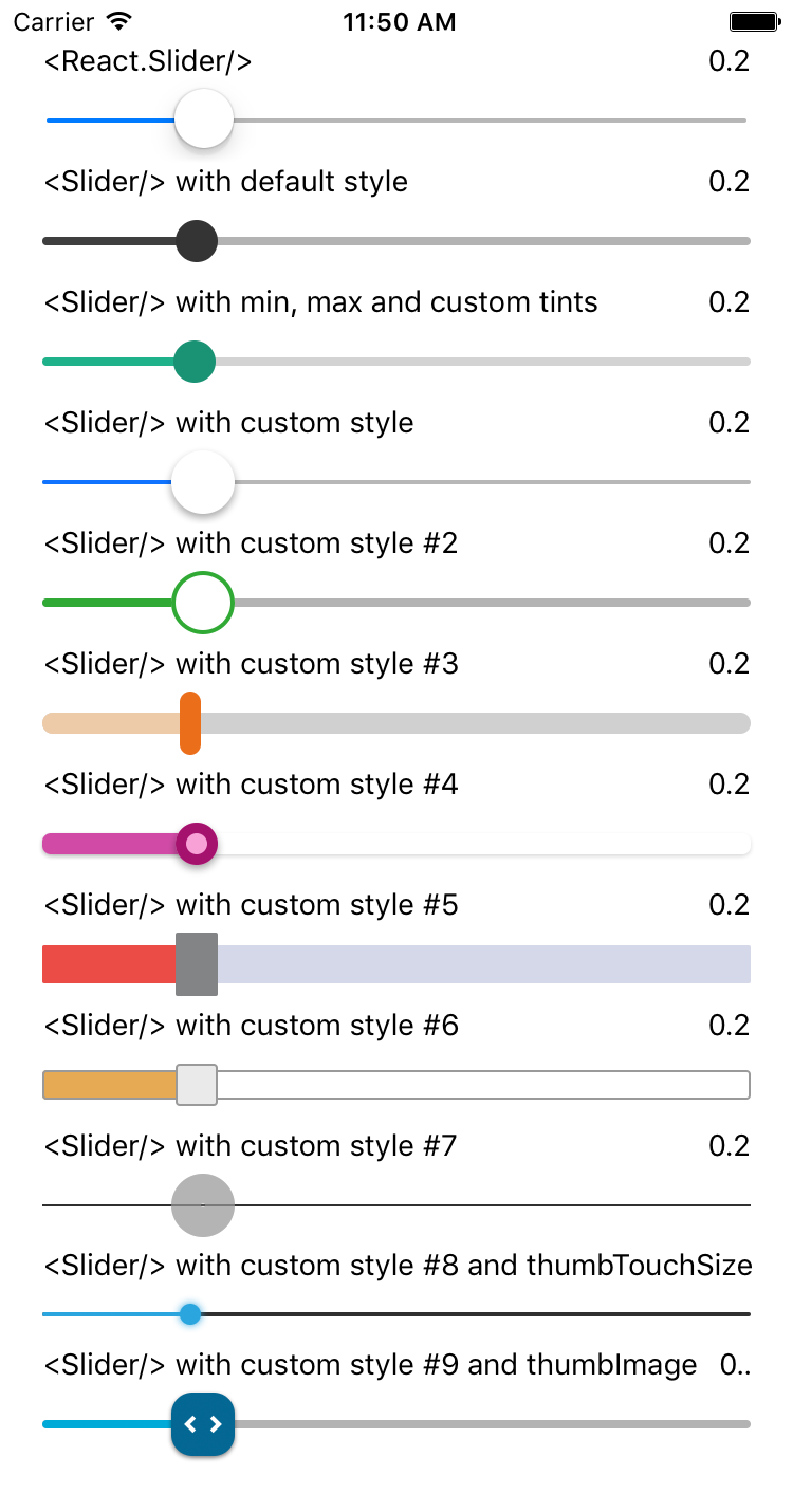
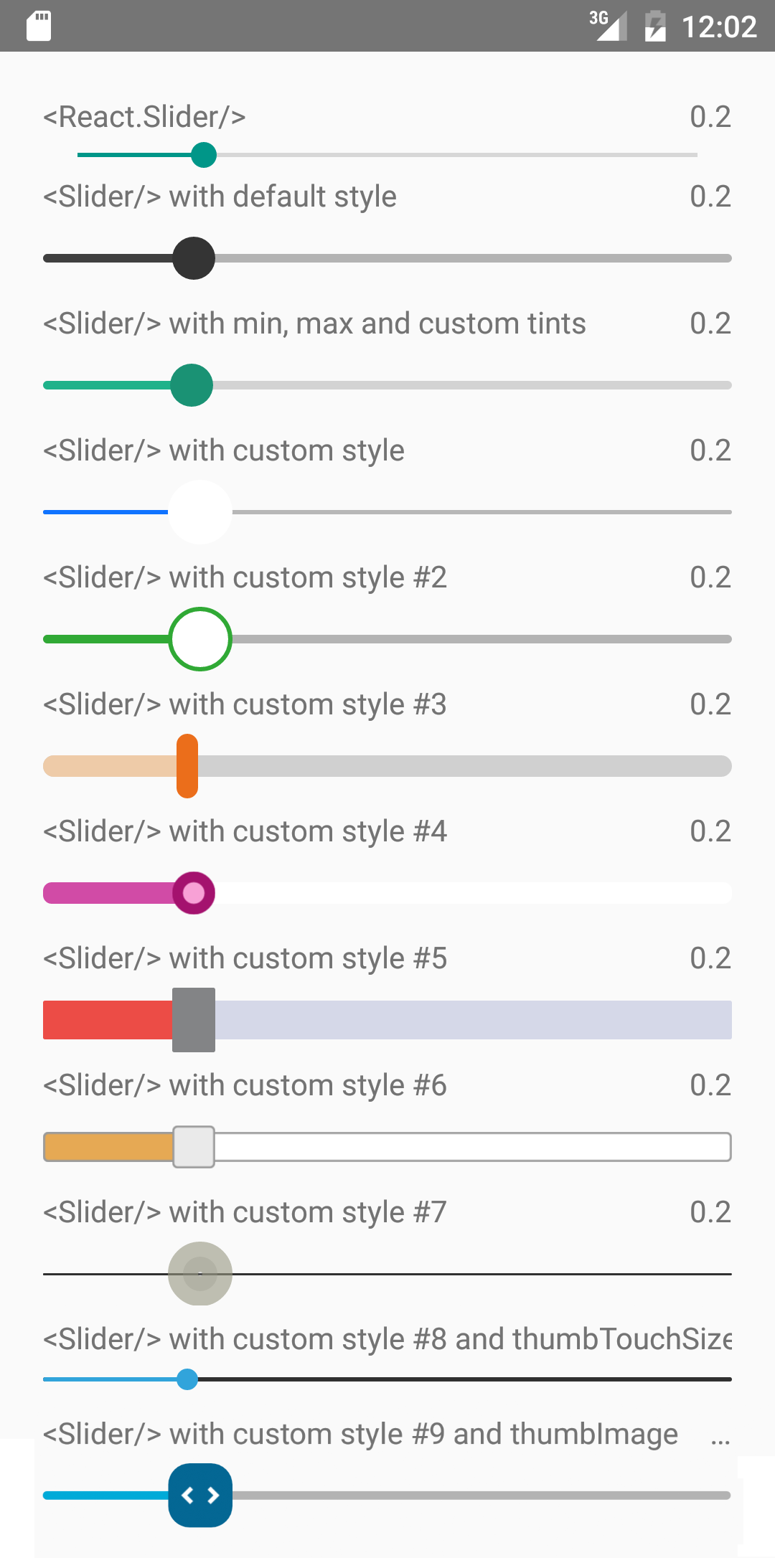
It is a drop-in replacement for Slider.
Install
For RN >= 0.60
``shell`
npm i --save react-native-smooth-slider react-native-gesture-handler
For RN < 0.60
`shell`
npm i --save react-native-smooth-slider@1.2.x react-native-gesture-handler@1.2.2
And be aware of https://github.com/software-mansion/react-native-gesture-handler/issues/1164 if you use react-native-web and want to slide on web.
Usage
`jsx
import React from "react";
import Slider from "react-native-smooth-slider";
import {AppRegistry, StyleSheet, Text} from "react-native";
// if react-native-gesture-handler@1.x, no need
// but just
// https://docs.swmansion.com/react-native-gesture-handler/docs/guides/migrating-off-rnghenabledroot/
// You should put
// example below is just playing the role of a root component
import {GestureHandlerRootView} from 'react-native-gesture-handler';
class SliderExample extends React.Component {
state = {
value: 0.2
};
render() {
return (
useNativeDriver={true}
onValueChange={value => this.setState({ value })}
/>
Value: {this.state.value}
);
}
}
const styles = StyleSheet.create({
container: {
flex: 1,
marginLeft: 10,
marginRight: 10,
alignItems: "stretch",
justifyContent: "center"
}
});
AppRegistry.registerComponent("SliderExample", () => SliderExample);
`
Props
Prop | Type | Optional | Default | Description
--------------------- | -------- | -------- | ------------------------- | -----------
value | number | Yes | 0 | Initial value of the slider
disabled | bool | Yes | false | If true the user won't be able to move the slider
minimumValue | number | Yes | 0 | Initial minimum value of the slider
maximumValue | number | Yes | 1 | Initial maximum value of the slider
step | number | Yes | 0 | Step value of the slider. The value should be between 0 and maximumValue - minimumValue)
minimumTrackTintColor | string | Yes | '#3f3f3f' | The color used for the track to the left of the button
maximumTrackTintColor | string | Yes | '#b3b3b3' | The color used for the track to the right of the button
thumbTintColor | string | Yes | '#343434' | The color used for the thumb
thumbTouchSize | object | Yes | {width: 40, height: 40}` | The size of the touch area that allows moving the thumb. The touch area has the same center as the visible thumb. This allows to have a visually small thumb while still allowing the user to move it easily.
moveVelocityThreshold | number | Yes | 2000 | Prevent onValueChange if velocityX or velocityY (vertical is true) of nativeEvent is over the moveVelocityThreshold
onValueChange | function | Yes | | Callback continuously called while the user is dragging the slider and the dragging movement speed is below the moveVelocityThreshold
onSlidingStart | function | Yes | | Callback called when the user starts changing the value (e.g. when the slider is pressed)
onSlidingComplete | function | Yes | | Callback called when the user finishes changing the value (e.g. when the slider is released)
style | style | Yes | | The style applied to the slider container
trackStyle | style | Yes | | The style applied to the track
trackImage | source | Yes | | Sets an image for the track.
thumbStyle | style | Yes | | The style applied to the thumb
thumbImage | source | Yes | | Sets an image for the thumb.
vertical | bool | Yes | false | Set this to true to be a vertical slider.
useNativeDriver | bool | Yes | false | The useNativeDriver parameter in Animated used by react-native-gesture-handler when the user change the value. Default value is false, because some Android phone PanGestureHandler causes Animated Value to jump when using native driver
animateTransitions | bool | Yes | false | Set to true to animate values with default 'timing' animation type when value in next props is different.
animationType | string | Yes | 'timing' | Custom Animation type when value in next props is different. 'spring' or 'timing'.
animationConfig | object | Yes | undefined | Used to configure the animation parameters when value in next props is different. These are the same parameters in the Animated library.
Methods
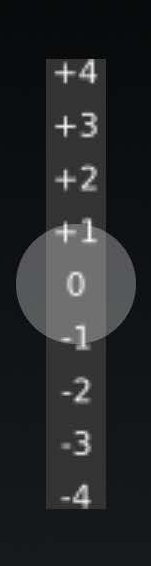
setValue(value)
In some use case e.g. "tension rod", it's more convenient to use method instead of prop to restore original positon of the tension rod. Below is a vertical tension rod example screenshot.
Donate
To support my work, please consider donate.
- ETH: 0xd02fa2738dcbba988904b5a9ef123f7a957dbb3e
- 
---
MIT Licensed