react-native-spacing-system
v2.0.0-rc.0TypeScript
Enforcing and Standardizing how components are spaced in ReactNative.
0/weekUpdated 3 years agoMITUnpacked: 82.8 KB
Published by hirokazu.tei@gmail.com
npm install react-native-spacing-system
React Native Spacing System

> Warning, you are currently looking at the v2 documentation. For v1 documentation please go over here.
What Is It?
Using margin and padding to control spacing between components introduces too many ways to accomplish the same goal. React Native Spacing System seeks to standardize your React Native code, increase legibility, and separate the concern of layouting though the usage of spacing components.
Stack: !#45e6e6
Queue: !#e645e6
Inset: !#e6e645


Factory method are provided so that you can use your own spacing key and values instead of raw values.
 and
and  are both supported!
Installation
``
npm install react-native-spacing-system
or
`
yarn add react-native-spacing-system
Features
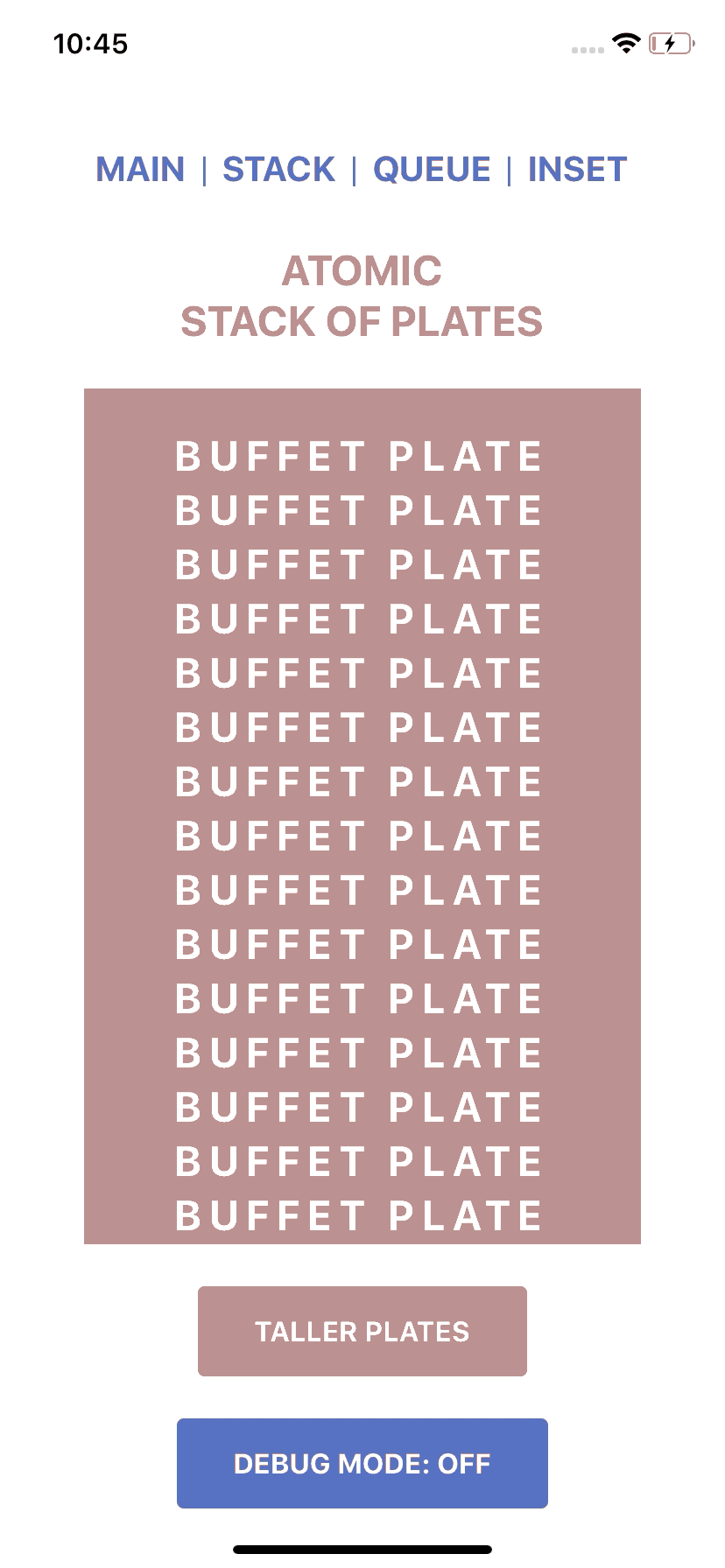
Stack
Stack is a vertical spacing component, think of a pile of plates at a buffet.
$3
Stack Props:
- size: number
-
-
`jsx
import React from "react";
import { View } from 'react-native';
import { Stack } from "react-native-spacing-system";
import { BuffetPlates } from "./BuffetPlates";
import { KitchenCounter } from "./KitchenCounter";
/*
Creates a vertical space with size of 16 between
*/
const QueueExample = () => {
return (
);
`
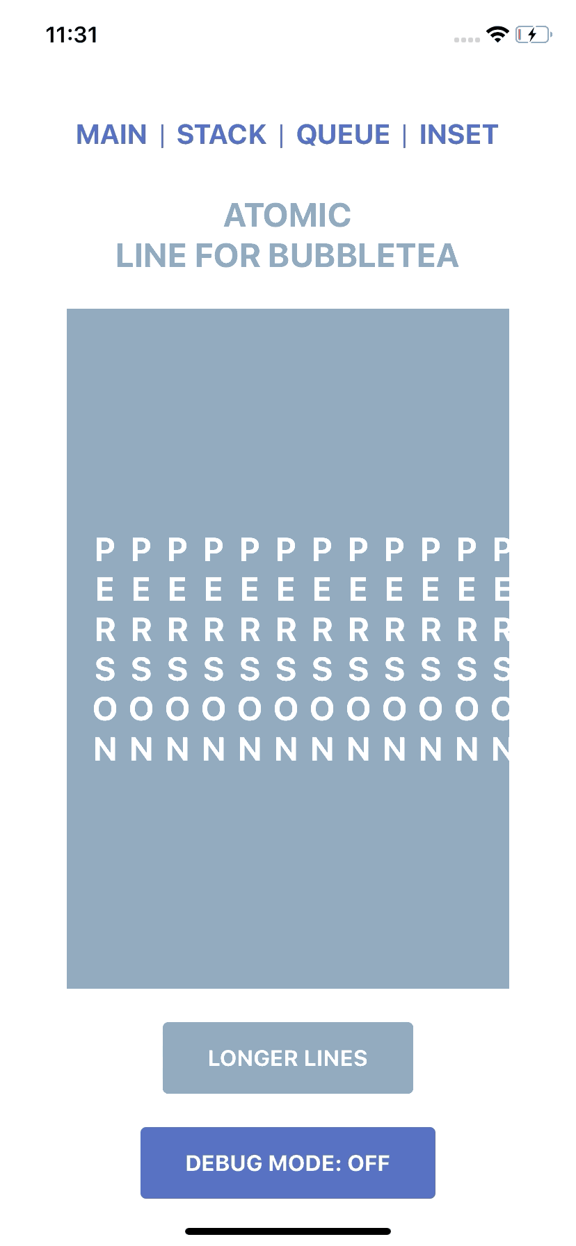
Queue
Queue is a horizontal spacing component, think of people queueing for that new bubbletea joint.
$3
Queue Props:
- size: number
-
-
`jsx
import React from "react";
import { View } from "react-native";
import { Queue } from "react-native-spacing-system";
import { BubbleTeaJoint } from "./BubbleTeaJoint";
import { PatientPatron } from "./PatientPatron";
/*
Creates a horizontal space with size of 16 between
Only works when flex direction is row.
*/
const StackExample = () => {
return (
);
};
`
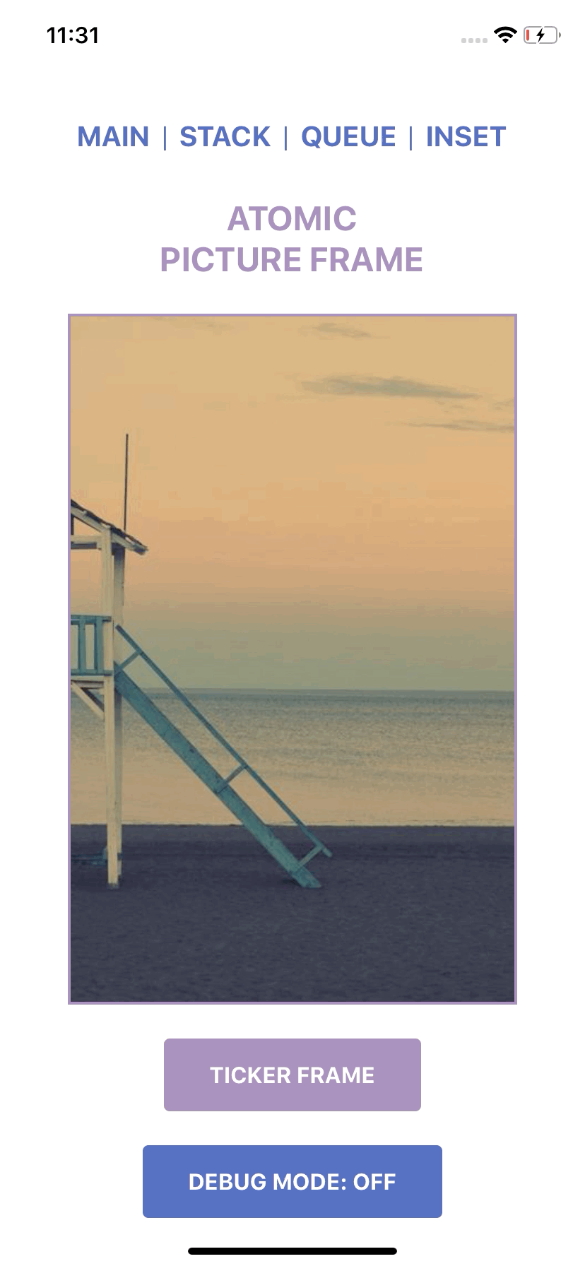
Inset
Inset is a boundary spacing component, think of adding frames around a picture (the child).
$3
Inset Props:
- children: ReactNode
-
-
-
-
-
The allowed PaddingCombinations are as follows:
- {all: number}
-
-
-
-
-
-
-
The allowed LayoutStyle can be found HERE
`jsx
import React from "react";
import { Inset } from "react-native-spacing-system";
import { PictureNeedingAFrame } from "./PictureNeedingAFrame";
/*
Creates a padding of size 16 around
the
*/
const InsetExample = () => {
return (
);
};
`
Factory Methods
Create your own spacing component with custom keys by passing in the space mapping object into the factory method provided.
- stackFactory()
-
-
`tsx
import { stackFactory } from "react-native-spacing-system";
const spacing = {
tall: 8,
grande: 12,
venti: 16
};
const Stack = stackFactory(spacing);
`
$3
If the spacing object is expected to be used in all Stack, Queue, and Inset, spacingFactory can be used to create the components in one function.
`tsx
import { spacingFactory } from "react-native-spacing-system";
const spacing = {
tall: 8,
grande: 12,
venti: 16,
};
const { Stack, Queue, Inset } = spacingFactory(spacing);
`
$3
`javascript
/ @flow /
import { stackFactory } from "react-native-spacing-system";
type SpacingKey = 'tall' | 'grande' | 'venti'
type Spacing = {[key: SpacingKey]: number}
const spacing: Spacing = {
tall: 8,
grande: 12,
venti: 16
};
const Stack = stackFactory
`
$3
For insetFactory and spacingFactory, you can declare if you would like to allow the layout prop to be able to be passed into Inset.
TypeScript
`tsx
/ @flow /
import { insetFactory } from "react-native-spacing-system";
const spacing = {
tall: 8,
grande: 12,
venti: 16
};
const disallowLayout = true;
const NoLayoutInset = insetFactory(spacing, disallowLayout);
`
Flow
For flow, you must specify the type arguments.
`jsx
/ @flow /
import { insetFactory } from "react-native-spacing-system";
type SpacingKey = 'tall' | 'grande' | 'venti'
type Spacing = {[key: SpacingKey]: number}
const spacing: Spacing = {
tall: 8,
grande: 12,
venti: 16
};}
type DisallowLayout = true;
const disallowLayout = true;
const NoLayoutInset = insetFactory
`
Debug Mode
Each component supports a debug mode where their spacing is highlighted.
Import the DebugContext and use the Provider to toggle debug mode on and off.
`jsx
import React from "react";
import { DebugContext } from "react-native-spacing-system";
import ComponentWithSpacingSystemComponents from "./ComponentWithSpacingSystemComponents";
const SomeComponent = () => {
return (
);
};
`
You can also control debug mode of each type of spacing component as well as their border highlighting.
#### Expected Type (TypeScript)
`tsx`
type DebugContextProps = {
debug: boolean;
inset?: {
debug?: boolean;
color?: string;
};
queue?: {
debug?: boolean;
color?: string;
border?: boolean;
borderColor?: string;
opacity?: number;
};
stack?: {
debug?: boolean;
color?: string;
border?: boolean;
borderColor?: string;
opacity?: number;
};
};
#### Expected Type (Flow)
`jsx``
type DebugContextProps = {|
debug: boolean,
inset?: {|
debug?: boolean,
color?: string,
|},
queue?: {|
debug?: boolean,
color?: string,
border?: boolean,
borderColor?: string,
opacity?: number,
|},
stack?: {|
debug?: boolean,
color?: string,
border?: boolean,
borderColor?: string,
opacity?: number,
|},
|};
Sentiment & Rationalization
Inspired by Nathan Curtis's Medium article Space In Design Systems and this react-spacing library by Nathan Winder, I figured I'd do something similar for React Native with slight tweaks.
For the full sentiment and rationalization, please check out my Medium blog post: Enforcing Component Spacing in React & React Native.
Contacts & Social Media