react-native-wagmi-charts
v2.9.1TypeScript
A sweet candlestick chart for React Native
0/weekUpdated 4 days agoUnpacked: 860.9 KB
Published by arancauchi
npm install react-native-wagmi-chartsreact-native-wagmi-charts 💸
A sweet & simple chart library for React Native that will make us feel like
We're All Gonna Make It
Features
📈 Line charts & candlestick charts (more to come 🔜)
🏷 Interactive price & date/time label components
🧱 Built with composability in mind
🛠 Highly customizable APIs
✨ Uses React Native Reanimated 2 under-the-hood
🧈 Slick data transition animations
💬 Interactive tooltips
Table of Contents
- Features
- Table of Contents
- Install
- Basic Usage
- Line chart
- Candlestick chart
- Line Chart Guides
- Interactive cursors
- Interactive labels
- Interactive tooltips
- Tooltips / labels
- Haptic feedback
- Colors
- Gradients
- Dots
- Horizontal lines
- Customizing size
- Customizing labels
- Customizing tooltips
- Axis
- Candlestick Chart Guides
- Interactive cursors
- Interactive labels
- Interactive tooltips
- Haptic feedback
- Colors
- Customizing labels
- Component APIs
- LineChart.Provider
- LineChart
- LineChart.Path
- LineChart.CursorCrosshair
- LineChart.CursorLine
- LineChart.Dot
- LineChart.Highlight
- LineChart.HorizontalLine
- LineChart.Gradient
- LineChart.Tooltip
- LineChart.PriceText
- LineChart.DatetimeText
- LineChart.HoverTrap
- CandlestickChart.Provider
- CandlestickChart
- CandlestickChart.Candles
- CandlestickChart.Crosshair
- CandlestickChart.Tooltip
- CandlestickChart.PriceText
- CandlestickChart.DatetimeText
- Hooks
- LineChart.useChart
- LineChart.useDatetime
- LineChart.usePrice
- CandlestickChart.useChart
- CandlestickChart.useCandleData
- CandlestickChart.useDatetime
- CandlestickChart.usePrice
- Web Support
- Credits
Install
To get started with using WAGMI charts in your React Native project, install thereact-native-wagmi-charts package.
``bash`
npm install react-native-wagmi-charts
WAGMI charts also depends on a few libraries, you will also need to install
these packages if you don't already have them:
`bash`
npm install react-native-reanimated react-native-gesture-handler react-native-haptic-feedback
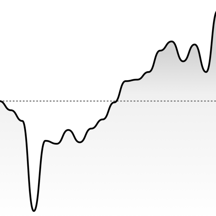
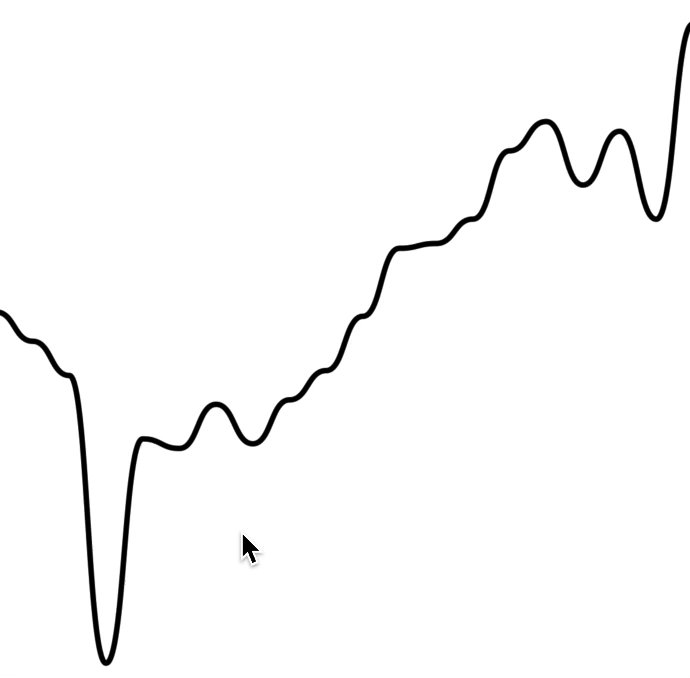
Basic Usage
The library currently comes with 2 types of charts: Line & Candlestick. Below
are the most basic usages of them.
$3
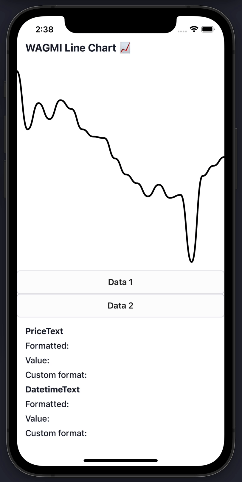
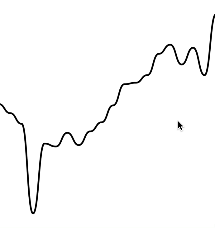
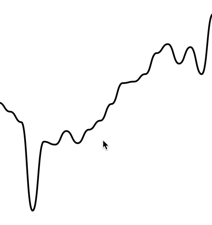
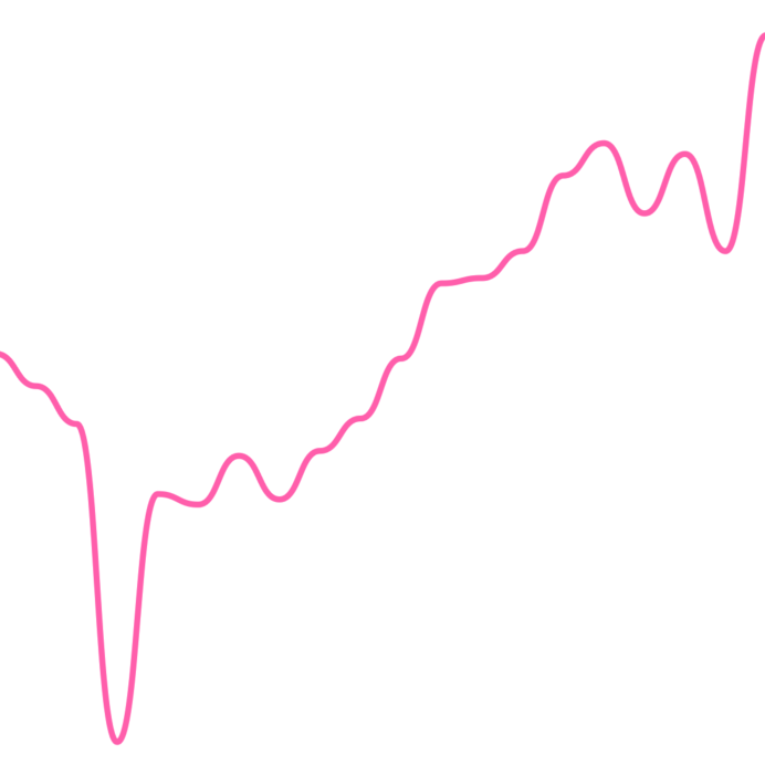
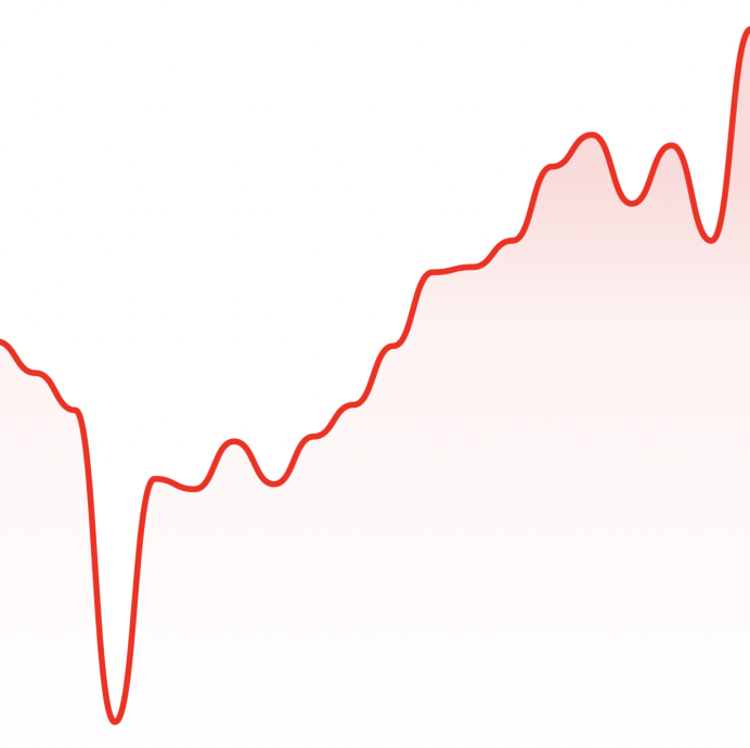
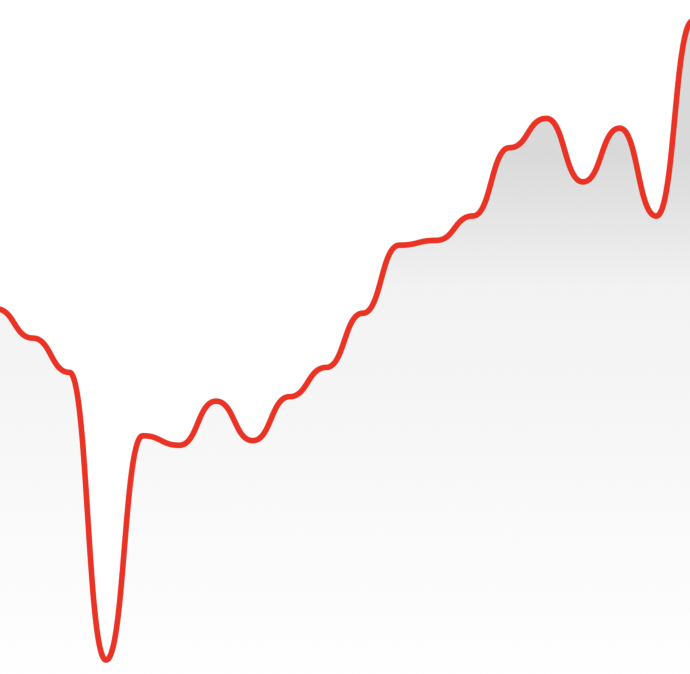
To render a simple line chart, you will need to use the LineChart.Provider,LineChart & LineChart.Path components.
The LineChart.Provider component sets up the context of your chart,LineChart composes the chart elements, and the LineChart.Path component
renders your data in the form of a line path.
> Note: This chart does not include an interactive cursor like in the animated
> example above. If you want one,
> check out the "Interactive Cursors" guide
`jsx
import { LineChart } from 'react-native-wagmi-charts';
const data = [
{
timestamp: 1625945400000,
value: 33575.25,
},
{
timestamp: 1625946300000,
value: 33545.25,
},
{
timestamp: 1625947200000,
value: 33510.25,
},
{
timestamp: 1625948100000,
value: 33215.25,
},
];
function Example() {
return (
);
}
`
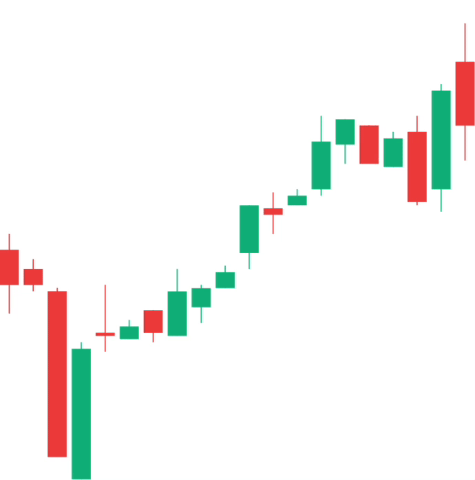
$3
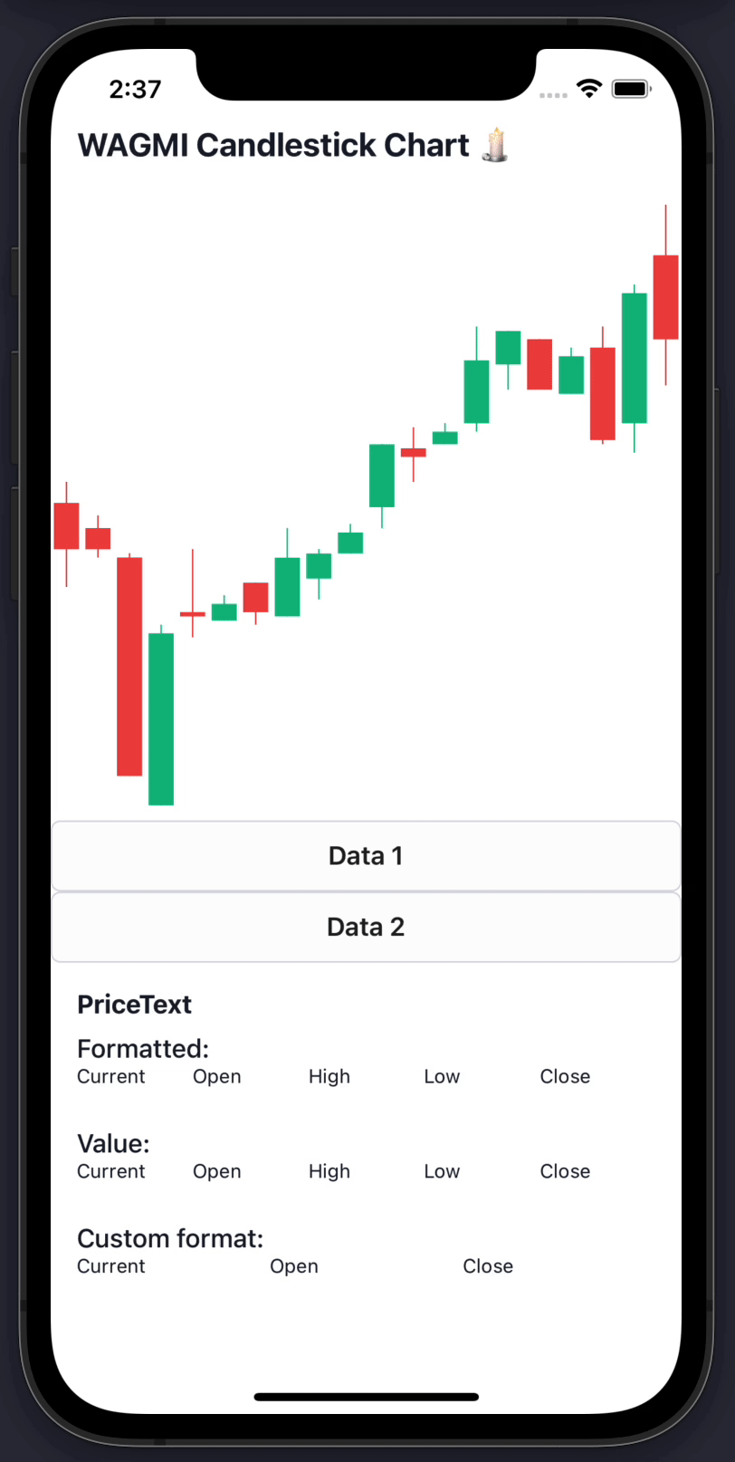
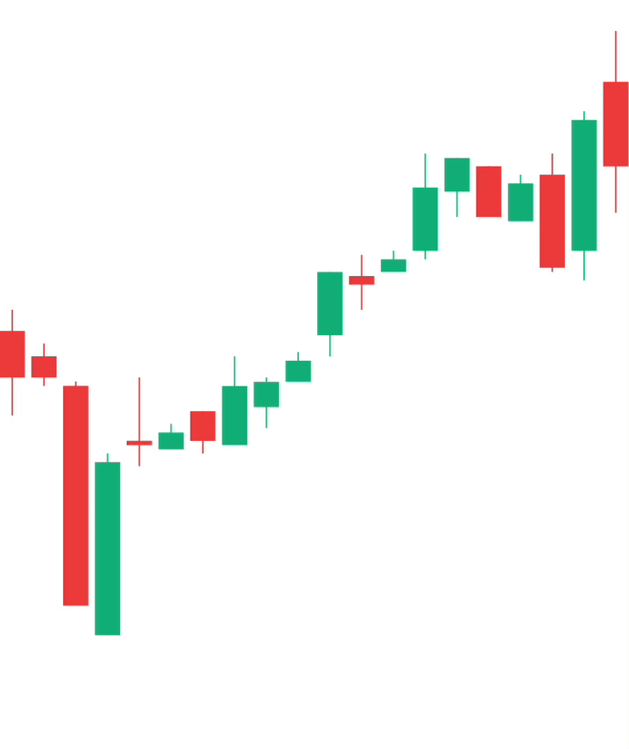
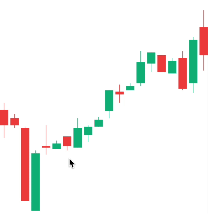
To render a simple candlestick chart, you will need to use the
CandlestickChart & CandlestickChart.Candles components.
The CandlestickChart.Provider component sets up the context of your chart,CandlestickChart composes the chart elements, and theCandlestickChart.Candles component renders your data in the form of a line
path.
> Note: This chart does not include an interactive cursor like in the animated
> example above. If you want one,
> check out the "Interactive Cursors" guide
`jsx
import { CandlestickChart } from 'react-native-wagmi-charts';
const data = [
{
timestamp: 1625945400000,
open: 33575.25,
high: 33600.52,
low: 33475.12,
close: 33520.11,
},
{
timestamp: 1625946300000,
open: 33545.25,
high: 33560.52,
low: 33510.12,
close: 33520.11,
},
{
timestamp: 1625947200000,
open: 33510.25,
high: 33515.52,
low: 33250.12,
close: 33250.11,
},
{
timestamp: 1625948100000,
open: 33215.25,
high: 33430.52,
low: 33215.12,
close: 33420.11,
},
];
function Example() {
return (
);
}
`
Line Chart Guides
Below are some line chart guides to help you make your charts suit your brand.
Hopefully a combination of the below will enable you to make a great chart! :-)
$3
To render an interactive cursor on your line chart, you can include either the
LineChart.CursorCrosshair or LineChart.CursorLine components:
##### LineChart.CursorCrosshair
`jsx`
##### LineChart.CursorLine
`jsx`

$3
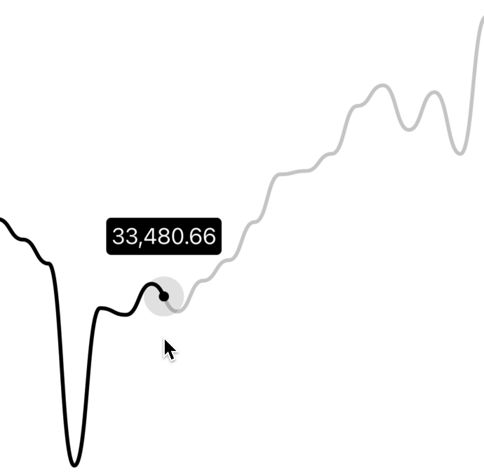
To render an interactive label on your line chart as your cursor moves along
the graph, you can use the PriceText or DatetimeText components:
> Note: These components must be within the LineChart.Provider component.
`jsx`
$3
To render an interactive tooltip that follows your cursor, you can use the
Tooltip component.
`jsx`
You can even add another tooltip to show something like date/time:
`jsx`
$3
You can also use the Tooltip component to render a "static" tooltip at aat
given index, by specifying the prop (similar to Dots). Note that
the tooltip will disappear when there is interaction with a cursor on the
chart.
`jsx`

$3
By making use of the chart event handlers, you are able to integrate haptic
feedback into your charts.
We can utilise the onActivated and onEnded events to create haptic feedback
on our line chart. This will cause a vibration on touch down/up.
`jsx
import * as haptics from 'expo-haptics';
const data = [...];
function invokeHaptic() {
haptics.impactAsync(haptics.ImpactFeedbackStyle.Light);
}
function Example() {
return (
)
}
`
We can also use the onCurrentIndexChange callback, passed toLineChart.Provider. This differs to the above method as it will cause a
vibration on touch down/up and also when the selected value changes.
`tsx
import * as haptics from 'expo-haptics';
const data = [...];
function invokeHaptic() {
haptics.impactAsync(haptics.ImpactFeedbackStyle.Light);
}
function Example() {
return (
)
}
`
If you want to synchronize two graphs, or even initialize a new graph with a
cursor position, you can use the at prop:
`tsx`
$3
By default, the charts come with default colors out-of-the-box... But you
probably will want to change these to suit your brand.
#### Coloring the path
To customise the color of the line chart path, supply a color prop toLineChart.Path. This can be any valid React Native StyleSheet compatible
color.
`jsx`
#### Coloring the cursor
To customise the color of the line chart cursor, supply a color prop toLineChart.CursorCrosshair. This can be any valid React Native StyleSheet
 compatible
color.
> Note: This also works for LineChart.CursorLine
`jsx`
#### Hovering the chart
By default, the cursor is triggered whenever you press the chart.
If your app runs on Web, you may want to trigger the cursor when a user hovers,
too. To achieve this, simply add as the child of your
cursor.
`jsx`
$3
By using the LineChart.Gradient component, you can apply a gradient to the
area underneath your path.
`jsx`
The gradient will inherit your path's color by default, however, you can
provide a color prop to LineChart.Gradient.
`jsx`
$3
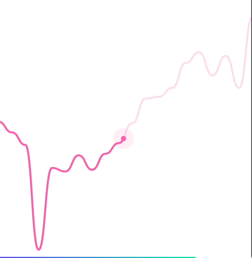
You can render dots on your line chart with LineChart.Dot.
`jsx`
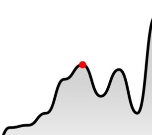
Your dot can also have an animated pulse by passing the hasPulse prop.
`jsx`
!Kapture 2021-11-23 at 11 50 54
$3
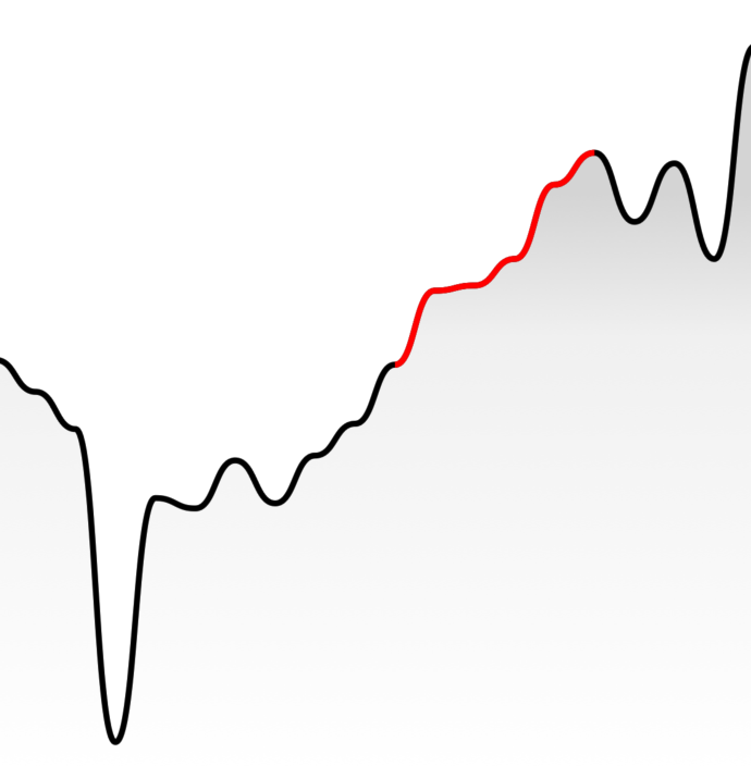
You can highlight a section of your path with LineChart.Highlight.
`jsx`
$3
You can render a static horizontal line on your line chart which moves whenever
your data change. In this example, the y value of the line is equal to the y
value of the point at index 0.
`jsx`
You can also directly specify the y value of the HorizontalLine with thevalue attribute:
`jsx`
$3
You can modify the width & height of the charts by providing width andheight props to LineChart or CandlestickChart. Your chart should adapt
to it's size.
`jsx`
$3
#### Price labels
##### Precision
By default, the price labels have a precision of 2, meaning that the pricesprecision
will always be to 2 decimal places. However, you can customize this with the prop:
`jsx`
##### Custom formatting
To customize the formatting of the price text, you can supply a format
function in the form of a
reanimated worklet:
> Note: due to the nature of reanimated worklets, you cannot define functions
> that run on the React Native JS thread.
> Read more here
`jsx$${formattedPrice} AUD
'worklet';
const formattedPrice = yourOwnFormatValueFn(value);
return ;`
}}
/>
#### Datetime labels
##### Date/time options
Internally, WAGMI charts uses
Date.prototype.toLocaleString()
to generate the date/time label. You can customise it's options like so:
`jsx`
options={{
year: 'numeric',
month: 'numeric',
day: 'numeric',
hour: 'numeric',
minute: 'numeric',
second: 'numeric',
}}
/>
##### Custom formatting
To customize the formatting of the date/time text, you can supply a format
function in the form of a
reanimated worklet:
> Note: due to the nature of reanimated worklets, you cannot define functions
> that run on the React Native JS thread.
> Read more here
`jsx`
'worklet';
const formattedDate = yourOwnFormatValueFn(value);
return formattedDate;
}}
/>
$3
#### Style
You can customize the style of the tooltip by providing the textStyle prop:
`jsx`
backgroundColor: 'black',
borderRadius: 4,
color: 'white',
fontSize: 18,
padding: 4,
}}
/>
#### Gutter
You can customize the gutters of the tooltip by providing cursorGutter,xGutter or yGutter.
cursorGutter is the gutter between the cursor and the tooltip.
xGutter and yGutter is the gutter on the x & y axis of the chart (the
tooltip can't pass the gutter).
`jsx`
$3
You can render an axis on your line chart with LineChart.Axis.
`jsx`
Candlestick Chart Guides
$3
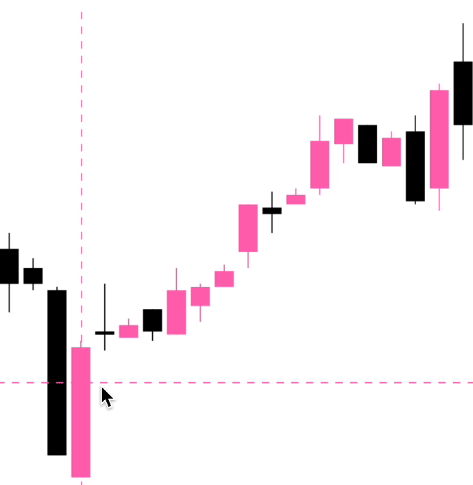
To render an interactive cursor on your candlestick chart, you can include the
CandlestickChart.Crosshair component:
`jsx`
$3
To render an interactive label on your candlestick chart, you can use the
PriceText or DatetimeText components:
> Note: These components must be within the CandlestickChart.Provider
> component.
`jsx`
$3
To render an interactive tooltip that follows your crosshair, you can use the
Tooltip component.
`jsx`
$3
By making use of the chart event handlers, you are able to integrate haptic
feedback into your charts.
We can utilise the onCurrentXChange event to create haptic feedback on our
candlestick chart.
`jsx
import * as haptics from 'expo-haptics';
const data = [...];
function invokeHaptic() {
haptics.impactAsync(haptics.ImpactFeedbackStyle.Light);
}
function Example() {
return (
)
}
`
$3
By default, the charts come with default colors out-of-the-box... But you
probably will want to change these to suit your brand.
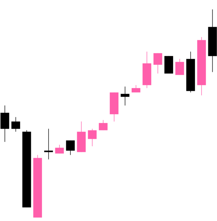
#### Coloring the candles
To customise the color of the candlestick chart candles, supply a
negativeColor and a positiveColor to CandlestickChart.Candles. This canStyleSheet
be any valid React Native compatible color.
`jsx`
#### Coloring the crosshair
To customise the color of the line chart cursor, supply a color prop toCandlestickChart.Crosshair. This can be any valid React Native StyleSheet
compatible color.
`jsx`
$3
#### Price labels
##### Precision
By default, the price labels have a precision of 2, meaning that the pricesprecision
will always be to 2 decimal places. However, you can customize this with the prop:
`jsx`
##### Custom formatting
To customize the formatting of the price text, you can supply a format
function in the form of a
reanimated worklet:
> Note: due to the nature of reanimated worklets, you cannot define functions
> that run on the React Native JS thread.
> Read more here
`jsx$${formattedPrice} AUD
'worklet';
const formattedPrice = yourOwnFormatValueFn(value);
return ;`
}}
/>
#### Datetime labels
##### Date/time options
Internally, WAGMI charts uses
Date.prototype.toLocaleString()
to generate the date/time label. You can customise it's options like so:
`jsx`
options={{
year: 'numeric',
month: 'numeric',
day: 'numeric',
hour: 'numeric',
minute: 'numeric',
second: 'numeric',
}}
/>
##### Custom formatting
To customize the formatting of the date/time text, you can supply a format
function in the form of a
reanimated worklet:
> Note: due to the nature of reanimated worklets, you cannot define functions
> that run on the React Native JS thread.
> Read more here
`jsx`
'worklet';
const formattedDate = yourOwnFormatValueFn(value);
return formattedDate;
}}
/>
Component APIs
$3
| Prop | Type | Default | Description |
| --------- | --------------------------------------------- | ------- | ---------------------------------------------------------------------------------------------------------------------------------------------------------------------------------------------------------------------------------------------------------------------- |
| data | Array<{ timestamp: number, value: number }> | | The line chart data as an array of timestamps & values (prices). |yRange
| | { min?: number; max?: number } | | Set a custom range for the y values of your chart. See #20 for a use-case. |xDomain
| | [ min: number; max: number ] | | Scale x values proportionate to their time scale. Distance between points will be relative to each other instead of same spacing between in point. See #140 for a use-case. |
$3
| Prop | Type | Default | Description |
| ---------- | ----------- | ----------------------- | -------------------------------------------------------------------------------------------------------------------------- |
| width | number | Width of device screen | The width of the chart |height
| | number | Height of device screen | The height of the chart |yGutter
| | number | 16 | The gutter of the chart on the Y axis (the chart data will not exceed it's gutter) |shape
| | function | shape.curveBumpX | The shape type/curve of the graph. Accepts a curve function from d3-shape |...props
| | ViewProps | | This component also inherits React Native's View props. |
$3
| Prop | Type | Default | Description |
| ----------- | ----------- | --------- | -------------------------------- |
| color | string | "black" | Color of the line path |width
| | number | 3 | Width of the line path |pathProps
| | PathProps | {} | React Native SVG's Path props. |
$3
| Prop | Type | Default | Description |
| ----------------------- | ------------------------------ | --------- | --------------------------------------------------------------------- |
| color | string | "black" | Color of the crosshair dot |size
| | number | 8 | Size of the crosshair dot |outerSize
| | number | 32 | Size of the outer crosshair dot (faded dot) |crosshairWrapperProps
| | ViewProps | | Props of the wrapper component of the crosshair |crosshairProps
| | ViewProps | | Props of the crosshair dot |crosshairOuterProps
| | ViewProps | | Props of the crosshair outer dot |snapToPoint
| | boolean | false | REACT NATIVE ONLY Snap cursor to X position of nearest data point |persistOnEnd
| | boolean | false | Keep the cursor pinned at its last position after the gesture ends |at
| | number | | Index of followed data item. |...props
| | LongPressGestureHandlerProps | | |
$3
| Prop | Type | Default | Description |
| -------------- | ----------- | -------- | ------------------------------------------------------------------ |
| color | string | "gray" | Color of the cursor line |lineProps
| | LineProps | | Props of the cursor line. Takes React Native SVG's Line props. |persistOnEnd
| | boolean | false | Keep the cursor pinned at its last position after the gesture ends |at
| | number | | Index of followed data item. |
$3
| Prop | Type | Default | Description |
| ------------------- | -------------------------------- | ------------------ | ---------------------------------------------------------------------------------------------------------------------------------------------------------------------------------------- |
| at | number | | Index of followed data item. |color
| | string | "black" | Color of the dot |size
| | number | 4 | Size of the dot. |inactiveColor
| | string | | Color of the dot when the chart is inactive. |showInactiveColor
| | boolean | true | Whether or not to show the inactive dot when the chart is inactive. |hasOuterDot
| | boolean | false | Whether or not the dot has an outer circle. |hasPulse
| | boolean | false | Whether or not the dot has an animated pulse. |outerSize
| | number | 16 | Size of the outer dot. |pulseBehaviour
| | "while-inactive" or "always" | "while-inactive" | Behaviour of the pulse. If always, the outer dot will still animate when interaction is active. If while-inactive, the outer dot will animate only when the interaction is inactive. |pulseDurationMs
| | number | 800 | Duration in ms of the pulse animation. |dotProps
| | CircleProps | | Props of the dot (accepts React Native SVG's Circle props). |outerDotProps
| | CircleProps | | Props of the outer dot (accepts React Native SVG's Circle props). |
$3
| Prop | Type | Default | Description |
| ------------------- | --------- | --------- | ------------------------------------------------------------------------- |
| from | number | | Data index of where to start the highlight. |to
| | number | | Data index of where to end the highlight. |color
| | string | "black" | Color of the highlighted path. |inactiveColor
| | string | | Color of the highlight when the chart is inactive. |showInactiveColor
| | boolean | true | Whether or not to show the inactive highlight when the chart is inactive. |width
| | number | 3 | Width of the highlight stroke. |
$3
| Prop | Type | Default | Description |
| ----------- | ------------------------------------------------------ | -------- | ---------------------------------------------------------------------------------------------------------- |
| color | string | "gray" | Color of the cursor line |lineProps
| | LineProps | | Props of the cursor line. Takes React Native SVG's Line props. |at
| | number or { index: number } or { value: number } | 0 | Index of followed data item. You can alternatively pass { value: number }, corresponding to a y value. |
$3
| Prop | Type | Default | Description |
| ---------- | ----------- | ------- | --------------------- |
| color | string | | Color of the gradient |...props
| | PathProps | | |
$3
| Prop | Type | Default | Description |
| ------------------------ | ---------------------------------------------- | ------- | ------------------------------------------------------------------------------------------------------------------------------ |
| xGutter | number | 8 | X axis gutter in which the tooltip will not pass. |yGutter
| | number | 8 | Y axis gutter in which the tooltip will not pass. |cursorGutter
| | number | 48 | Gutter (spacing) between the cursor and the tooltip. |position
| | "top" or "bottom" or "left" or "right" | "top" | Position of the tooltip relative to the cursor. |withHorizontalFloating
| | boolean | false | If set to true, the position will changes between left and right on if tooltip reaches the X axis gutters. |textStyle
| | {} | | Style of the tooltip text |at
| | number | | Make the tooltip static at the given data index (which shows the tooltip always, unless there is interaction with the chart) |
$3
| Prop | Type | Default | Description |
| ----------- | ---------------------------------- | ------------- | ------------------------------------------ |
| format | ({ value, formatted }) => string | | Custom format function of the price. |precision
| | number | 2 | Default precision of the price. |variant
| | "formatted" or "value" | "formatted" | Default representation of the price value. |...props
| | TextProps | | Inherits React Native's Text props |
$3
| Prop | Type | Default | Description |
| --------- | ---------------------------------- | ------------- | ------------------------------------------------------------------------------------------------------------------------------------------------------------------------- |
| format | ({ value, formatted }) => string | | Custom format function of the timestamp. |locale
| | string | "en-US" | Locale of the timestamp. |options
| | {} | | Options to pass to toLocaleString(). Available options are here |style
| | {} | | Style of the price text |variant
| | "formatted" or "value" | "formatted" | Default representation of the timestamp value. |
$3
This component doesn't take any props. Place it as the child of your cursor
component to trap hover events on Web. If you're using mutliple cursors, place
this as the child of your lowest-rendered cursor.
`tsx`
$3
| Prop | Type | Default | Description |
| :------------------ | :---------------------------------------------- | :--------- | :--------------------------------------------------------------- |
| position | string | | Position of the axis. Can be left, right, top or bottom. |orientation
| | string | | Orientation of the axis. Can be vertical or horizontal. |color
| | string | #666 | Color of the axis line and ticks. |strokeWidth
| | number | | Width of the axis line and ticks. |tickCount
| | number | 5 | Number of ticks to display on the axis. |domain
| | [number, number] | [0, 100] | Domain of the axis. |hideOnInteraction
| | boolean | false | Whether to hide the axis when the user interacts with the chart. |format
| | (value: number or string) => string or number | | Function to format the tick labels. |textStyle
| | StyleProp | | Style of the tick labels. |
$3
| Prop | Type | Default | Description |
| ------ | -------------------------------------------------------------------------------------- | ------- | ----------------------------------------------------------------------- |
| data | Array<{ timestamp: number, open: number, high: number, low: number, close: number }> | | The candlestick chart data as an array of timestamps & values (prices). |
$3
| Prop | Type | Default | Description |
| ---------- | ----------- | ----------------------- | --------------------------------------------------------- |
| width | number | Width of device screen | The width of the chart |height
| | number | Height of device screen | The height of the chart |...props
| | ViewProps | | This component also inherits React Native's View props. |
$3
| Prop | Type | Default | Description |
| --------------- | ------------------------------------------------------------------------------------------------------------------------------- | --------- | ------------------------------------------------------------------ |
| positiveColor | string | #10b981 | Color of the positive candles |negativeColor
| | string | #ef4444 | Color of the negative candles |rectProps
| | RectProps | | Props of the SVG Rectangle. Takes React Native's SVG Rect props. |lineProps
| | LineProps | | Props of the SVG Line. Takes React Native's SVG Line props. |renderRect
| | ({ x: number, y: number, width: number, height: number, fill: string, candle: TCandle }) => React.ReactNode | | Renders a custom rect component |renderLine
| | ({ x1: number, x2: number, y1: number, y2: number, stroke: string, strokeWidth: number, candle: TCandle }) => React.ReactNode | | Renders a custom line component |...props
| | SvgProps | | This component also inherits React Native SVG's Svg props. |
$3
| Prop | Type | Default | Description |
| ------------------ | ------------------------------ | --------- | ------------------------------------------------ |
| color | string | "black" | Color of the crosshair |onCurrentXChange
| | (xValue: number) => void | | Callback to invoke when the x coordinate changes |...props
| | LongPressGestureHandlerProps | | |
$3
| Prop | Type | Default | Description |
| ------------------ | ---------------- | ------- | ------------------------------------------------- |
| xGutter | number | 8 | X axis gutter in which the tooltip will not pass. |yGutter
| | number | 8 | Y axis gutter in which the tooltip will not pass. |tooltipTextProps
| | PriceTextProps | | Props of the tooltip (price) text. |textStyle
| | {} | | Style of the tooltip text |
$3
| Prop | Type | Default | Description |
| ----------- | ---------------------------------- | ------------- | ------------------------------------------ |
| format | ({ value, formatted }) => string | | Custom format function of the price. |precision
| | number | 2 | Default precision of the price. |variant
| | "formatted" or "value" | "formatted" | Default representation of the price value. |...props
| | TextProps | | Inherits React Native's Text props |
$3
| Prop | Type | Default | Description |
| --------- | ---------------------------------- | ------------- | ------------------------------------------------------------------------------------------------------------------------------------------------------------------------- |
| format | ({ value, formatted }) => string | | Custom format function of the timestamp. |locale
| | string | "en-US" | Locale of the timestamp. |options
| | {} | | Options to pass to toLocaleString(). Available options are here |style
| | {} | | Style of the price text |variant
| | "formatted" or "value" | "formatted" | Default representation of the timestamp value. |
Hooks
The following hooks are only accessible inside the LineChart.Provider orCandlestickChart.Provider.
$3
The LineChart.useChart hook returns the current state of the chart.
`jsx`
const { currentX, currentY, currentIndex, data, domain, isActive } =
LineChart.useChart();
#### Reference
Returns
| Variable | Type | Default | Description |
| -------------- | --------------------------------------------- | ------- | ------------------------------- |
| currentX | SharedValue | | Current x position |currentY
| | SharedValue | | Current y position |currentIndex
| | SharedValue | | Current index of the data |data
| | Array<{ timestamp: number, value: number }> | | Data of the chart |domain
| | [number, number] | | Y domain of the chart |isActive
| | SharedValue | | Is the chart active by gesture? |
$3
`jsx`
const { value, formatted } = LineChart.useDatetime({
format,
locale,
options,
});
#### Reference
Arguments
| Variable | Type | Default | Description |
| --------- | ---------------------------------- | --------- | ------------------------------------------------------------------------------------------------------------------------------------------------------------------------- |
| format | ({ value, formatted }) => string | | Custom format function of the timestamp. |locale
| | string | "en-US" | Locale of the timestamp. |options
| | {} | | Options to pass to toLocaleString(). Available options are here |
Returns
| Variable | Type | Default | Description |
| ----------- | -------- | ------- | ------------------------- |
| value | string | | Timestamp value in ms. |formatted
| | string | | Formatted timestamp value |
$3
`jsx`
const { value, formatted } = LineChart.usePrice({
format,
precision,
});
Arguments
| Variable | Type | Default | Description |
| ----------- | ---------------------------------- | ------- | ------------------------------------ |
| format | ({ value, formatted }) => string | | Custom format function of the price. |precision
| | number | 2 | Precision of the price value. |index
| | number | | Get the price for a specific index |
Returns
| Variable | Type | Default | Description |
| ----------- | -------- | ------- | --------------------- |
| value | string | | Price value |formatted
| | string | | Formatted price value |
$3
`jsx`
const { currentX, currentY, data, domain, step } = CandlestickChart.useChart();
#### Reference
Returns
| Variable | Type | Default | Description |
| ---------- | -------------------------------------------------------------------------------------- | ------- | ------------------------- |
| currentX | SharedValue | | Current x position |currentY
| | SharedValue | | Current y position |data
| | Array<{ timestamp: number, open: number, high: number, low: number, close: number }> | | Data of the chart |domain
| | [number, number] | | Y domain of the chart |step
| | number | | Current index of the data |
$3
The useCandleData hook returns the current candle data.
`jsx`
const { timestamp, open, high, low, close } = CandlestickChart.useCandleData();
#### Reference
Returns
| Variable | Type | Default | Description |
| ----------- | -------- | ------- | ----------- |
| timestamp | number | | |open
| | number | | |high
| | number | | |low
| | number | | |close
| | number | | |
$3
`jsx`
const { value, formatted } = CandlestickChart.useDatetime({
format,
locale,
options,
});
#### Reference
Arguments
| Variable | Type | Default | Description |
| --------- | ---------------------------------- | --------- | ------------------------------------------------------------------------------------------------------------------------------------------------------------------------- |
| format | ({ value, formatted }) => string | | Custom format function of the timestamp. |locale
| | string | "en-US" | Locale of the timestamp. |options
| | {} | | Options to pass to toLocaleString(). Available options are here |
Returns
| Variable | Type | Default | Description |
| ----------- | -------- | ------- | ------------------------- |
| value | string | | Timestamp value in ms. |formatted
| | string | | Formatted timestamp value |
$3
`jsx`
const { value, formatted } = CandlestickChart.usePrice({
format,
precision,
});
Arguments
| Variable | Type | Default | Description |
| ----------- | ---------------------------------- | ------- | ------------------------------------ |
| format | ({ value, formatted }) => string | | Custom format function of the price. |precision
| | number | 2 | Precision of the price value. |
Returns
| Variable | Type | Default | Description |
| ----------- | -------- | ------- | --------------------- |
| value | string | | Price value |formatted
| | string | | Formatted price value |
Web Support
Web support is currently experimental.
Currently, transitions for a line chart's path flicker a little. You can
disable them on Web with the isTransitionEnabled prop.
$3
`tsx
import { Platform } from 'react-native';
const isWeb = Platform.OS === 'web'
isTransitionEnabled: !isWeb,
}}
/>;
`
$3
In order to support SVG animations on Web, you'll need at least Reanimated
version 2.3.0-beta.2`. Or, you can use the patch from
Issue #8.
Credits
This library wouldn't be possible if it weren't for:
- Rainbow's Animated Charts
- @wcandillon and his Can It Be Done In React Native series 💪😍