React St Modal is a simple and flexible library for implementing modal dialogs
npm install react-st-modal   
---
---
React St Modal is a simple and flexible library for implementing modal dialogs.
---
DEMO AND DOCS: https://nodlik.github.io/react-st-modal/
---
``shell`
npm install react-st-modal
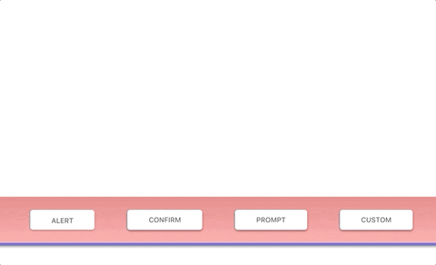
Functions Alert, Confirm, Prompt implement the behavior of existing browser functions.
Function CustomDialog shows any JSX element in a modal window.
React component StaticDialog is used to define modals in your JSX element.
| body: JSX.Element (string), title?: string, buttonText?: string | void | Shows a message (body) and waits for the user to press button |
| Confirm | body: JSX.Element (string), title?: string, okButtonText?: string, cancelButtonText?: string | boolean | Shows a modal window with a text (body) and two buttons: OK and Cancel. The result is true if OK is pressed and false otherwise|
| Prompt |title?: string, options?: PromptConfig | string | Shows a modal window with a text message, an input field for the visitor, and the buttons OK/Cancel|PromptConfig allows you to specify the following optional parameters:
* defaultValue: string | number
*
*
*
* Example
jsx
import { Confirm } from 'react-st-modal';function ConfirmExample() {
return (
const result = await Confirm('Сonfirmation text',
'Сonfirmation title');
if (result) {
// Сonfirmation confirmed
} else {
// Сonfirmation not confirmed
}
}}
>
Show confirm
);
}
`
---
$3
 is an async function that shows any element in a modal window.Parameters
*
body: JSX.Element - the element shown in the modal dialog
* options?: CustomConfig - specified optionsCustomConfig allows you to specify the following optional parameters:
* title?: string - modal dialog title
* className?: string - css className
* defaultBodyOverflow?: string (default: visible) - default value to body css property overflow
* (default: false) - show close button in the top corner of the window
* isCanClose?: boolean (default: true) - is it possible to close the dialog by clicking on the overlay or ESC button
* isFocusLock?: boolean (default: true) - lock focus on modal
* isBodyScrollLocked?: boolean (default: true) - content scrolling lock
* replaceScrollBar?: boolean (default: true) - whether to replace the body scrollbar with a placeholder
* scrollBarPlaceholderColor?: string (default: #eeeeee) - default color for the scrollbar placeholder
* onAfterOpen?: () => void - event called after the dialog was openedTo control a dialog from an inner element, use
useDialog hookuseDialog returns an object containing:
* isOpen: boolean - the current state of the modal
* close: (result?: T) => void - function that closes the dialog and returns the resultExample
`jsx
import { CustomDialog, useDialog } from 'react-st-modal';// The element to be shown in the modal window
function CustomDialogContent() {
// use this hook to control the dialog
const dialog = useDialog();
const [value, setValue] = useState();
return (
onChange={(e) => {
setValue(e.target.value);
}}
/>
// Сlose the dialog and return the value
dialog.close(value);
}}
>
Custom button
);
}function CustomExample() {
return (
const result = await CustomDialog(
{
title: 'Custom Dialog',
showCloseIcon: true,
}
);
}}
>
Custom
);
}
`
---
$3
 it is a React component that used to define modals in your JSX elementProps
*
isOpen: boolean - describing if the modal should be shown or not
* children: React.ReactNode - the element shown in the modal dialog
* title?: string - modal dialog title
* className?: string - css className
* defaultBodyOverflow?: string (default: visible) - default value to body css property overflow
* (default: false) - show close button in the top corner of the window
* isCanClose?: boolean (default: true) - is it possible to close the dialog by clicking on the overlay or ESC button
* isFocusLock?: boolean (default: true) - lock focus on modal
* isBodyScrollLocked?: boolean (default: true) - content scrolling lock
* replaceScrollBar?: boolean (default: true) - whether to replace the body scrollbar with a placeholder
* scrollBarPlaceholderColor?: string (default: #eeeeee) - default color for the scrollbar placeholder
* onAfterClose?: (result?: T) => void - event called after the dialog was closed
* onAfterOpen?: () => void - event called after the dialog was openedExample
`jsx
import { StaticDialog, useDialog } from 'react-st-modal';function CustomStaticExample() {
const [isOpen, setOpen] = useState(false);
return (
title="Custom static dialog"
onAfterClose={(result) => {
setOpen(false);
// do something with dialog result
}}
>
{/ see previous demo /}
setOpen(true);
}}
>
Custom static
);
}
`
---
$3
To decorate your dialogs, you can use the following components:
, ModalContent, ModalFooterExample
jsx
import { ModalContent, ModalFooter, ModalButton, useDialog } from 'react-st-modal';function CustomDialogContent() {
const dialog = useDialog();
const [value, setValue] = useState();
return (
Custom dialog content
dialog.close(value);
}}
>
Custom button
);
}
``---
$3
Oleg,
[![Buy me a coffee][buymeacoffee-shield]][buymeacoffee]
[buymeacoffee]: https://www.buymeacoffee.com/nndlik
[buymeacoffee-shield]: https://www.buymeacoffee.com/assets/img/custom_images/orange_img.png