React-based typeahead and typeahead-tokenizer
npm install react-typeahead> A typeahead/autocomplete component for React
react-typeahead is a javascript library that provides a react-based
typeahead, or autocomplete text entry, as well as a "typeahead tokenizer",
a typeahead that allows you to select multiple results.
For a typeahead input:
``javascript`
var Typeahead = require('react-typeahead').Typeahead;
React.render(
maxVisible={2}
/>
);
For a tokenizer typeahead input:
`javascript`
var Tokenizer = require('react-typeahead').Tokenizer;
React.render(
onTokenAdd={function(token) {
console.log('token added: ', token);
}}
/>
);
* [Basic Typeahead with Topcoat][1]
* [Typeahead Tokenizer with Topcoat][2]
* [Typeahead Tokenizer with simple styling][3]

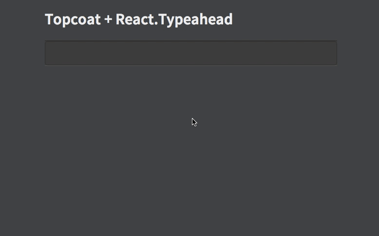
[1]: http://wookiehangover.github.com/react-typeahead/examples/typeahead-topcoat.html
[2]: http://wookiehangover.github.com/react-typeahead/examples/tokenizer-topcoat.html
[3]: http://wookiehangover.github.com/react-typeahead/examples/TypeaheadTokenizer-simple.html
[4]: http://blog.npmjs.org/post/85484771375/how-to-install-npm
Type: React Component
Basic typeahead input and results list.
#### props.options
Type: Array
Default: []
An array supplied to the filtering function. Can be a list of strings or a list of arbitrary objects. In the latter case, filterOption and displayOption should be provided.
#### props.defaultValue
Type: String
A default value used when the component has no value. If it matches any options a option list will show.
#### props.value
Type: String
Specify a value for the text input.
#### props.maxVisible
Type: Number
Limit the number of options rendered in the results list.
#### props.resultsTruncatedMessage
Type: String
If maxVisible is set, display this custom message at the bottom of the list of results when the result are truncated.
#### props.customClasses
Type: Objectinput
Allowed Keys: , results, listItem, listAnchor, hover, typeahead, resultsTruncated
An object containing custom class names for child elements. Useful for
integrating with 3rd party UI kits.
#### props.placeholder
Type: String
Placeholder text for the typeahead input.
#### props.disabled
Type: Boolean
Set to true to add disable attribute in the or
#### props.textarea
Type: Boolean
Set to true to use a
#### props.inputProps
Type: Object
Props to pass directly to the element.
#### props.onKeyDown
Type: Function
Event handler for the keyDown event on the typeahead input.
#### props.onKeyPress
Type: Function
Event handler for the keyPress event on the typeahead input.
#### props.onKeyUp
Type: Function
Event handler for the keyUp event on the typeahead input.
#### props.onBlur
Type: Function
Event handler for the blur event on the typeahead input.
#### props.onFocus
Type: Function
Event handler for the focus event on the typeahead input.
#### props.onOptionSelected
Type: Function
Event handler triggered whenever a user picks an option.
#### props.filterOption
Type: String or Function
A function to filter the provided options based on the current input value. For each option, receives (inputValue, option). If not supplied, defaults to fuzzy string matching.
If provided as a string, it will interpret it as a field name and fuzzy filter on that field of each option object.
#### props.displayOption
Type: String or Function
A function to map an option onto a string for display in the list. Receives (option, index) where index is relative to the results list, not all the options. Must return a string.
If provided as a string, it will interpret it as a field name and use that field from each option object.
#### props.formInputOption
Type: String or Function
A function to map an option onto a string to include in HTML forms (see props.name). Receives (option) as arguments. Must return a string.
If specified as a string, it will interpret it as a field name and use that field from each option object.
If not specified, it will fall back onto the semantics described in props.displayOption.
This option is ignored if you don't specify the name prop. It is required if you both specify the name prop and are using non-string options. It is optional otherwise.
#### props.defaultClassNames
Type: boolean
Default: true
If false, the default classNames are removed from the typeahead.
#### props.customListComponent
Type: React Component
A React Component that renders the list of typeahead results. This replaces the default list of results.
This component receives the following props :
##### Passed through
- props.displayOptionsprops.customClasses
- props.onOptionSelected
-
##### Created or modified
- props.optionsprops.options
- This is the Typeahead's filtered and limited to Typeahead.props.maxVisible.props.selectionIndex
-
- The index of the highlighted option for rendering
#### props.showOptionsWhenEmpty
Type: boolean
Default: false
If true, options will still be rendered when there is no value.
#### props.allowCustomValues
Type: boolean
If true, custom tags can be added without a matching typeahead selection
#### typeahead.focus
Focuses the typeahead input.
---
Type: React Component
Typeahead component that allows for multiple options to be selected.
#### props.options
Type: Array
Default: []
An array supplied to the filter function.
#### props.maxVisible
Type: Number
Limit the number of options rendered in the results list.
#### props.resultsTruncatedMessage
Type: String
If maxVisible is set, display this custom message at the bottom of the list of results when the result are truncated.
#### props.name
Type: String
The name for HTML forms to be used for submitting the tokens' values array.
#### props.customClasses
Type: Objectinput
Allowed Keys: , results, listItem, listAnchor, hover, typeahead, resultsTruncated, token
An object containing custom class names for child elements. Useful for
integrating with 3rd party UI kits.
#### props.placeholder
Type: String
Placeholder text for the typeahead input.
#### props.disabled
Type: Boolean
Set to true to add disable attribute in the or
#### props.inputProps
Type: Object
Props to pass directly to the element.
#### props.onKeyDown
Type: Function
Event handler for the keyDown event on the typeahead input.
#### props.onKeyPress
Type: Function
Event handler for the keyPress event on the typeahead input.
#### props.onKeyUp
Type: Function
Event handler for the keyUp event on the typeahead input.
#### props.onBlur
Type: Function
Event handler for the blur event on the typeahead input.
#### props.onFocus
Type: Function
Event handler for the focus event on the typeahead input.
#### props.defaultSelected
Type: Array
A set of values of tokens to be loaded on first render.
#### props.onTokenRemove
Type: Function(removedToken)
Params:
Event handler triggered whenever a token is removed.
#### props.onTokenAdd
Type: Function(addedToken)
Params:
Event handler triggered whenever a token is added.
#### props.displayOption
Type: String or Function
A function to map an option onto a string for display in the list. Receives (option, index) where index is relative to the results list, not all the options. Can either return a string or a React component.
If provided as a string, it will interpret it as a field name and use that field from each option object.
#### props.filterOption
Type: String or Function
A function to filter the provided options based on the current input value. For each option, receives (inputValue, option). If not supplied, defaults to fuzzy string matching.
If provided as a string, it will interpret it as a field name and use that field from each option object.
#### props.searchOptions
Type: Function
A function to filter, map, and/or sort the provided options based on the current input value.(inputValue, options)
Receives .
If not supplied, defaults to fuzzy string matching.
Note: the function can be used to store other information besides the string in the internal state of the component.
Make sure to use the displayOption, inputDisplayOption, and formInputOption props to extract/generate the correct format of data that each expects if you do this.
#### props.inputDisplayOption
Type: String or Function
A function that maps the internal state of the visible options into the value stored in the text value field of the visible input when an option is selected.
Receives (option).
If provided as a string, it will interpret it as a field name and use that field from each option object.
If no value is set, the input will be set using displayOption when an option is selected.
#### props.formInputOption
Type: String or Function
A function to map an option onto a string to include in HTML forms as a hidden field (see props.name). Receives (option) as arguments. Must return a string.
If specified as a string, it will interpret it as a field name and use that field from each option object.
If not specified, it will fall back onto the semantics described in props.displayOption.
#### props.defaultClassNames
Type: boolean
Default: true
If false, the default classNames are removed from the tokenizer and the typeahead.
#### props.showOptionsWhenEmpty
Type: boolean
Default: false
If true, options will still be rendered when there is no value.
#### tokenizer.focus
Focuses the tokenizer input.
#### tokenizer.getSelectedTokens
Type: Function
A function to return the currently selected tokens.
You will need npm to develop on react-typeahead. [Installing npm][4].
Once that's done, to get started, run npm install in your checkout directory.gulp
This will install all the local development dependences, such as and mocha
react-typeahead uses mocha for unit tests and gulp for running them. Large changes should
include unittests.
After updating or creating new tests, run npm run-script build-test to regenerate the
test package.
Once that's done, running the tests is easy with gulp:
`
> gulp test
[00:17:25] Using gulpfile ~/src/react-typeahead/gulpfile.js
[00:17:25] Starting 'test'...
․․․․․․․․․․․․․․․
15 passing (43ms)
[00:17:25] Finished 'test' after 448 ms
[00:17:25] Starting 'default'...
[00:17:25] Finished 'default' after 6.23 μs
``
Basically, fork the repository and send a pull request. It can be difficult to review these, so
here are some general rules to follow for getting your PR accepted more quickly:
- All new properties and exposed component function should be documented in the README.md
- Break your changes into smaller, easy to understand commits.
- Send separate PRs for each commit when possible.
- Feel free to rebase, merge, and rewrite commits to make them more readible.
- Add comments explaining anything that's not painfully obvious.
- Add unittests for your change if possible.
[reactecf]: https://facebook.github.io/react/tips/expose-component-functions.html