spotify-now-playing-card
v1.0.9TypeScript
A beautiful React component to display your currently playing Spotify track
31/weekUpdated 2 weeks agoMITUnpacked: 72.0 KB
Published by Bojan Jagetic
npm install spotify-now-playing-cardSpotify Now Playing Card
A beautiful, customizable React component to display your currently playing Spotify track. Perfect for personal websites, portfolios, and blogs.

Features
- 🎵 Displays currently playing track from Spotify
- 🎨 Fully customizable styling
- ⚡ Built with SWR for efficient data fetching
- 📱 Responsive design
- 🔄 Auto-refresh with configurable interval
- 🎯 Framework agnostic (works with Next.js, Create React App, etc.)
- 📘 Written in TypeScript with full type definitions
Installation
``bash`
npm install spotify-now-playing-cardor
yarn add spotify-now-playing-cardor
pnpm add spotify-now-playing-card
Quick Setup
$3
1. Go to Spotify Developer Dashboard
2. Create a new app
3. Get your CLIENT_ID and CLIENT_SECRET
4. Set redirect URI (e.g., )
5. Get your refresh token (you can use tools like this)
$3
Create .env file:
`env`
SPOTIFY_CLIENT_ID=your_client_id
SPOTIFY_CLIENT_SECRET=your_client_secret
SPOTIFY_REFRESH_TOKEN=your_refresh_token
$3
You need to create an API endpoint that the component will call. Choose the option that matches your setup:
> How do I know which Next.js option to use?
> - Pages Router: If you have a pages folder in your project → Use Option Aapp
> - App Router: If you have an folder in your project → Use Option B
> - Not using Next.js: Use Option C
#### Option A: Next.js (Pages Router)
If you're using Next.js with the pages directory, create pages/api/spotify.js:
`javascript
import { createSpotifyHandler } from 'spotify-now-playing-card'
const spotifyApi = createSpotifyHandler({
clientId: process.env.SPOTIFY_CLIENT_ID,
clientSecret: process.env.SPOTIFY_CLIENT_SECRET,
refreshToken: process.env.SPOTIFY_REFRESH_TOKEN
})
export default spotifyApi
`
#### Option B: Next.js (App Router)
If you're using Next.js 13+ with the app directory, create app/api/spotify/route.ts:
`typescript
import { createSpotifyAppHandler } from 'spotify-now-playing-card'
const spotifyApi = createSpotifyAppHandler({
clientId: process.env.SPOTIFY_CLIENT_ID!,
clientSecret: process.env.SPOTIFY_CLIENT_SECRET!,
refreshToken: process.env.SPOTIFY_REFRESH_TOKEN!
})
export const GET = spotifyApi
`
#### Option C: Express.js or other Node.js backend
If you're using Express.js or another Node.js backend with React frontend, create an API route:
Express.js example (server.js or routes/spotify.js):
`javascript
import express from 'express'
import { createSpotifyHandler } from 'spotify-now-playing-card'
const app = express()
const spotifyHandler = createSpotifyHandler({
clientId: process.env.SPOTIFY_CLIENT_ID,
clientSecret: process.env.SPOTIFY_CLIENT_SECRET,
refreshToken: process.env.SPOTIFY_REFRESH_TOKEN
})
// The handler from createSpotifyHandler works with Express too
app.get('/api/spotify', spotifyHandler)
app.listen(3000, () => {
console.log('Server running on http://localhost:3000')
})
`
Note: The component will call whatever URL you pass to apiUrl prop. Make sure your backend returns data in the format shown in the "API Response Format" section below. If you're using a different backend framework, you'll need to implement the Spotify API logic yourself - see the "API Response Format" section for the expected response structure.
$3
`jsx
import { SpotifyCard } from 'spotify-now-playing-card'
import 'spotify-now-playing-card/dist/styles.css' // Required for default styles
function App() {
return
}
`
Important: Make sure the apiUrl matches your API endpoint:/api/spotify
- Next.js: (relative URL)http://localhost:3000/api/spotify
- Express/other backend: (full URL) or use environment variable
That's it! The library handles all Spotify API calls, token refresh, and error handling automatically.
Usage Examples
$3
Important: You need to import the CSS file for default styles to work:
`jsx
import { SpotifyCard } from 'spotify-now-playing-card'
import 'spotify-now-playing-card/dist/styles.css'
function App() {
return
}
`
The component works without Tailwind CSS - it includes its own CSS file with default styles. If you're using Tailwind, you can still override styles using the styles prop.
$3
`jsx
import { SpotifyCard } from 'spotify-now-playing-card'
import 'spotify-now-playing-card/dist/styles.css'
function App() {
return (
className="my-custom-class"
styles={{
container: "bg-gray-900 rounded-xl",
title: "text-white text-lg",
artist: "text-gray-400"
}}
/>
)
}
`
$3
The package includes full TypeScript definitions:
`tsx
import { SpotifyCard, SpotifyCardProps } from 'spotify-now-playing-card'
import 'spotify-now-playing-card/dist/styles.css'
const MyComponent: React.FC = () => {
const cardProps: SpotifyCardProps = {
apiUrl: '/api/spotify',
showAlbum: true,
refreshInterval: 30000
}
return
}
`
Component Props
| Prop | Type | Default | Description |
|------|------|---------|-------------|
| apiUrl | string | '/api/spotify' | API endpoint URL that returns Spotify data |fallbackUrl
| | string | 'https://open.spotify.com' | URL to redirect when not playing |variant
| | 'default' \| 'spotify' \| 'modern' \| 'dark' | 'default' | Pre-built style variant |className
| | string | '' | Additional CSS classes for container |styles
| | object | {} | Custom style overrides for different elements |showAlbum
| | boolean | true | Whether to show album name |notPlayingText
| | string | 'Currently not listening' | Text when not playing |refreshInterval
| | number | 30000 | Auto-refresh interval in milliseconds |
Styling
The component includes its own CSS file with default styles, so it works without Tailwind CSS. Simply import the CSS:
`jsx`
import 'spotify-now-playing-card/dist/styles.css'
$3
The component comes with 3 built-in style variants. Just use the variant prop - no custom CSS needed!
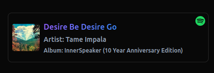
#### Variant 1: Default (default)
Clean and minimal design with subtle borders and gradient text when playing:
`jsx`
variant="default"
/>
#### Variant 2: Spotify Official Design
Bold design with white and orange split background, black text, and grayscale album art - inspired by Spotify's visual identity:
`jsx`
variant="spotify"
/>
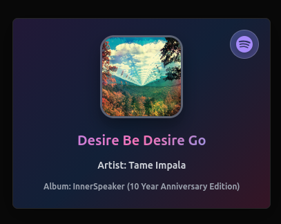
#### Variant 3: Modern Glossy/Glassmorphism
Vertical card layout with glassmorphism effect, centered content, large album art with hover animations, and gradient text:
`jsx`
variant="modern"
/>
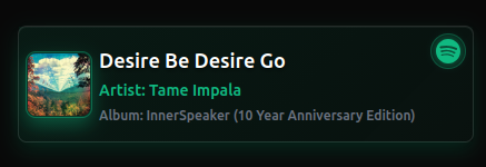
#### Variant 4: Dark Elegant
Dark theme with elegant green accents, subtle gradients, and smooth hover effects:
`jsx`
variant="dark"
/>
That's it! No need to write any CSS - just set the variant prop.
$3
You can still customize variants by combining them with the styles prop or className:
`jsx`
variant="spotify"
className="my-custom-class"
styles={{
container: "shadow-2xl", // Add additional Tailwind classes
title: "text-lg" // Override specific elements
}}
/>
$3
If you're using Tailwind CSS, you can override styles using the styles prop:
`jsx`
styles={{
container: "bg-gray-900 rounded-xl", // Tailwind classes
title: "text-white text-lg"
}}
/>
$3
You can also override styles using your own CSS by targeting the component classes:
`css`
.spotify-card-container {
background: #1a1a1a;
border-radius: 12px;
}
API Response Format
The API endpoint should return JSON in this format:
When playing:
`json`
{
"isPlaying": true,
"title": "Song Title",
"artist": "Artist Name",
"album": "Album Name",
"albumImageUrl": "https://...",
"songUrl": "https://open.spotify.com/track/..."
}
When not playing:
`json`
{
"isPlaying": false
}
The library's createSpotifyHandler and createSpotifyAppHandler functions automatically return data in this format, so you don't need to worry about it.
Setup Script (Alternative)
Alternatively, you can use the setup script:
`bash`
npx spotify-now-playing-card-setupor if installed locally
npm run setup
This will:
- Detect your framework (Next.js Pages/App Router)
- Generate the API endpoint automatically
- Set up environment variables
- Guide you through the process
Dependencies
- react (>=16.8.0)react-dom
- (>=16.8.0)axios
- (for API calls)swr
- (for data fetching)react-icons` (for Spotify icon)
-
License
MIT
Contributing
Contributions are welcome! Please feel free to submit a Pull Request.