squeezebox
v1.4.1
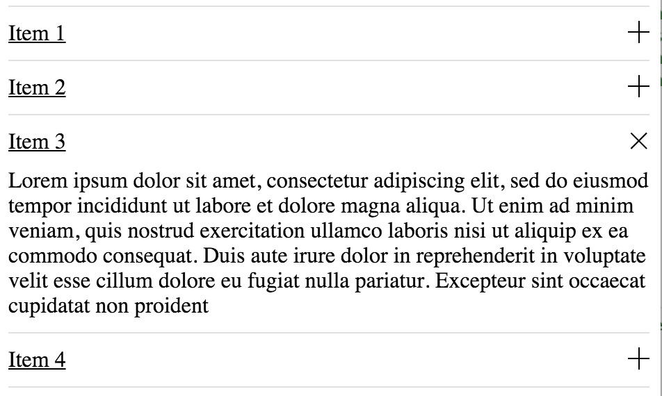
Angular 2 simple accordion component
0/weekUpdated 3 years agoMITUnpacked: 150.9 KB
Published by Alejandro Soto
npm install squeezebox
Squeezebox
Simple Angular 2 accordion component with smooth transitions/animations
$3
Running sample can be seen here , but this is not for real use case, so for real usage take a look at the following references: installation via npm, typescript usage, etc
$3
npm install squeezebox --save$3
Import the module wherever is going to be used:
import {SqueezeBoxModule} from 'squeezebox/dist';
Import the module also in your app module, like:
``
@NgModule({
  imports:      [BrowserModule, SqueezeBoxModule], // here
  declarations: [AppComponent],
  bootstrap:    [AppComponent]
})
export class AppModule { }
`
Start using it in the component template:
`
or iterate a data list
`
$3
* multiple:boolean (default: true) => this attribute enable/disable the multiple item expanded at the same time, for example: ... ...
* collapsed:boolean (default: true) => this attribute enable/disable collapse from the beginning when component is rendered, for example: ...
* collapsed:boolean (default: true) => this attribute enable/disable collapse from the beginning when component is rendered, for example:
$3
* onToggled => this output is triggered everytime item is expanded or collapsed, returns true
if collapsed or false if expanded, for example:
`
   ...
... itemWasToggled(event) {
    console.log('collapsed:', event);
}
...
$3
* refresh => This method is useful when accordion is hidden for example when using tabs or panels that go visible and hidden. It can be called from a SqueezeBox reference via or @ViewChildren, for example following code can refresh all the available squeezeboxes in the current component :
`
...
@ViewChildren(SqueezeBox) squeezeboxes: QueryList;
......
onTabActive(event:Event) {
    event.preventDefault();
    this.squeezeboxes.toArray().forEach(function(s) {
        s.refresh();
    });
}
...
$3
Will need to map the module:
map: {
    "squeezebox": "npm:squeezebox",
    ...
}
And set the package configuration:
packages: {
      ...
      squeezebox: {
        main: './index.ts',
        defaultExtension: 'ts'
      },
      ...
If you are not compiling third party javascript, you can try the following configuration so you can use generated files:
squeezebox: {
    defaultExtension: 'js',
    main: 'index.js'
}
$3
Styles needs to be included, imported or copied, also feel free to modify the styles: