virtual-tree-list
v1.1.3
react-table-for-virtual-tree
0/weekUpdated 3 years agoISCUnpacked: 518.2 KB
Published by 18398216881@163.com
npm install virtual-tree-listrsuite-table
A React table component.
[![npm][npm-badge]][npm]
[![Travis][build-badge]][build] [![Coverage Status][coverage-badge]][coverage]
Features
- Support virtualized.
- Support fixed header, fixed column.
- Support custom adjustment column width.
- Support for custom cell content.
- Support for displaying a tree form.
- Support for sorting.
- Support for expandable child nodes
- Support for RTL
Preview
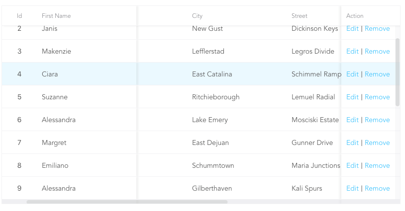
- Fixed Column
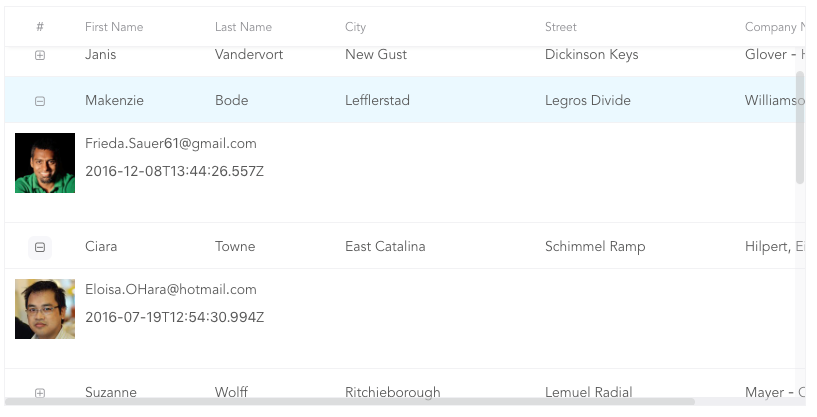
- Custom Cell

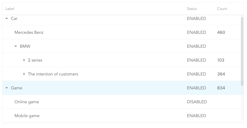
- Tree Table
- Expandable
Install
``sh`
npm i rsuite-table --save
$3
`tsx
import { Table, Column, HeaderCell, Cell } from 'rsuite-table';
import 'rsuite-table/lib/less/index.less'; // or 'rsuite-table/dist/css/rsuite-table.css'
const dataList = [
{ id: 1, name: 'a', email: 'a@email.com', avartar: '...' },
{ id: 2, name: 'b', email: 'b@email.com', avartar: '...' },
{ id: 3, name: 'c', email: 'c@email.com', avartar: '...' }
];
const ImageCell = ({ rowData, dataKey, ...rest }) => (
);
const App = () => (
);
`
API
$3
| Property | Type
                                                   | Description                                                                                   |
| ------------------------ | ------------------------------------------------------------------ | --------------------------------------------------------------------------------------------- |
| affixHeader              | boolean,number                                                     | Affix the table header to the specified position on the page                                  |
| affixHorizontalScrollbar | boolean,number                                                     | Affix the table horizontal scrollbar to the specified position on the page                    |
| autoHeight               | boolean                                                            | Automatic height                                                                              |
| bordered                 | boolean                                                            | Show border                                                                                   |
| cellBordered             | boolean                                                            | Show cell border                                                                              |
| data \*                  | object[]                                                           | Table data                                                                                    |
| defaultExpandAllRows     | boolean                                                            | Expand all nodes By default                                                                   |
| defaultExpandedRowKeys   | string[]                                                           | Specify the default expanded row by
rowkey |
| defaultSortType | enum: 'desc', 'asc' | Sort type |
| expandedRowKeys | string[] | Specify the default expanded row by rowkey (Controlled) |
| headerHeight | number(40) | Table Header Height |
| height | number(200) | Table height |
| hover | boolean (true) | The row of the table has a mouseover effect |
| isTree | boolean | Show as Tree table |
| loading | boolean | Show loading |
| locale | object: { emptyMessage: ('No data'), loading: ('Loading...') } | Messages for empty data and loading states |
| minHeight | number (0) | Minimum height |
| onExpandChange | (expanded:boolean,rowData:object)=>void | Tree table, the callback function in the expanded node |
| onRowClick | (rowData:object, event: SyntheticEvent)=>void | Click the callback function after the row and return to rowDate |
| onRowContextMenu | (rowData:object, event: SyntheticEvent)=>void | Invoke the callback function on contextMenu and pass the rowData |
| onScroll | (scrollX:object, scrollY:object)=>void | Callback function for scroll bar scrolling |
| onSortColumn | (dataKey:string, sortType:string)=>void | Click the callback function of the sort sequence to return the value sortColumn, sortType |
| renderEmpty | (info: React.ReactNode) => React.ReactNode | Customized data is empty display content |
| renderLoading | (loading: React.ReactNode) => React.ReactNode | Customize the display content in the data load |
| renderRowExpanded | (rowDate?: Object) => React.ReactNode | Customize what you can do to expand a zone |
| renderTreeToggle | (icon:node,rowData:object,expanded:boolean)=> node | Tree table, the callback function in the expanded node |
| rowClassName | string , (rowData:object)=>string | Add an optional extra class name to row |
| rowExpandedHeight | number (100) | Set the height of an expandable area |
| rowHeight | number(46), (rowData: object) => number | Row height |
| rowKey | string ('key') | Each row corresponds to the unique key in data |
| rtl | boolean | Right to left |
| shouldUpdateScroll | boolean(true) | Whether to update the scroll bar after data update |
| showHeader | boolean (true) | Display header |
| sortColumn | string | Sort column name ˝ |
| sortType | enum: 'desc', 'asc' | Sort type (Controlled) |
| virtualized | boolean | Effectively render large tabular data |
| width | number | Table width |$3
| Property | Type
(Default) | Description |
| ------------- | ------------------------------------------------ | ----------------------------------------------------------------------------------------------------------- |
| align | enum: 'left','center','right' | Alignment |
| colSpan | number | Merges column cells to merge when the dataKey value for the merged column is null or undefined. |
| fixed | boolean, 'left', 'right' | Fixed column |
| flexGrow | number | Set the column width automatically adjusts, when set flexGrow cannot set resizable and width property |
| minWidth | number(200) | When you use flexGrow, you can set a minimum width by minwidth |
| onResize | (columnWidth?: number, dataKey?: string) => void | Callback after column width change |
| resizable | boolean | Customizable Resize Column width |
| rowSpan | (rowData: any) => number | Merges rows on the specified column. |
| sortable | boolean | Sortable |
| treeCol | boolean | A column of a tree. |
| verticalAlign | enum: 'top', 'middle', 'bottom' | Vertical alignment |
| width | number | Column width |>
sortable is used to define whether the column is sortable, but depending on what key sort needs to set a dataKey in Cell.
> The sort here is the service-side sort, so you need to handle the logic in the ' Onsortcolumn ' callback function of