vue-js-popover
v1.2.1
Vue.js 2+ popover component
0/weekUpdated 3 years agoMITUnpacked: 78.5 KB
Published by euvl
npm install vue-js-popover
$3
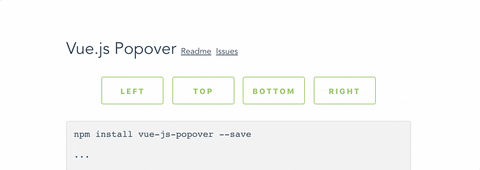
Install:
``bash`
npm install vue-js-popover --save
Import:
`javascript
import Vue from 'vue'
import Popover from 'vue-js-popover'
Vue.use(Popover)
`
Use:
`vue
Hello
`
Or:
`vue`
$3
Plugin contains a simple wrapper for Tooltip. To use it you will have to:
Set tooltip flag in your main.js:
`javascript`
import VPopover from 'vue-js-popover'
Vue.use(VPopover, { tooltip: true })
Include tooltip component anywhere in the application:
`vue`
Assign message to any element:
`vue`
$3
| Name | Type | Required | Description |
| ---------- | ---------------------- | -------- | ------------------------------------------------------ |
| name | String | + | ... |
| width | Number | - | ... |
| transition | String | - | ... |
| pointer | Boolean | - | If set - will show a tiny tip |
| event | "click" \| "hover" | - | Type of event that will trigger showing of the popover |
| delay | Number | - | Delay in milliseconds |
$3
You can use .left, .right, .top, .bottom modifiers to set the position of the popover.
Example:
`vue
`
$3
Popover components have data-popover="name" argument that allows to apply styles to it.
Example:
`vue`
`css
[data-popover='foo'] {
background: #444;
color: #f9f9f9;
font-size: 12px;
line-height: 1.5;
margin: 5px;
}
``