vue-simple-multi-select
v1.0.4
multiple select autocomplete dropdown for vue
16/weekUpdated 3 years agoISCUnpacked: 267.8 KB
Published by Rob Rogers
npm install vue-simple-multi-selectvue-simple-multi-select
A Vue component that makes long, unwieldy select boxes user friendly.
What it Does
vue-simple-multi-select provides an elegant, user-friendly component to replace long, unwieldy multi select elements. Great for users. Simple for developers.
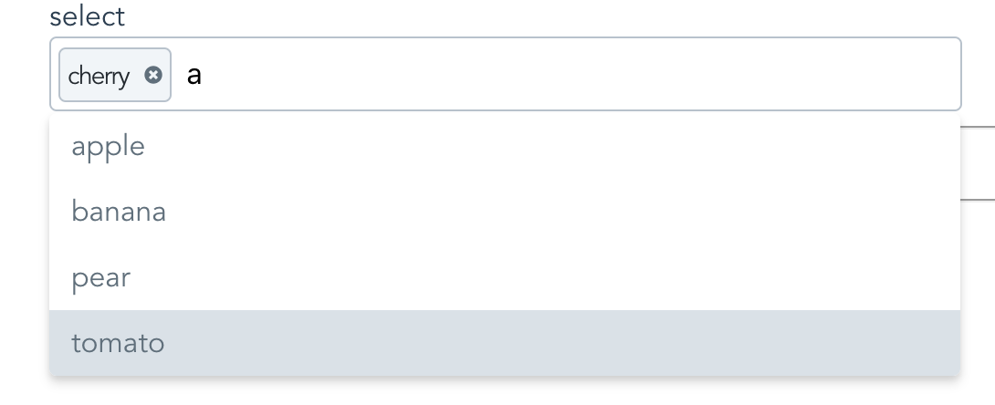
How simple?
This simple:
This simple
``html`
:options="['apple','cherry','banana','pear', 'tomato']"
>
What It Does Not Do
Nope no regular selects. See vue-single-select for this.
No ajax loading.
Usage
$3
`html`
:options="fruits"
>
`html`
$3
`bash`
$ npm i vue-simple-multi-select
$3
In your component:
`javascript`
import VueMultiSelect from "vue-simple-multi-select";
export default {
components: {
VueMultiSelect
},
//...
}
Globally:
`javascript`
import VueMultiSelect from "vue-simple-multi-select";
Vue.component('vue-multi-select', VuemultiSelect);
$3
`html`
:options="['apple','banana','cherry','tomato']"
:required="true"
>
$3
`html`
placeholder="pick a post"
you-want-to-select-a-post="ok"
v-model="post"
out-of-all-these-posts="makes sense"
:options="posts"
a-post-has-an-id="good for search and display"
option-key="id"
the-post-has-a-title="make sure to show these"
option-label="title"
>
$3
`html`
v-model="reply"
out-of-all-these-replies="yep"
:options="replies"
a-reply-only-has-a-reply="sounds about right"
option-label="reply"
seed-an-initial-value="what's seed mean?"
initial="seed me"
you-only-want-20-options-to-show="is 20 enough?"
:max-results="20"
>
$3
You can override some of it. Like so:
`html`
name="a_reply"
option-label="reply"
v-model="reply"
:options="replies"
you-like-huge-dropdowns="1000px is long!"
max-height="1000px"
:classes='{
active: "active",
wrapper: "multi-select-wrapper",
searchWrapper: "search-wrapper",
searchInput: "search-input",
pill: "pill",
required: "required",
dropdown: "dropdown"
}'
>
Then all you need to do is provide some class definitions like so:
`css`
.active {
background-color: pink;
}
.multi-select-wrapper {
display: block;
font-size: 16px;
}
.search-input {
color: black;
}
.pill {
padding: .5em;
}
... and so on.
Note: Bootstrap 3 Users May want to increase the size of the icons.
If so do this:
`css`
.icons svg {
height: 1em;
width: 1em;
}$3
Meh, see props below.
Why vue-simple-multi-select is better
1. It handles custom label/value props for displaying options.
Other select components require you to conform to their format. Which often means data wrangling.
2. It's easier on the DOM.
Other components will load up all the options available in the select element. This can be heavy. vue-multi-select makes an executive decision that you probably will not want to scroll more than N options before you want to narrow things down a bit. You can change this, but the default is 30.
3. Snappy Event Handling
- up and down arrows for selecting options
- enter to select first match
- remembers selection on change
- hit the escape key to, well, escape
- hit delete to remove the last selection
4. Lightweight
- Why are the other packages so big and actually have dependencies?
5. It works for regular 'POST backs' to the server.
If you are doing a regular post or just gathering the form data you don't need to do anything extra to provide a name and value for the selected option.
6. Mine just looks nicer
A lot nicer!
7. It's simple!!
Available Props
`javascript
props: {
// This corresponds to v-model
value: {
required: true
},
// Use classes to override the look and feel
// Provide these 7 classes.
classes: {
type: Object,
required: false,
default: () => {
return {
active: 'active',
wrapper: "multi-select-wrapper",
searchWrapper: "search-wrapper",
searchInput: "search-input",
pill: "pill",
required: "required",
dropdown: "dropdown"
};
}
},
// Give your input a name
// Good for posting forms
name: {
type: String,
required: false,
default: () => ""
},
// Your list of things for the select
options: {
type: Array,
required: false,
default: () => []
},
// Tells vue-simple-multi-select what key to use
// for generating option labels
optionLabel: {
type: String,
required: false,
default: () => null
},
// Tells vue-multi-select the value
// you want populated in the select for the
// input
optionKey: {
type: String,
required: false,
default: () => null
},
// Give your input an html element id
placeholder: {
type: String,
required: false,
default: () => "Search Here"
},
maxHeight: {
type: String,
default: () => "220px",
required: false
},
//Give the input an id
inputId: {
type: String,
default: () => "multi-select",
required: false
},
// Seed search text with initial value
initial: {
type: String,
required: false,
default: () => null
},
// Make it required
required: {
type: Boolean,
required: false,
default: () => false
},
// Max number of results to show.
maxResults: {
type: Number,
required: false,
default: () => 30
},
//Meh
tabindex: {
type: String,
required: false,
default: () => {
return "";
}
},
// Remove previously selected options
// via the delete key
keyboardDelete: {
type: Boolean,
required: false,
default: () => {
return true;
}
},
// Tell vue-multi-select how to display
// selected options
getOptionDescription: {
type: Function,
default(option) {
if (this.optionKey && this.optionLabel) {
return option[this.optionKey] + " " + option[this.optionLabel];
}
if (this.optionLabel) {
return option[this.optionLabel];
}
if (this.optionKey) {
return option[this.optionKey];
}
return option;
}
},
// Use this to tell vue-multi-select
// the values are for doing a submit
getOptionValue: {
type: Function,
default(option) {
if (this.optionKey) {
return option[this.optionKey];
}
if (this.optionLabel) {
return option[this.optionLabel];
}
return option;
}
}
},
``