wx-svelte-core
v2.4.0
SVAR Svelte Core - Svelte UI library of 20+ components and form controls
sveltesvelte librarysvelte ui componentssvelte-ui-librarycomponent-librarycomponents libraryui libraryui-libraryui componentsui components
0/weekUpdated 2 months agoMITUnpacked: 192.6 KB
Published by marta-ko
npm install wx-svelte-coreSVAR Svelte Core | UI Library


SVAR Svelte Core library offers a set of 20+ ready-made Svelte UI components: form controls, popups, date and time picker, selects, notifications, and more. All components are lightweight, responsive, fast-performing, and support TypeScript. The library comes in beautifully designed light and dark themes that are easy to customize.
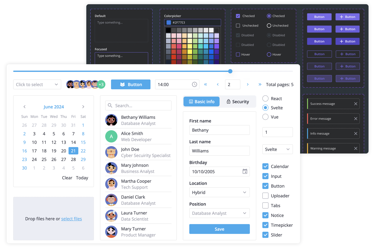
SVAR Svelte Core library includes the following components:
- buttons & form controls,
- calendar (datepicker),
- popups,
- notifications,
- sliding sidebar,
- tabs, and more.
Additionally, you can use these SVAR Svelte components to build unified app interfaces:
- Menu
- Toolbar
- File uploader
- Comments
- Tasklist
$3
There are two versions of the library: the 1.x version - designed to work with Svelte 4, and the 2.x version - created for Svelte 5.
To use the SVAR Core for Svelte 5, install it as follows:
``
npm install @svar-ui/svelte-core
To use the SVAR Core for Svelte 4:
`
npm install wx-svelte-core@1.3.0
$3
To use any of the Core components, simply import the package and include the desired component in your Svelte file:
`svelte
`
See the getting started guide to quickly set up and begin using SVAR Core components in your Svelte projects.
$3
Typically, you don't need to modify the code. However, if you wish to do so, follow these steps:
1. Run yarn to install dependencies. Note that this project is a monorepo using yarn workspaces, so npm will not workyarn start
2. Start the project in development mode with
$3
To run the test:
1. Start the test examples with:
`sh`
yarn start:tests
2. In a separate console, run the end-to-end tests with:
sh``
yarn test:cypress
$3
Join our community forum to get help or submit feature requests.