wx-svelte-grid
v2.5.0
A fast, feature-rich Svelte DataGrid component
sveltedatagriddata tabledata-tabledata gridui componentdatatabledata-gridsvelte datagridsvelte datatable
0/weekUpdated 2 weeks agoMITUnpacked: 98.9 KB
Published by marta-ko
npm install wx-svelte-gridSVAR Svelte DataGrid | Data Table


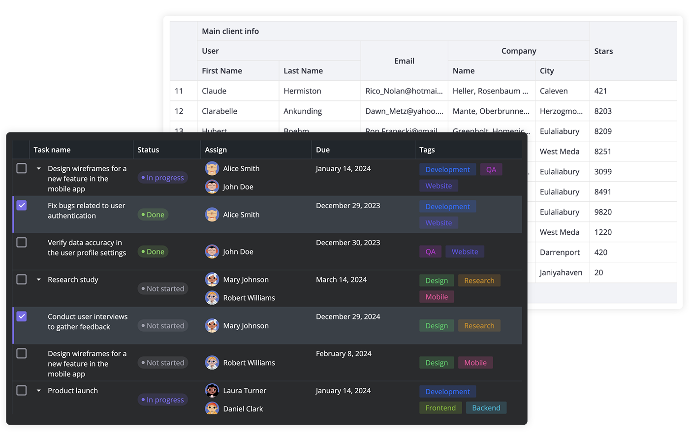
SVAR Svelte DataGrid is a high-performance Svelte component for building feature-rich, accessible data tables with sorting, filtering, paging, in-cell editing, and virtual scrolling. Easily customizable with CSS and a developer-friendly API.
$3
Here is a quick overview of what SVAR Svelte DataGrid offers:
- High performance (virtual scrolling for rows and columns)
- In-cell editing with different cell editors (datepicker, combo, select, rich select, etc.)
- Custom HTML for cells
- Sorting by multiple columns
- Filtering
- Paging
- Fixed columns
- Expandable/collapsible columns
- Customizable tooltips for grid cells
- Context menu
- External editor for grid data
- Tree-like structure
- Print support
- Responsive design to adapt to different screen/container sizes
- Accessibility: compatible with WAI-ARIA standard
- Keyboard navigation
- RestDataProvider for easy backend data binding
- Dark and light skins
- Full TypeScript support
$3
To use SVAR Svelte DataGrid, simply import the package and include the component in your Svelte file:
``svelte
`
For further instructions, see the detailed how-to-start guide.
$3
Typically, you don't need to modify the code. However, if you wish to do so, follow these steps:
1. Run yarn to install dependencies. Note that this project is a monorepo using yarn workspaces, so npm will not workyarn start
2. Start the project in development mode with
$3
To run the test:
1. Start the test examples with:
`sh`
yarn start:tests
2. In a separate console, run the end-to-end tests with:
sh``
yarn test:cypress
$3
Join our community forum to get help or post feature requests.